SOTW 109 Voting Thread!

SOTW 109 Voting


  • Total voters
    14
  • Poll closed .

Saga

ice ice baby
Veteran
Joined
Aug 16, 2007
Messages
3,123
Location
:inmypants:
Gil
0
This weeks theme was The Star Ocean Series

Here are the entries I recieved =3

Remember, you must post in order for your vote to count ;))

#1:
Albel2.jpg


#2:
213npee.png


#3:
2zjgtnq.png


#4:
30b02h0.jpg


#5:
w6wl20.jpg


#6:
2lk385y.jpg


#7:
2wf8wm9.png
 
Oh wow, stunning entries everybody! Well done to all who entered^^

#1 I like the text, i like the effects, I like the overall thing, but I think the render is blended in too much. its hard to focus on the render when its the same colour as the bg...i dunno, thats just me.

#2 I love it. The lighting around the render is superb! I like the whole starry effect and following the colour of the hair into the effects, the text and the border was also verrry clever. Well done!

#3 Again, lovely colour scheme and effects, i just wish the render stood out more...the text does, maybe that was the point? I like how the border is sort of blended in to the bg. Overall a very nice peice.

#4 Love it. I'm a sucker for lighting behind renders, it just makes it stand out more. The text is very cute. the only thing I'm not sure of is the placement over the render. I can see that the artist tried to avoid the dark places over the render, but thats my only fault with this siggy.

#5 Loving the text, border, effects and the blending of the render into the bg, verrry well done. Its a very simple and clean siggy, i only dont like the space on the left side, too much? The border is hard to see as well. But overall still an awesome job^^

#6 Awesome. just awesome. I'm loving the text placement and the render placement, especially the glow around the character. The bg was also very well done. The only thing i'm not too sure of tis the blobs over the render. I feel like they should be behind. Good job^^

#7 BUBBLES! I like bubbles. and the uneven border, very nice. The text and render placement is good too, and i love how the render is blended in nicely. Still, its not a good use of space. I feel like the right side of the siggy is kind of abandoned.but overall a very nice peice, has everything I like in it! Good work.

In the end i was stuck between #2 and #4 but I went with #2. It simple, its clean, its not drowned with effects and its light source is perfect. Awesome job.

Well done to all who entered^^
 
I voted for No. 5
I remember looking at the very same render but I decided not to use it because of the colours. But the colour scheme used is absolutely brilliant IMO. The neutral tones (browns and tans etc) work really really well with the red/orange colours.
It's blended in very well and the effects around the render are sublime.
The only things I would change are the size and text. The left hand side is empty so I would have cropped the tag and I probably would have used a more sci-fi text for a SO themed tag. The small text underneath is a great touch though.
But overall, really great work.
Well done to all those who entered :neomon:
 
Absolutely number 7. Its definately my favourite. Nice use of colour and subtle lighting makes it very effective. I think the text lets it down but even still its my favourite tag out the bunch.
 
30b02h0.jpg


Okay... So whoever made this, thank you for the laugh before work. :D 
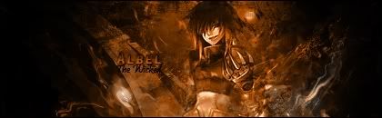
That line is awesome. "You've made me ... very... very mad, kay?" xD

I love the colours used in this one. The brightness really stood out, and I love the little dots of light on the right, all placed nicely into one piece. Good job ^^


w6wl20.jpg


It's gonna be this one for me this week. I love how the render is worked into the background. I thought the font was gorgeous, and the little text underneath it, though it could've been a little less, is cute. The brighter shades on the bottom right of the render look really pretty. Overal this was just the nicest sig to me, personally.


I have to say something about 6 though:

2lk385y.jpg


Gorgeous, so... soft almost. I love the light brush tat's been used making the faded shades around the sig. Really nice sigs guys!

My vote goes to number 5 this week.
 
No6!
Tis the one that got my attention first, I like the light colors and somewhat 'angelic' feeling towards it. I've always loved tiny sub text so yeah e.ell That one pretty much has it. The light spots over it are so lovely, and the entire image flows very well. =)
 
I voted for #6!
There's just something about it for me. ^_^
I love the look. The feel is so soft, the colors are nice and very warm.
The lighting effect is also very great *O*
 
~#6 all the way!

OMG it's Albel!! *fan girl squeal* XD

Seriously though, this sig is beautiful. The way it's made reminds me of someone stepping through the fog. I also love the colors in it, even if they are soft. ^_^
 
It was between 5 and 6 for me.

w6wl20.jpg


Brilliant work. The stock placement and the effects surrounding it are pretty powerful. I like the negative space, in this case it's just the right amount. I'm not a fan of the text, I think it may have been better if cursive wasn't the font used. A little more rendering as well because I can see tiny, white pixels around his arm. But over-all, the blending is just perfect, the light is put in interesting places. Very, very good job.

2lk385y.jpg


It's very soft and artistic. This kind of style I'm drawn to the most. :wacky: I can see the use of a bokeh. Very good smudging technique applied. I'm always a fan of the white, 2x2 pixel border. The text placement and font suit the tag well. Though, I do think the stock is too light and too blended in. But all in all, fantastic piece.

It was tough because I liked both so much. I wished I could've voted for the two. But it went to 6. It was close though. Very, VERY close.

Kudos to all who entered. We've been having a great turn out these days.
 
4

I hate voting because I can't C&C very well, I just end up repeating this awful "it just stands out, and that's what you WANT in a winner, isn't it!?". I was going to say the same in this thread, and I have, just in a more creative way. :wacky:
 
4 for me this week!

Just perfect, the colours really stand out and gives a definite 3D shape. The text was ver nice as well.

Well done!
 
I'm going to go for #6, although #5 came in a extremely close second.

The lighting has been executed brilliantly, and the softness of it really adds a nice touch and combines with the render really well. The general flow of colour flows extremely well as well and the texture of the background is amazing. I also love the simplicity of the font, it's extremely well done :)
 
213npee.png


Hands down awesome.. I love the blue.. Blue.. and maybe I'm bias but dang I love that blue. I love the lighting too, if I was an anime character I would be him. Good work!
 
1 - Not too bad. I noticed that the background on the left and right side starts out clean and the effects gave way for a dramatic look on the center, but at that point the image used seems to be low quality, or perhaps just very hard to see. Maybe if there was a bit more colors applied, it would have been a lot better. The text can use some work as well since it looks out of place - moreso the font itself, really...but overall the tag's pretty good.

2 - Nice, clean, and simple. Great use of sparkles and the subtle C4D in the background. I think the lightsource is a bit overwhelming on the bottom, but comes off nicely balanced as it work its way up. The text in the middle and the font used can be improved, but this is a nice one too.

3 - Pretty good. The text is the first thing I noticed as it clashed with the color theme...doesn't seem to fit with yellow text and the effects used. The duplicated image seem to have made the overall 'look' appear to be a bit dirty and unorganized...I think it would have been better if it was left alone. But it's a nice try and experimenting is good practice.

4 - I like this one...the text's on the creative side and the color theme really stands out. The artist went for a more simplistic look here but it's quite effective. The motion blur lines going across on the side looks pretty good. Great job on this one.

5 - Again, great piece here. The effects are just right, not overwhelmingly scattered everyone. There's a balance at work here and that's always good to see. My only suggestion is to fix the text...the cursive doesn't really suit the tag, I think.

6 - Fabulous tag. I wish I can see more of the details though, but I can see this whole look is the artists' preference. And with that it really does stand out. The lighting is a bit on the bright side but nothing to mar the great signature. The texture is awesome and I love text. Thumbs up!

7 - Nice use of two color theme on the side...that's kinda hard to do I think. The bubble C4D (I'm assuming) looks really hot surrounding her. Clean and simple, it stands out to me.

In the end I chose 6 though. It's completely the opposite of my style and preference, but this one was just too good. Congrats to everyone!
 
I voted for #4.

I love the crisp clean look it has and the colours are lovely.

The lighting looks brilliant in this piece and the effects around the outside look fantastic!

I love the text. <3

The detail around the text looks brilliant too! That white box coming off the border and then running under the bottom line of text looks awesome!

Well done to all who entered!
 
A big congratulations to Fusionist! Well done on your first SotW win!!!

1) -=Sativo=-
2) Mage Masher
3) Raging Tempest
4) Onion Knight
5) Stevie Nicks
6) Fusionist
7) Kandy-Sugar
 
Back
Top