The theme this week was Sprites, and here are the entries I have -
1)

2)
3)

1)
2)
3)
Last edited:
Follow along with the video below to see how to install our site as a web app on your home screen.
Note: This feature may not be available in some browsers.

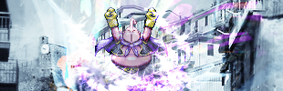
That's what I thought.Isn't it funny how all the entries ended up being DBZ sprites?
") The best sprite tag I've seen so far.
The best sprite tag I've seen so far.