Squids Graphics

Squid

Suck my dick.
Veteran
Joined
Nov 29, 2010
Messages
3,512
Location
Australia
Gil
0
Well...I got bored yesterday arvo so I started to give sig making a try and decided I was having a lot of fun.

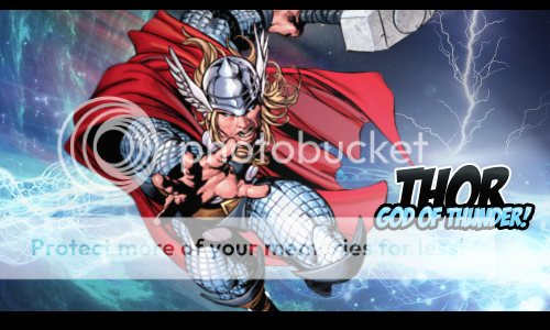
I'm real shite at it though so I thought I'd make a graphics thread and get some help! I've only made a couple of things so far, I'll post up one I'm happy-ish with:

IronManSig.png


I think I need a lot of help with text and maybe backgrounds and blending the render in a little better.

Any help and feedback would be greatly appreciated :D <3

IronManSig.png


Thor.png


Nightcrawler.png


Fairythingo.png


Tifa.png


Springtime.png


cityofgod.png


Lilith.png


TheMeddler.png

:ari:
 
Last edited:

This is a great looking sig for a beginner, actually! For one thing, it looks way better than my first few sigs :P

The render looks like it belongs to the background, which is a good thing. You probably just need a little more blurring of the background, as the background is a real-life shot, while the render is obviously cartoon.

I like how the head and fingers seem to pop out of the sig. It's a lovely addition.

As for the text, generally, they look better when they are located in the center. But since there's not much space, you could reduce the font size. I think it will also look better if you had used more serious looking font. But I like how you outlined the text, because it always add a great effect to them.

Great attempt! Good luck! I am sure you will make awesome sigs in no time.
 
Thanks so much for your feedback!! :D It's really helpful and I'm glad you like what I've come up with so far :hmmm:

I've made another sig and I tried to listen to what you said about the font, I made it smaller, I think it looks nicer though I got lazy looking for a serious font and chose a random one I already had installed.

I'm still having a lot of trouble with the blending though :rage:

Thor.png


More feedback would be so great please :inlove:

Also >_> my little lightning bolt above the text is lame, I know... But I couldn't help myself :ari:

Wow these are good for a beginner! xD You're off to an amazing start! I love the text in your recent signature! It's really comicy like the image. The only thing Id say is to try and blend your background and Thor images together a bit maybe using gradients or another hand drawn image for the background. Other than that I love the color schemes in your two sigs, your subjects and the backgrounds you chose. Just blend the background and subjects together more so that they look like they belong in the piece is my only criticism(I think the iron man one was blended much better and the pop out effect was just amazing <3)! ^_^
 
I am scared. :ohshit:

Toni eats lightning and craps thunder when it comes to GFX.. Its official.

Born with a paintbrush in one hand and an olive branch in the other.. Communicates with animals and the wild... And isn't afraid to live in australia with its bus size spiders and venemous everythings..

I'll surrender my man card, nao... :ohshit:
 
These are the best beginner signatures I've come across so far. It took me several months just to be able to come up with something like that from when I first started.

Your Iron Man signature is blended quite well actually. He looks like he's about to pop out.

For blending, there's different ways. I'll show you a tutorial I made for someone here last year. Hopefully it'll help you out a bit, though to be honest I think you're off to an excellent start so with more practice, it'll become easier each time.

------

Here we start with the basics. Before we begin, are you aware of a useful shortcut - CTRL+ALT+Z and CTRL + Z? That will undo/redo every step you make on photoshop, and I find this very useful. In fact, every time I make a few changes, I'll use those shortcut even if I don't have to actually redo/undo anything. It's just a habit to compare the changes made.


So here we have an anime render on top of a city building background. I like to fill my Layer 1 with the Gradient Tool - in this case, I chose a light blue and a creamy yellow.

2j3f7z9.jpg


Step 2: Duplicated the render and stock a few times. Hid some of them. I set Layer 2 to Soft Light. Opacity stayed at 100%.

With a soft brush (200 size), I erased some parts of the character (Layer 3). I then reveal Layer 3 copy to bring out the character a bit more (so she doesn't look too erased!)


9fmeer.jpg


Okay, now you notice how the building is showing up on top of the character? We'll simply erase that, using a 100 size soft brush. (If you use 200, it might be too big and you might end up erasing more than necessary).

Like so:


2rclb2q.jpg


From there you can continue with Layer 2, and maybe duplicate (CTRL+J) the layer, then lower down the Opacity. If you don't like how something is turning out in the signature, you can always erase the one part whilst leaving the rest alone.


One more step:

I duplicated Layer 2 (which is Layer 2 copy 4) and set the Opacity down to 72% (random number). I erased some of Layer 2's building background. Mostly the corners and towards the center where her back is.


Then I went to Gradient Map, set it to Soft Light.

2ntfs5d.jpg


Now see those black round stuff on the top layer? Those are erase marks. I erased where the character's standing because as soon as I applied Gradient Map and set it to Soft Light, the lighting was way too overwhelming on the character. So I fixed that by simply erasing the overwhelming light :)


And that's pretty much the gist of it. Simple, yes? This is far from done of course, but that's just a few simple steps you can do while starting your signature. Also notice that you can achieve a simple piece like this by just using one stock and one render. No brushes or C4Ds applied.

Just remember to have fun and experiment. You can apply another background in and have it blend with another background, or mess with the colors by using Color Balance.

---------

I hope the visuals help a bit.
 
Thanks for all the comments so far :grin:
And thank you Mits for the tut, I kiiiinnnda used it in this piece but not really hahaha, I still have to try it out properly.

I also need to get new renders but I am too lazy :wacky: So for now it is X-men and avengers themes :sad3:

Nightcrawler.png


Meh I dunno what I think of this :wacky: I can't even tell if I've managed to blend nightcrawler in better or not hahaha

feedback plz <3

This is the 3rd sig youve posted and already you've nailed the lighting. This is amazing!! He is blended quite well for the style you're going for, but I recommend changing the colour scheme of the bg from that pinky colour youve got to more of a blue...I just think it would suit the sig a little better, but overall this sig is looking really good! well done! :)
 
Thanks so much for the feedback :jess: I do see what you mean about the purple-y colour, it would definitely look better as blue! I didn't even notice it while I was creating it. I'm really glad you reckon I've blended the picture in well at least :inlove:

Here's another one I made :wacky:
I never know what to write as text so forgive the gayness of it. I also enjoy making them look like they're 'popping out' of the sig hahaha.

Fairythingo.png


Anyway, let me know what you think, It's a bit plain I reckon :(
 
Thanks for all the comments so far :grin:
And thank you Mits for the tut, I kiiiinnnda used it in this piece but not really hahaha, I still have to try it out properly.

I also need to get new renders but I am too lazy :wacky: So for now it is X-men and avengers themes :sad3:

Nightcrawler.png


Meh I dunno what I think of this :wacky: I can't even tell if I've managed to blend nightcrawler in better or not hahaha

feedback plz <3

Your lighting on the render needs some work, but overall this is great. You should duplicate the background and put it over the render layer. Then just start smudging till it's starting to blend, with the appropriate burn/dodge.
 
you commenting on my thread reminded me that i need to comment on this one

Fairythingo.png


WOW, I remember seeing this this morning on my phone and was like dam that awesome, thinking that your only been doing this a few days your doing amazing work for a beginner, for what you are doing after a few days took me months to do..... your blending as well as lighting need some work, but they are really good for a person only doing it a few days. I'm loving the text, you pretty much cracked that already, something I only started to get a hang of the past month. the colors are amazing as well great choice..

your blending and background need some work, try using the blur tool around the render or the eraser tool to get some blending in.... these are the best way to go with the blending for a beginner, as for lighting, try using the soft brush at 300 - 400px, using white place it, and set the layer to overlay and change the opacity to the level you want, or try out the lighting effect filter... these are great vways to get some lighting in your signature :)
 
I hate you and your ability to have good text that also looks good this early on :mokken: Looks better than most of what I've made :wacky: keep it up, Toni
 
Thanks for the comments and tips guys :ryan:

Here is one I made this morning.
I HATE it. Hahaha I think it is utter trash but, you guys can still give me criticism on it.

Tifa.png


The picture was so hard to work with :damon: I was going to give up using it. Those black and white bits are a bit dumb and I dunno about the text. Ahhh well. :mokken:
 
Tifa.png


it just looks a little low quality, but great job here, but blending looking pretty good and I'm loving the half border, I prefer them thinner like about 10-15px (but that just what I prefer) I loving the top line of text, not sooo sure about the second line, just seems abit off theme, but great job with that getting better :wacky:
 
Tifa.png


toni my baby you are so great

i would have moved the render a little more to the left and the text down a bit, and the border a little thinner but :ohoho: YOU ARE DOING VERY WELL
 
Wow, Toni.

Amazing pieces so far. I especially like your "Who'd a thunk it?" piece. :lew: The colours are great and the popping out render is really nice. I think as for text, (sorry, my forte, so it's something I can give feedback on. :sad3:) you are doing great. You are experimenting with all sorts of fonts, rather then sticking with something that's easy to use in your beginner state. That's really the trick of getting the hang of fonts, so you're doing great with that.

Far as your lighting goes, try dapping a soft brush with a very light creme coloured yellow (at the top layer of your piece), under the border, it gives a simple light source for starter pieces, or if you just want it to stand out a bit more. :D

Good luck!
 
I love what you're doing with fonts and text so far, and I actually like what you're doing with your borders. You're Tifa one is pretty awesome! :D

I look forward to seeing more stuffs from you! You've picked it up pretty quick.
 
Toniiiii you are so good :jess: Your fairy who'd a thunk piece doesn't look like a beginner piece at all :jess:


Tifa.png


I actually like the black and white images of Tifa in this. I'd just say to maybe have some light shed on Tifa's face, cuz the image looks a bit lower quality and her tummy is brighter than her face :lew:

You're doing great :inlove:
 
Thank you guys for all the comments and helpful tips. I'm glad a few of you thought that Tifa one looked at least semi decent haha.

I've not had much time to do GFX's this week as I have been really ill but here are a couple that I have done:

My Clan Challenge Entry:
Springtime.png

Thank you so much to everyone who voted for this :ari: I really appreciate it and you've really helped motivate me to keep on gfxing.

This one I used Ari's @Ellie's paint splatter tutorial and i made it for my pal Lew.
I think it came out... ehhh okish
feedback would be lovely though
cityofgod.png


thanks again :D
 
Last edited:
:O Toni you did that flower piece for the clan entry :O It's really good :gasp: The sparkles and especially the text make it look really cute.

As for the second one...gosh I hate your ability to have really nice text :hmph: And I also really like the double image/paint splatter. The only thing is I think I would play with the lighting a bit more, just because when I looked at it my eyes sorta went everywhere. But really, this stuff is amazing Toni, keep it up! :lew:
 
Back
Top