I hate you toni.  Your skills are a lot better than what mine were when I first started.
  I'm super impressed. That flower entry you did for CC was amazing. Quite surprised indeed. Keep it up.
Your skills are a lot better than what mine were when I first started. I'm super impressed. That flower entry you did for CC was amazing. Quite surprised indeed. Keep it up. 


 )
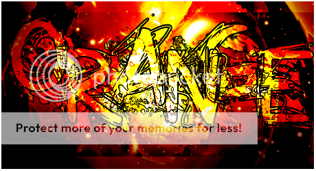
) Oh my goodness, that font.
 (kidding!
  ) It's just exactly what I look for in a signature, that is all I can say. It's just awesome.

 I appreciate your comment so much!!!


 Double posting coz I can, mother fuckers.

") I'm very surprised to hear you're a beginner. We're going to see some fantastic work from you yet!
I'm very surprised to hear you're a beginner. We're going to see some fantastic work from you yet! 
 It's artistic and comicbook-like, which suits Iron Man very well. The render looks like part of the background!
  What did you do to blend it in? It's simply super!


 why is it so hard