SOTW 60 Voting Thread!

SOTW 60!


  • Total voters
    22
  • Poll closed .

Daenerys

The Last Dragon
Veteran
Joined
Nov 26, 2006
Messages
11,178
Age
33
Location
Suburban hell.
Gil
1
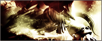
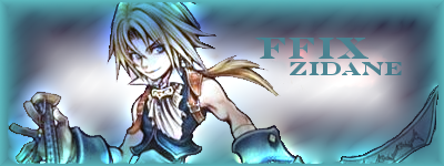
This weeks theme was Final Fantasy VII / VIII / IX, and I received a lot of good entries :3 Remember, you must post for your vote to count ;D

1)
sigoftheweekyo0.png


2)
Freya.png


3)
Untitled-1-19.png


4)
Vincent.png


5)
SOTW60entry.jpg


6)
CloudandAerith2.png


7)
Zidane.png


8)
LonelyLeonhartSOTWEntry3copy.png


9)
Nanakisigcopy.png


10)
vivi.png


I'm going for 10 it's just looks pure and I like the colors and the use of it, it really fits.
 
It's between #4, #5, and #10 for me so far...

*Few seconds go by*

Now it's between #4 and #10.

*5 seconds later*

#10! Yeah, I'm gonna go ahead and vote for that one. Tons of different colors, and they all fit well together. Looks cool.
 
Number 2. Loving the colour effect, makes everything more...dark, sad etc
 
#4 for me. I absolutely love the affects surrounding Vincent.
 
Despair, as you guessed it number 2 is my choice this week.

That word suits the image and the overall mod greatly and I have to say well done, although the colors aren't great in numbers they are effective and work well to set a mod for the image which the word Despair highlights.

A awesome Sig that gets a 9/10 a WOOT and a BOYA.
 
Vote for #6, i like the effects, renders and colors used and the border is excellent :)
however i think the text written could be a little better.
 
Number 6 and 8 were my favorites! I'm going to have to give my vote to number 6 though, simply because I love the colors and the effects. Once again, fabulous job Mark! I love everything you do it seems ^^

Like I said though, number 8 was a really close second. Whoever made it really has talent, so good job!
 
Aw man, great entries you guys; this is gonna be tough to choose >_<

But I think I'm gonna go with 10; the render looks the cleanest and the effects go along well with Vivi's character.
 
#10 easily, it's the cleanest of the bunch, everything just seems to fit together
 
I went with 10. It's clean and although very simple, I like the effects surrounding Vivi. The lighting is quite superb too. My second choices were 6 and 4, but 10 was a little more appealing to me.
 
2, 6, 8 and 10 are my favs. Just to pick one is damn mean lol. But gotta be done hasnt it?

Okay then, im going for ... 8! The brushes and textures are amazing and the image has been cut well, I find it hard making sigs where the image breaks the border, but this artist had no probs doing this. Well done!
 
10, the colouring is awesome. Though I was torn between it and 8, because the brush work on 8 is mega cool.

But, 10 it is.
 
#10

the whole magic theme fits the effects done in the sig very well, and I think the effects compliment the stock
 
Back
Top