SOTW 172 Voting Thread

SOTW 172


  • Total voters
    17
  • Poll closed .

Daenerys

The Last Dragon
Veteran
Joined
Nov 26, 2006
Messages
11,178
Age
33
Location
Suburban hell.
Gil
1
The theme this week is Remake. Please remember, that while posting isn't necessary in order to count your vote, it is encouraged.

Also, please remember that you CANNOT vote for your own entry, and you will be disqualified from this SOTW, and the next two SOTWs if you do so.

Here are the entries I received :

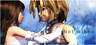
Note; the original signature is displayed first, then the remade signature.

1)

j0zpjq.png


2eecyut.png


2)

29dbfpe.jpg


25jv9fq.png


3)

lovesig.jpg


Final_Fantasy_IX_Zidane_Garnet.png

 
Number 1 gets my vote. Not only do I like how it's done, but I also like everything that's going on in there. It all fits, especially with the different colors and lighting.

Exceptional job.

Number 2 also looks cool, but my eyes instantly directed to no. 1.
 
Voted 1. Even though the original is great to begin with, and there's not much room for improvement, the second signature shows a change in style, and it works. Really liked both in this case.

I'll be honest for the second one, I thought the original signature was much better. It's a lot cleaner and the small canvas suits the render, as well as the colors. An improvement to it for me would be adding text, a border and maybe a stock for a background instead of just effects and color.

The 3rd definitely shows improvement but the end result still has flaws. To me it lacks the basic elements that a signature should have. Depth, color, lighting...
 
  • Like
Reactions: Six
voted 2

uhm it shows the most improvement i think and out the 3 new sigs its the one i like best.
 
  • Like
Reactions: Six
I voted number 2. I think both of the sigs were good, but the remake was very much remarkable. And I thought the original sig for #1 was cute the way it was, while it's remake just has way too much stuff going on for me to like. So yeah, I picked #2 .
 
One itself (the original) was already amazing to begin with and, I preferred that over the remake. Now don't get my wrong, the remake was flawless as well but, eh.

The second one is the one I decided to vote on. While the original was decent, I think the remake is much approved because there's more to it then the first one.


The third's remake is in fact alot better then the original however, it didn't stand out to me as much as the second or first's remake.
 
#2!

Definitely was much better in the remake. In fact, I liked how in the first, the contrast was very high (dark) but in the remake, it went for the opposite effect. The background was incredibly more dynamic, and I could see the gauntlets much better.
also, Dante ^^

Now, for the rest~

#1 was interesting. The original was already fairly attractive, but I don't think the remake truly made the stock drastically better. It certainly looks more appealing (no question!) and is overall more dramatic and plain cool-looking, it was a bit busy. In the original, there was a sense of how this stock picture was positioned. The remake felt so abstract from the first, it was jarring. O_O And that trick with putting the picture inside the circle was very cool. So props for that. But what really decided it for me was that the beam of light cuts the sig in half, and obscures the background. Speaking of, the background was much better than the original by ages! It was a tough call between this one and two.

#3 actually, was kind of funny. :wacky: I liked the original in favor of the remake. :P I noticed that the remake had much better quality stock (no pixel dust around the figures) but I actually preferred the effects in the original.
 
1: It was hard to improve on this signature I think. The first one already looks so great.

2: Think this one had the "most improved" feel. So it gets my vote.

3: Definitely improved with quality, but as stated above, I liked the effects in the first one more. :lew:
 
This may be blunt,

But it seems that sometimes expert GFXers on these types of Themes just wanna show off. I mean if your originals already look great, why even bother competing in such a theme like this.
 
This may be blunt,

But it seems that sometimes expert GFXers on these types of Themes just wanna show off. I mean if your originals already look great, why even bother competing in such a theme like this.

Because even expert graphic artists want to improve - which is the whole point of being a graphic artist. They might even enjoy a different take on their old signatures with the experience they gained since they made it. ;)
 
I voted for #1.

It definitely struck me as the most improved in the second version.

It wasn't just the same with a different effect or colour. The whole style changed.

Fantastic work on the remake. You can see just how much the artist has improved over time. =)
 
Back
Top