SOTW 151 Voting Thread

SOTW 151 Voting


  • Total voters
    24
  • Poll closed .

Saga

ice ice baby
Veteran
Joined
Aug 16, 2007
Messages
3,123
Location
:inmypants:
Gil
0
The theme this week is Disney. Please remember, that while posting isn't necessary in order to count your vote, it is encouraged.

Also, please remember that you CANNOT vote for your own entry, and you will be disqualified from this SOTW, and the next two SOTWs if you do so.

Here are the entries I received :

1:
Dory.png


2:
madersig0021copy.png


3:
princessnfrogwhite.jpg


4:
2cii3q1.jpg


5:
2ufez53.jpg


6:
w82ctl.jpg


7:
jacksparrow.png


If I somehow missed anyone, just let me know. ^^
 
1. I liked the style that was used in this one, bright blue was nice, but I couldn't help but think the focal point was a bit too overwhelmed with the effects going on. I know I'm being picky, but that white line on the right side kinda bothered me. >_< Love the texts and effects though.

2. The colours are mixed nicely. The blending was nice too, though I couldn't help but feel that the right side was a bit too empty and missing 'something'.

3. Looks like a classy tag. I like the border, the colours of the tag seem a bit washed away in my opinion, but I think the scribbled text is really cute, "When you wish upon a star" such a nice line too. Image is nice and the focal is definitely there. =)

4. I think the colours threw me off in this one... I don't really think they work together that well, and the pink effects look off in my opinion. I think had their been less clashing colours it'd have made for a nicer tag. The smudging doesn't really work if the colours are too different, even though it's nicely smudged, just my opinion.

5. Text is cute. I like the boxes around the text. C4D looks nice, and Buzz seems like the center focal, which is good. The grainy effect works nicely along with the rest of the tag.

6. Nice use of colours, text looked nice too. I liked the background effects, and the smuding over Ariel, although the lightning seems a tad off, it's still a nice tag. =)

7. First thing I noticed was the border, if it's that. It went behind Jack, which threw me off a little. I think the text is a little too crowded, cornered, and meshed together. Having a clean font a little closer to the render would've looked a little better I thinks. Very nice smudgy background.

My vote goes to #3.
 
My vote is either on 3 or 5, reason being different for both of course.

#3 feels as Kira said, classy. Very timely in my opinion and the enhanced Polkadot effect (correct this newb if it's called something different) is pretty nice. The illumination around both characters are excellent to.

#5 Because it gives it a rugged look, which is fresh to me. Never seen Buzz lightyear look any different than that fresh out of the box look. The lighting is good, but for some reason I feel it doesn't match well on the left side and his right arm.

I'll have to go with #3.. Congrats =).
 
i voted number one. I really like the color and the overal design of it. especially with the lighting glare(think thats whats its called) really flows well. The only thing i could say is that Dorothy should stand out a little more and capture all the attention.
 
I think they all could use some work TBH. I voted for 2 though because I even though I thought there were too many red bubbles, it did look the best out of the bunch IMO.
 
Loved #3, even though I hated that movie. :wacky: 
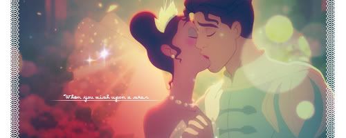
Love the border, colors, and placement. Text seems a bit too small, but at least it's readable. I really liked the line underneath and the font too.
 
I liked 5 the best. Id recomend lowering the scan line oppacity and sorting the text but to me its the best signature there.
 
I went for number 2..........the coulers were mixed which made it look really nice.........and well,I am a big fan of the couler red.......it's also shiny as well,definately the best out of the lot in my opinion.
 
Of course i'm no expert on things like this but, I'ma have to go with #5. Following up close next: 1.

Buzz looks amazing against the background color and focus on him. It has a certain edge to it.

The boxes around the text were neat too =)


Good job guys!
 
I was the first person to vote for #3. :p There are a lot of fantastic designs here, but that embroidered border really stands out and the whole bubbly romantic scene feels like a finished piece.
 
This is one of the best collections Ive ever seen of pieces. Well dont to everyone involved, you all did an amazing job. But my vote is going for number 3.

Reasons are that its eye catching, soft, colourful, beautiful and just blended so well together. Truly has a fairytale feel to it.
 
this weeks winner is Yumiko!

Congrats. =]

1) Smiley
2) Imperious
3) Yumiko
4) Stevie Nicks
5) Raigeki
6) .Fran
7) Lucia
 
Back
Top