This week we've seen the largest number of entries EVER for a SOTW ^^ so, well done all! The theme was a mystery stock/render, which was determined by a number from 1-5, so some signatures might have the same render.
Please remember, you must post for your vote to count ^^
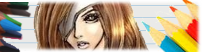
1)

2)

3)

4)

5)

6)

7)
8)

9)

10)

11)

12)
13)

14)

15)
Please remember, you must post for your vote to count ^^
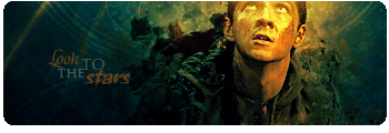
1)
2)
3)
4)
5)
6)
7)
8)
9)
10)
11)
12)
13)
14)
15)
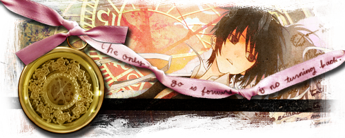
") The texture is marvelous too. x)
The texture is marvelous too. x) The lighting from the top was brilliant. And something about the text, I think just the way it looks, is really something. =)
 I love the colours in this sig though.
 It's a hard decision, I must admit. There are three that stood out to me on this one:


