Savvy Graphics :O!

Dark Adonis Wilt

Blue Mage
Joined
Jan 9, 2008
Messages
102
Age
35
Location
The Cool Side Of The Pillow
Gil
0
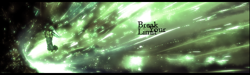
So after about a year or two without using photoshop, I've finally gotten my hands on another copy. I've pretty much forgot half of what I knew, blows but I'll catch up soon enough with practice. I'll showcase these from oldest to newest.

feliciasigv2copy.png


cantisigcopy.png


cloudsig3copy.png


limitbreaksigcopy.png


Zeldasigcopy.png


midbosssigcopy-2.png


kingdomheartssig2copy.png


marionintendosigcopy.png


naminecopy.png


LINKSIGNATUREPSDcopy.png


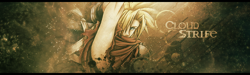
I've lost all my resources, but I've been searching high and low to gain the lot of them back. I've forgotten how to use clipping masks lol, so if anyone has a tutorial or can just tell me I'd appreciate it.

The last signature I made just to jog the memory, trying to remember what does what. If anyone would like me to make a signature for them, just ask and I will do my best :D! But please... bare with me on the fact it's been a long time, I'm not as sharp at this as I used to be, will soon though :P.

So tell me what ya think :O!
 
Pretty good :monster:
Considering you havent done it for a while now. Just keep practicing and you'll get it all back to you :P
I never was good with Photoshop and plus it fucked up my computer so, good job to you (y)
 
Haha, there is gonna be some grand competiton for SOTW(if you enter that is :P). I personally like this one best. The bright colors are a nice touch to the stock/render's natural appeal. Also the effects are quite damn sexy :wacky:.

feliciasigv2copy.png
 
DON'T ENTER SOTW! I have enough trouble reaching everybody elses standards...YOU'RE ALL TOO GOOD! :gonk:

Well, with that out of the way, here we go!

These are my personal favourites. You're very talented. Keep \using PS and It'll all come back to you =)

Oh, and don't enter Sotw :gonk:
 
You definitely have some experience with PS, I can tell you have some knowledge on things like flow, text, colours and stock placement. I really like them.

cantisigcopy.png


This is my favourite. It looks very original. I love the blend of music and scifi robotic themes. I think the text could use some work but overall I think it looks great.
If you've found the guitarist used, do you mind sharing it?


Hope to see more! (y)
 
You definitely have some experience with PS, I can tell you have some knowledge on things like flow, text, colours and stock placement. I really like them.


This is my favourite. It looks very original. I love the blend of music and scifi robotic themes. I think the text could use some work but overall I think it looks great.
If you've found the guitarist used, do you mind sharing it?


Hope to see more! (y)

Lol yeah I've always neglected my font/text skills, never really know what to do with the fucker. And yeah I can search around for the render for ya, I had it on my old external drive. Which housed all my PSD, stocks, C4Ds, etc.. Now it doesn't work :(. But I know I found it on planet renders, I'll search there. If you wanna look too, that's Canti from FLCL.

I really appecriate the comments from everyone, and please tell me what you think needs to be worked on, I won't bite :P. And for everyone who liked the Felicia signature, here's the tutorial I used if you wanna take a crack at it.

http://demonflair.deviantart.com/art/Kanye-West-Tutorial-64905208
 
OMG :gonk: I love your works, they all really give a nice feel~ :3 You know where to put everything, which font/brushes/effects to use <3

cloudsig3copy.png


I particularly like this one. It makes Cloud look more gorgeous : D The lighting is really well done, and the texture is nice. The text :3 Oh God, what is that font called?

Don't think losing resources is gonna be a big problem, man, with these skills? No way. Keep it up, looking forward for more :elmo:
 
Lol, I really appreciate that Sabriel. I know resources don't prevent me from being good at PS but sometimes you're like "Well I just go use this... oh wait, I don't have that... Fuck my life". And I'm not so sure what the font was called, I know for a fact I got it from Dafont.com!

And I found that stock for anyone who wants to use it!

gfxjunk495.jpg


I'll be posting more signatures in a few hours :P!

EDIT:

Well I looked around a found a tutorial on mask clipping, just messed around with that and pen tooling.

Contrastcopy.png


Not anything amazing, but I'm trying lol.
 
Last edited:
This is actually really nice! I'm loving all the colours used. Do you remember what tutorial you used? If so can you give it to me please???
 
Contrastcopy.png


This one i really like a lot. The wide variety of colors are excellent. YOur pentooling is great as well, something that is grand to see now-a-days. you should totally join SOTW, it'll great to have you as competition.

Keep up the great work (y)
 
Contrastcopy.png


Ooooo I like that. Love the use of colours. Looks a little rough with the black and white, :hmmm: but it doesn't look bad? I actually like it.

I love the simple border you gave it.

I should really get myself to not put text on sigs sometime. Sometimes it looks really good without it. Yours being a good example.

The only thing I'm not sure of, is the little sign on the bottom right? :hmmm:

Haha I wish I could say I don't use text on purpose. But I procrastinate about going off and finding some... And yeah the little sign is part of the stock. It looks funny because some idiot over sharpened it and wasn't paying attention -_-.. Oops lol.

Anyways thanks all for the comments, I made a new one to try and regain some smudging knowledge. I don't like this signature much. But hey, fuck it right?

smudgingcopy.png


Learning little by little, it's coming about though :P. And I'm off to find me some fonts :O!

EDIT: I find me a font :P.

prototypepentoolingcopy.png


And one for the road :P, simple smudging siggy. All done with a soft brush and smudging :), it looks a little plain to me, but I wasn't trying anything extraordinary.

softbrushsmudgingcopy.png
 
Last edited:
Contrastcopy.png


This is awesome, i love it :gasp:
The differance between the colour and the black and white render looks awesome and i love the subtle use of vectors. Funky render positioning aswell but it works magnificently. Great piece of art.
 

First of all I have to say how gross that bump GIF is. XD Imagine that. >.< Some fat guys gut butting you in the face. >.<

Anyway, lovely work on the signature.

Lovely colours and use of negative space around her.

I do feel it's a tad too sharpened but that's nothing too major.

Very sexy font used and the smudged colours around her look fantastic!

It's a very gorgeous piece of work. =)
 
aioncopy.png


:gasp: Bright piece is bright. But the text and colours are pretty! The text looks really interesting, and it's the first thing that stood out for me. The whole signature is nice too look at. Bright, but really nice.

I think it does look a little empty seeing how it fades to white on the sides, and like Kandy said a bit too much sharpening going on, but I definitely agree on how the smudgy effect looks really pretty.
 
very refreshing, nice concepts dude! very pro and polished looking.
although i don't like how some of the renders are sticking out of the smudge work.
focus on blending them better with your smudge layers on special settings. good luck :3
 
Back
Top