♣ • .:Castles Made of Sand:. • ♣

CidRaines.png

:monster:

This signature is sex.

I don't have any idea how you do what you do. Those particular crystal effects are something that only you have captured. You've also owned the white half border. I can't find anything to fault. I love the text, especially the touch of orange for the beginning letters. I'm so fond of that red diagonal line. It creates a balance. Light sources are beautiful and the color scheme is unique and attractive.
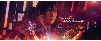
 
CidRaines.png


I love this signature. Your use of colour is sexy as fuck.
It really set the piece off immediately. Im liking the clipping masks and how uv sharpened them. Adds nice depth. The lighting sparks down the bottom add flare and direcction to the sig. Truly an awesome piece merc. I would have liked to have seen some sharpening to the face though he kinda lok hidden beneath the colour. Its not a big deal but i think itd make an awesome signature look even awesome...er?
(y) nice one
 
@Micci, that red line is in the stock so there wasn't much I could do :sad3:

@Lew, yeah I can see what you mean now that you've mentioned it so it's been sharpened. :ryan:
CidRaines-1.png


Cheers guys! :awesome:
 
CidRaines-1.png


Beautiful signature all-around! The vertical patterns in the background add a very good balance towards the ones going upward on the bottom-right, which creates a most peculiar flow. The lighting is executed really well and not as overwhemling, which makes the orange sparks more distinct from the overall picture. Cid was blended in well properly and quite professionally - it's astounding. I'm certainly loving the different shades of purples amongst the even-layered of brighter colors all around. As mentioned by previous critics, sharpening his face a bit would be a little better, although I know that the quality of the image is not the greatest to begin with. Text is awesome as usual and the half-borders completes the tag in style. Great work, Ryan, and looking forward to more of your sexy work!
 
Thanks Mits! :awesome:

Two requests, the first Nathan Drake asked me to do and the second I've always wanted to make a Lightning one so I took the request that Shadow_Hunter asked for. :)

e7ndz4.png

Lightning-Shadow_Hunter.png

avatar13650_16gif.png
LightningAvy.png


and the new site banner:
banner.jpg
 
Ryan always make awesome signatures.

His colors are so lively and fluent, they all go so well together. The textures he makes on the signatures along with the images are always so awesome. The lighting gives the signatures their own warm lighting. The text is always simple but it just goes so well with everything else. The mere colors and simplicity of them is what makes them awesome. In the end, the white half border rounds off everything nicely. <3

Ryan is awesome v.v

*wnats to be like him but he doesn't know it* >.>
 
I think outta the 2 banners the lightning one has better flow but this one is definately my favourite.
e7ndz4.png


Again, superb use of colour. Hahahaha i hate repeating myself in all my posts but your use of colour is exceptional theres not much else i can say other than that its amazing XD I like how uv mixed the tag up with the wireframe to the left thats my favourite part of the signature and its the first time iv seen you use them but it fits like a glove.
Im not really feeling the text placement i think the space to the left of his body would be more suitable but i dont think it really clashes with the signature in any way as the use of fonts is very good. Great work (y)
 

Gorgeous work as always!

The purples, reds and yellows all blend in nicely together and the lighting is well directed to bring out the focal more.

Lovely blending of the girls and the effects coming from the bottom look gorgeous!

I like how you did the text with the faint line saying 'Oerba' in the background.

Fantastic work!
 
e7ndz4.png


This has to be my favorite out of this style so far. All the elements work so beautifully together. There's a nice balance of texture all-throughout the piece and the light sources are just so attractive. It really draws you in. The text is spot-on. Finished off by your signature, white half-border and it's perfect.

OerbaYunFang-Mandi.png


This one surprised me. The fact that you didn't render the subject actually makes it look sexier. Unique idea. I'm still really in love with this style, and there's not much to say after that. :wacky:

Great work, Ryan!
 
Thanks gaiz. I'll comment your works tomorrow when I get up! :D

OerbaDiaVanille-1.png


Stock:
94.jpg


Of all the sigs I've made definitely the my favourite stock to work with and sig itself. :ryan:
 
Thanks gaiz. I'll comment your works tomorrow when I get up! :D

OerbaDiaVanille-1.png


Stock:
94.jpg


Of all the sigs I've made definitely the my favourite stock to work with and sig itself. :ryan:

-__- the stock link is broken D:

But yeah the sig itself is nice, love the style :D..its so mofo sexy :D. The colors and everything to it is off the charts:busta:
 

Looking at the stock I'm quite amazed at the stunning job you did with it! =D

It's simply gorgeous! <3

Lovely effects down the bottom. I love that blueish little creature coming out of the disc. It's so pretty!

The lighting is perfect. It looks as though the brightness of the disc is shining up onto her face. Very nice.

Fantastic blending and the texture of the background is very appealing.

Colours are all very attractive and the text is looking very professional as always.

10/10
 
I really like the clipping masks used, especially the ones near her shoulder. As usual, the colours look fantastic and the faded images of Lightning and Serah in the background are a nice touch. Love the border as well, I use half borders all the time and I think they look much better and more professional.

IMO, having such a colourful background makes the sig look too empty. It almost seems like it's missing something where as a white background would look minimalist. For me, it feels like it needs something to finish it off and to make it balance.

Awesome stuff. (y)
 
Last edited:

I love the simplicity of this one!

It's so pretty! I love the colours you've used. They all go so beautifully together.

The smudginess of the background looks great and I love the faded images of Lightning and Serah around the main image of her.

The specks splattered off her body look fantastic and the blue and purple haze on her arm and shoulder look pretty.

The half border looks great as always too.

Such a pretty piece you've done here!
 
FinishedMerColourV4.png


Collab with Kirababes. :ryan:

This is a very gorgeous piece of work.

Absolutely love how well the colours go together in the centre!

I love what yous have done with the text as well! Very clever with the 'C'. Gorgeous font too! It all comes together so nicely!

I like the scan lines on that little blob behind the text too. It adds a bit of depth to the signature.

Nice lighting and that orange glow on Cloud's arm looks awesome too! Adds a nice spark to it!

As always I love the half border. <3

Great work to both of you!
 
Back
Top