Shadra
White Mage
I like the one with the 'xx' in the bottom corner more. It brings more to the avatar. I love the border as well, it's really kickass. It really adds flare to it as a whole.
Follow along with the video below to see how to install our site as a web app on your home screen.
Note: This feature may not be available in some browsers.


 I was surprised to see how nicely you worked with a black and white image. I can't do that at all. Black and white isn't my thing. xD Once again, adore the little xx's ^^ They just really add "something" extra to icons it seems. 'Cause looking at the one without the x's on it, makes me realize how much better I think this one looks.


")


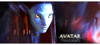
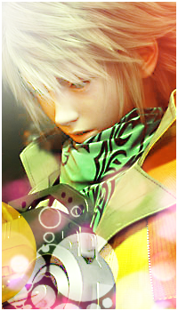
I liked the picture, but is it me or is that low quality ): Great job on the lighting though, I liked the general feel of of it: warmth.
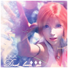
 It caught my eye but I couldn't read it. <3
")
Thanks for the comments guys. =)
Here's another update:
AOTW 70:
SOTW 120:
. But seriously, it is a really well-done; I congratulate you C:.
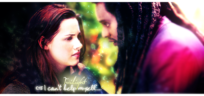
I do like this sig, it has a dreamy effect about it because of the lighting. I think I mentioned this in the LP section as well but I really like the contrast between the more softer side of the sig to the more sharper side and the effects are brilliant, I like the blurring of the trees as well to make to focal stand out more. I can't fault the text, it's horribly difficult to know where to place it when there's two people but I think you've nailed it. Awesome work!Thanks for the comments guys. =)
Here's another update:
SOTW 120:
 Post more stuff!