AOTW 10 Voting Thread!

AOTW 10


  • Total voters
    18
  • Poll closed .

Daenerys

The Last Dragon
Veteran
Joined
Nov 26, 2006
Messages
11,178
Age
33
Location
Suburban hell.
Gil
1
The theme for AOTW this week was FFXII / XIII, and I received a lot of great entires :3 Well done everyone! Remember, you must post for your vote to be counted!

1)
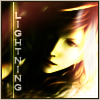
LightningAvatar.jpg


2)
Franavatar.png


3)
Lv1_a.png


4)
Power.jpg


5)
Lightning1.png
 
I will vote for 3, I like the one color thing and it really looks good, my second choice would 5 it's really good too but you can't see much of it very well.
 
Number 2, I like the image and the background much better than I like the others. It stands out more imo
 
I voted for #3. It just totally stood out the most to me. I'm not quite sure how to explain it.
 
I'm going with #3. Adjust the lighting on a few of the others, and I could have easily voted for a different entry. Some just looked washed out.

I like #3's border, colors, and overall quality. Nifty spiffy.
 
Vote for #3, Its simply Awesome good work with the Avatar, ist one of the best Lightning Avatars i have seen, the border matches perfectly. ;)
 
I vote for 4. I wanted to choose 2, but the wholy girly flowers don't suit Fran's personality and looks. Nuber 4 was my choice because of the colours and the text of the picture. Everything seems persfect. There's a lot going on in the picture but the characters are a bit faded. I'm not sure if it is supposed to be that way or not.

So, 4 is my choice.
 
This week my choice is 3.

The dark colors give the image a mood that is effective and looks great.

Good work overall and it earns a 8/10 and a WOOT from The Hunter.
 
Well... despite the fact that I'm a Lightning fan, I'm going to have to give my vote to number 2. It caught my eye right off the bat and stood out to me more than the other avatars. It just looks the best in my opinion, so 2 ftw!
 
#3 gets my vote, I don't really know why I like it so much to be quite honest. #5 gets second place it's just the text and the lighting which let it down.
 
3 definitely takes the cake. Very simple but it really looks good.
 
I'm going with #3. Adjust the lighting on a few of the others, and I could have easily voted for a different entry. Some just looked washed out.

I like #3's border, colors, and overall quality. Nifty spiffy.
I agree completely. The avatars are very well made, but 3 tops them all.
 
Wow, a lot of nice entries this week. I'm going to go ahead and vote for #3. It looks cleanly done and I love the effects
 
Back
Top