[03/11] Final Fantasy XIII-2 box art

Status
Not open for further replies.

Ohri-Jin

"Memories of your past can be forgotten, but
Veteran
Joined
Dec 2, 2009
Messages
2,352
Location
The_Netherlands
Gil
0
FFXIV
Ohri Jin
FFXIV Server
Cerberus
Final Fantasy XIII-2 box art

Lightning takes the cover, once again.
11.01.11 / 18:10 / Sal Romano


FF13-2-Box-Art.jpg


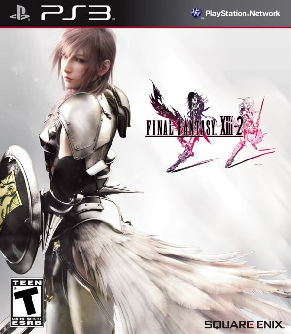
The North American box art for Final Fantasy XIII-2 sees a Valkyrie armor-suited Lightning take the spotlight. Square Enix released the official artwork today.

Her presence on the cover says something about her character—though she’s not the star of Final Fantasy XIII-2, she plays a largely important role.

View the box art in high-res at the gallery.

Final Fantasy XIII-2 is due for PlayStation 3 and Xbox 360 on January 31, 2011.


->>>>

Final Fantasy XIII-2 is One Disc Game (360)


Source - http://gematsu.com/2011/11/final-fantasy-xiii-2-box-art
 
Horrible, just horrible. Let's ruin traditional tasteful and minimalistic cover with crappy CGI. Again. Usually they did it only for us releases, you know, because americans are stupid and have to be attracted to buy something like little babies, with colors and stuff on a cover. But now they are doing it for all international releases. Good thing PS3 isn't region locked. Just buy original version.
 
Horrible, just horrible. Let's ruin traditional tasteful and minimalistic cover with crappy CGI. Again. Usually they did it only for us releases, you know, because americans are stupid and have to be attracted to buy something like little babies, with colors and stuff on a cover. But now they are doing it for all international releases. Good thing PS3 isn't region locked. Just buy original version.

I don't understand...

You won't buy the NA version JUST because of an ugly cover? And you rather get the original Japanese version with a different cover, but in a language that you don't understand? (well unless you understand Japanese). So the cover is more important than understanding anything in the game?

You must either be sarcastic or extremely choosy :P or you won't even play the game lol
 
Well, after FFXIII, I was expecting this to look extremely tacky, so I'm not too surprised...I imagine that the traditional, proper cover (i.e. just the logo) will be reserved for the special edition box.

All the same, it'd be nice if they didn't keep downplaying Serah. She's a bad enough character as it is, but this just further shows just how much her older brother eclipses her.
 
Well duh its damn girly.. I've said it many times before there is NOTHING MANLY about the game period.

You probably wont play with Lightning often or not at all so why Lightning on the cover?

I agree with Hatifnatten, they should keep it simple, stick to tradition and stay true to old formula..

This marketing disappoints me......older ff titles always blew me away when it comes to designs etc.....but these days...sigh...

This is acceptable IF they have two covers or double sided.
 
i think the boxart looks pretty nice :) i hope the EU version gets the same boxart as thew americans cuz i think it pretty nice.. shame there no serah in it but it still looks nice :)
 
If you're going to post, refrain from doing short one-liners. It's simple. You know the drill by now; the forum post guidelines apply to this section as much as any other non-spam section and a little more effort doesn't cost much.

______________________

I'm not that fond of it. There's something about that render that doesn't sit right with me. Knowing what they did to the FFXIII cover in Europe, this will probably be what we'll get as well. The minimalist logo against the white has always been something I love about Final Fantasy game covers, though going with what some people said, it's just a cover. It's not in any way an issue at all that's going to affect your feelings for the game.

She's a bad enough character as it is, but this just further shows just how much her older brother eclipses her.

And Lightning's butchiness has reached new peaks. :ohoho:
 
Last edited:
It could have been better, and I am surprised Serah is not on it. I like Lightning better anyway. These covers are just basic, but honestly it is not so bad. The European ones are more creative though. XIII had just Lightning on it as well for NA. Not that the cover even affects me. I will still get any game if I know I want it, even if it had a shite cover.
 
You know I really do like this cover... The lighting and everything is pulled off really well and I kind of like the idea of having the main character just chilling against a white background for box art.
 
I would prefer the simpler box with the logo on its own in the centre of a white background, but it's still a nice image. I think Lightning does make a more appealing cover than Serah, who's physical design is just a bit... so-so. Perhaps they're trying to appeal to a wider variety of gamers with these covers? The logo on its own is rather mysterious; add a character in armor and you may draw in people who like fighting games. Maybe? :hmm:
 
My opinion on Final Fantasy XIII-2 aside, I think the box art looks tacky and way too contrasting. Lightning's face looks way too soft and contrasts too much with the vividness of the pink logo, I also dislike how the left of Lightning is much darker than the rest of the cover but more so because it pretty much just goes straight to white on the right of Lightning which makes the cover even more contrasting. It looks like bad brushwork on the back of her head to where it looks like something is fading.

Not to be nitpicking, but I really just think it looks like someone has spent all of 5 minutes designing the cover.
 
European box art.

Europeans see a return to the classic logo on white for FINAL FANTASY XIII-2's release.

Thanks to Square Enix France, we now have the official standard edition cover art for FINAL FANTASY XIII-2. This will be the package for all PAL territories.

ULIjh.jpg


Source: Rpgsite


As I predicted, it looks better. This is the case with most EU and NA covers.
 
Yeah it looks better. Simple and clean. I like how they took some effort to enlarge and replace the drawings.
 
It makes sense company wise to put Lighting on front of the cover, as she's a poplaur character and she's going to help make sales, though plotline wise, it's almost false advertising. The EU cover looks much nicer, as it looks more traditional towards the FF series. :flower:
 
I hope people realize the real reason it's a CGI cover. In the US, anything that is related to Japan/anime style, gets a bad rap by the general public as being kiddy or "oh that anime garbage", by people who have seen a total of 2 episodes of one anime.

So thats the reason we see that. In Europe and other asian countries, it isnt so. So I wouldnt exactly blame SE. The same thing happened to Star Ocean
 
Slightly pleasant surprise, then. I was actually convinced that we would get that same (tacky-looking) US cover. My opinions aside on how the game is shaping up to be so far, that is a gorgeous cover. The pink and purple of the logo are just sublime even if Caius looks so oddly womanly that anyone can mistaken him for being an evil Decepticon version of Lightning or something.
 
I can't believe people are so critical of the box art of these games...do you really buy the game because of the art on it or because of the game play itself anyways? :lew:

The art on the covers of these games has never been that impressive for me personally. They always go for a less-is-more theme it seems and its really hit or miss for me. I'm not disappointed that Serah isn't on the cover of this...even though it seems like this is going to be a game that's for the most part...starring her.

The pinks and purples are pretty though.
 
Status
Not open for further replies.
Back
Top