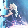
B's Experiments

chaps.png
ThinkOfYou-1.png


rimesig.png


28.png
rime2.png
pleaseohbaby.png
29.png
dontgo.png
larxel.png

Lovely work again!

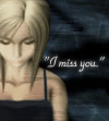
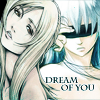
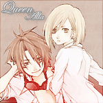
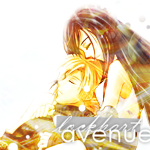
I especially like the second avatar with all the text in it! You've managed to make such a small piece not look so overcrowded with all that writing which is brilliant and the border looks great too by the way!

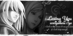
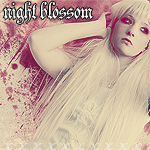
The signature is also very cute and the font used for the text looks fabulous!

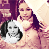
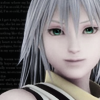
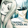
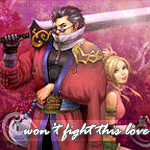
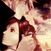
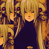
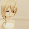
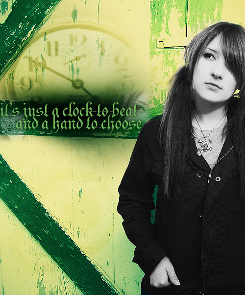
The black and white theme works really well and I like how the girls head is faded behind Riku's so that the focal point is more established.

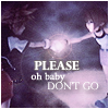
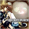
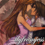
The 'Please Oh Baby Don't Go' and the 'Secret Place' avatars are adorable too by the way! I love the text and the images you've used.

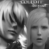
The simple one pixel border rounds them off nicely.

Well done and keep up the good work!
 
The first 2 avis look great in black and white-ish. Can't really improve on it :D

The sig was amazing, though I would limit myself to one render but differnt versions of it and not 2 completely different ones.

What Kandy said about the avis at the bottom. Maybes add a little text to the first one and a border to the end one? The choice is up to you.

Keep up the good work! :monster:
 
2wrpv14.png


Too many Yuna's spoil the sig. Yeah, it is a but cluttered. My main problem is that they're all the same image of Yuna aside from the one on the far right. If there was only three images in total and each was a different pose, there would be an entirely different feel to the sig. Borders, woman, borders!


adzz8n.png

Blending is quite nice and the poses are all different. Border needed. And some colour/mapping would make it look nice and glossy. ~.~

ogdgrn.png

It's hard to see what it is, which is the problem and you have to really get close to see Lenne and Shuyin. However, there's a border!

md00m1.jpg

One of my favourite cloti-esque moments. ~.~ It's simple and clean which is nice.

rhq0zk.png

I really can't see what you did to this except crop it, tbh. :gonk:

122dh86.png

same goes for this one

sb3tdd.png

And this one

s6n0hu.png

It's still only 'nice' when it could be amazing :gonk: Border... :ahmed:

2zs2p9d.png

The lighting is off. The left image is light and the right just dark. If there was a decrease in light from left to right, it'd look better.

j0uv4z.png

Is there a layer on this? :gonk:

2rx7bki.png

I'm not sure if I like the box around the !B but it's cute

wciesm.png

Stroke thickness is too big for me D:

2nqsia9.png

Less stroke = nicer and cleaner in my eyes.

2qi23c0.png

Mad hatter scares me...

c7yhf.png

Now this is pretty nice. It's clean and it's lit quite nicely. Definate improvement. Text MIGHT (not saying it definately would) have made it look more complete.

2jbmclc.png

Haha it's cute! I like it.

2dujfk0.png

There's some thing off about this avatar... I just can't place my finger on it. D:

n12x5i.png
favrb8.png

I think the only problem I have is that there could have been a source of light. Just a little area of light to finish it off. I know what I mean, it's just hard to explain it. >_>

2ngu6io.png

I dunno what it is that puts me off... but something does. Might be that it feels a little rough to me.>.<


dfxd1y.png

xDDD


28gqzdi.png

Serious blending needed here B D: It all looks weird in boxes. >.<

2ldzzue.png

It's cute but it's also kinda hard to see what is going on.

73cqo4.png

Typo? :wacky: 
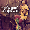
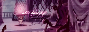
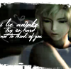
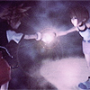
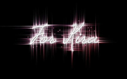
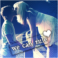
Also, scan lines are risky. They don't look right here.

sebsbp.png

Text is hard to read. Outer glow isn't always the best way to get font to stand out.

2nu2bfl.jpg

This one I like. It's vibrant and Kairi looks so happy. :3

2expv0w.jpg
24c9j74.jpg
20r67lx.jpg
2jaylcj.png


First one is adorable. Second one I find the ponder a little hard to read. Third one is so heart warming. And the final one D: It's so sad ._.

15g3z9h.png
2jan6yt.png

Text is SO hard to read on both D:

sbihaw.png
1h6u7a.png


First one... hmmm. I like it but I feel awkward reading from one place on the avatar to another. Second one, I ADORE the colours on it. <3


I did tell you I'd catch up on all I'd missed. :wacky:


2qstizm.jpg
2w4bepu.jpg


I'm not keen on the text for Jess, but I love them both besides that. Great job!

2i760j5.jpg
szx3ly.jpg
2cf2oaa.jpg
715kjk.png


Whilst these all just look as though they've been cropped (imo D: ) I love the Sora one. The text is fitting and it's not distracting. The Kairi avatar, the font is hard to make out. D:

a17ad.png
idyu7n.png
x537tz.jpg
e71mc6.jpg


I love the first one. It appeals to my morbid side :wacky:. I love the look of the Marlene one also. The first Riku one seems to dark and the second one feels a bit... drained of colour. D: But good work.

t56dc8.jpg
sbqx3n.jpg
or31fo.jpg
165loz.jpg

These are cute/ Though the random little white spots are distracting. :wacky:


ve14es.jpg

I don't like the whole scanliney thing that's going on tbh. And the lack of lighting distracts me. The font is good though. <3


2nur776.png

Haha :wacky:

2eeg1o6.png
2r78wgh.png

Kawaii

dqkax.jpg

Gorgeous. I love the silhouette of them. It really adds to the piece.


5wyrh0.jpg

Her lips stand out too much for me and make her look a bit... Yeah. O_O


2lo42mg.png

It's far too bland for me. She needs blending in and the text is too big/stands out way too much. D: A valiant attempt though hun.

jpk5xg.png

Again, font is huge but it seems to fit. I love the eyes behind the text, it looves great.

358clqg.jpg
14o40o1.jpg
30k4jnr.png
2zqziut.png


I love the first two Tifa avys. They're so adorable. Reno avatar is hawt. <3 but what's with the last one? It seems so random D:


x1hczt.jpg
idg5ko.jpg
2ngwthx.jpg

god how I despise that font xD


ntkdx.png

Perfection.


do1gue.png

You're beyond obssessed XDDDD The lighting feels off but it's a good attempt!

wtcc9y.png

It's cute but it feels so random. D: I jsut can't pick at it cos it'd take ages to work it out. :gonk:

rrv4lh.png

2vcc4gh.png

What IS it with you and that font? XD

311v283.png

I don't like the font. And I don't like the effect on the font. (bevelled?) The colours of the image and the background don't match enough for the drained colour thing to work fully for me either.

15yt2te.png

I don't like it. The outline of the image seems choppy and the background feels plain without a lighting source/blending. >_<

2lvxtn9.png

I'm going to get inside your pc and stop it from ever allowing you to use that damn font :gonk: Not keen on it tbh. Needs blending. ><


xfq5wl.jpg

This one's fantastic. The light colours are brilliant and the text works beautifully. <3 You work best with pink i think xD

dwoto0.png
2wp3y1h.png

I love the dark feeling of these two. I <3 Marlene.

1zox1du.png

text doesn't stand out quite enough

eja5xk.png

That font doesn't look good on everything you know >_> xD

2a5md2.png
xqe3d3.png
10n9g82.png

For the love of all things holy, PLEASE use a different font :grumpy:

15x4jr9.png

Rofl. I think the text could do with coming down off her face a bit though.

206isfl.png

Don't like the text, other than that, I love it.

1t2f0n.png
mlpojp.jpg

Jesus those are bright. O_O

25hzk3p.jpg
2nanvqr.png
fbyv4h.jpg

LOVE these three. The colours are fantastic and the fonts are lovely. Brilliant work!

2efi25k.png

Awww so cute D:

whgyko.png
1zefo91.png
t5gjyd.png

It's that little shape above the text. Without that you'd find placing the text a lot easier D=<

29nxvg0.png

Random boredom perhaps? It's cute :3

2yye0ic.png

So cute. I love the peach colours!

29fqfj8.png

Good question. >_> xD Font covers her face a little too much >_<

w2o8jc.png

Doesn't look anything like Mark's style imho. It's too dark and the font, whilst it looks great, stands out too much.

2qnccb6.jpg

I actually quite like this one. Though the stroke is too large. >_<

i1gt43.png

I think the second please would have looked better a little bigger and higher so the text font kinda shrunk gradually. It's cute though!!

2crx4lu.png

e7knli.png

2v0lh7k.png

Least it's not Bleeding Cowboys again. ¬.¬

oi7ukp.png

LOL xD That's awesome

b9983m.jpg

Love it. The style looks nice and clean. No border though D:

2mhzthi.jpg

Again love the style.

24nft5i.jpg

Your pink gfx always look stunning

2saytep.png

Lovely lighting there D: <333

wallpaper.png

Sexy. I love how simple it is. <3

OHMAI.png
ohmaaaai.png
ImSoGoingTooFarWithThisRimeThing.png

Haha. Though WHO IS THAT GIRL :gonk:

dayatthebeach.png

xDDDDD

zexionnamine3.png

Love that heart

27.png

Love it. It's so simple.

26.png

Awww xD

25.png

... just no D=<

aurikku.png

Wrong on so many levels. D: GODDAMN AURON/RIKKU SHIPPERS D=<


chaps.png

Omnomnomnom

ThinkOfYou-1.png

I love this one <3 It's so pretty

rimesig.png

Not sure about teh font myself but I love the overall finish of the piece. It's so cute. :mark:

28.png

Awwwww =3

rime2.png

<33 the mood is so depressing

pleaseohbaby.png
29.png
dontgo.png

I love the first two. The third on is cute but it looks better with the border and text.

larxel.png

You know how I feel about this pairing. ¬__¬ xDD


Anyway. After you bugging me for ages, I've finally caught up. I did say I was going to be honest so don't hold it against me. :grumpy: And keep up the good work!! ♥
 
Your avatars are just gorgeous! I have to agree with Mark...the Penelo one has a very soft feel to it and the focus on her is quite spot on. Simple but effective. You have an eye for great composition.

wallpaper.png


I love Aya Brea, and she looks quite comfy here. The subtle colors work quite well, but I probably would have added more colors just because I like to play around with them.

2yye0ic.png


I love how cute this avatar is. Peach and violet = win. Text is awesome as always.

Anyway I'd comment some more but I'm trying to catch up with people's threads here. xD
 
Thank heavens for Photobucket for keeping track of my graphics. <3 I fail at updates, I'm sorry ;__; MAHOOSIVE post now, comments are loved~

Not in order of creation - in fact they're probably backwards xDD

FFNet Icons:

queenalla.png
nightxblossom3.png
nightxblossom2.png
6jhjcg.png
ilyfromjess.png
nightblossom.png


Seven Sins Set:

lust2.png
envy.png
gluttony.png
greed.png
pride.png
sloth.png
wrath.png


Other Icons:


seinerav.png
fireintheclub.png
axel-1.png
AOTW.png
RikuForCharlotte.png
Yuna.png


Other:

STEPH.png
LUOLresizedCOVER.png


[Fake name for the win.]

HappyBdayWist.png


mia-4.png


whoscounting.png
 
queenalla.png
nightxblossom3.png
nightxblossom2.png
6jhjcg.png
ilyfromjess.png
nightblossom.png


My definite two favourites are the iloveyoufromjess, and ThroughTheLookingGlass, they just stand out and look vibrant. I love how simple they are, yet so pretty! I also love the text in the top third one. ^^ Really cute.


Seven Sins Set:

lust2.png
envy.png
gluttony.png
greed.png
pride.png
sloth.png
wrath.png


:gasp: 
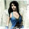
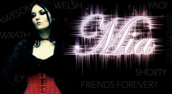
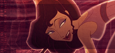
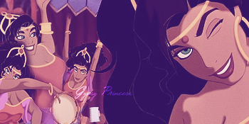
Hmm... My favourites out of the lot... Have to be... Greed... and.... Wrath. They're just really pretty. Love the colours used, and it's a really cute Icon theme <3

Other Icons:

seinerav.png
fireintheclub.png
axel-1.png
AOTW.png
RikuForCharlotte.png
Yuna.png


2nd, 3rd, and 6th OMNOMNOM so pretty. Definitely the Yuna one. That's Yuna right? o_o I love the font, and it all goes well. I wish you'd use your awesome random shaped borders a bit more though <3 They spice everything up really nicely. ^^

Other:

STEPH.png


Hm... I'm not sure what you did with the image? :gasp: xD The text made me lol. I'm sure she has a face. :P Would be really creepy if she didn't.
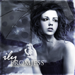
 :gasp:
LUOLresizedCOVER.png


Really pretty. Definitely. The little burned paper on the left saying "I love you" right? Is totally cute. Did you blend that girl onto the bed? O_O 'cause that's awesome! Really awesome piece you have here, babe. OLOL @ Fake name for the win. :P

HappyBdayWist.png


Me likies. Cute, simple, nice font, nice vibrant coloured picture. <3

mia-4.png


I'm totally in love with this. I LOVE the Mia font, you HAVE to tell me how you did that?! The girl is blended in so damn nicely, and the text around the whole little piece are awesome, <3 Love the random words that most likely describe 'Mia'. Love it. My favourite out of the lot.

whoscounting.png


Really pretty. ^^ The text actually reminded me of a You Me At Six song. :wacky: Go figure right? rofl. I love the newspaper faded like text in the background, so pretty!! <333


Keep up the awesome stuff B! <33
 
Thankies for the comments Kira <33
Quick update before I run off to do my music essay :gonk:

ilyfromjess2.png


[There's like a million grad maps on this. So don't tell me it doesn't look like it has a layer on it :vikki:]

iwantyourjeep.png

[I crapped up the text :gonk:]


FORKIRA.png


[Whee.]

clotiav.png
 

I've seen the original of this!

You've done a lovely job with the colouring. It gives off a really cold icy feel.

The text is gorgeous and the border looks great!


This one has a relaxed and pretty feel to it.

The blurred background looks great, as it makes you focus more on the girl.

It has a nice soft appearance and the text looks nice though I don't quite understand it. XD


Very pretty.

The colour scheme is gorgeous and the detail looks lovely.

The small text looks great and positioned well.

I like the transparent border too!
 
holy cow WOWZERS bb why are you so good. ;-;

&& -steals icons-

=w=
 
6jhjcg.png


At first I thought this one was almost too plain because it has such a white background, but now that i keep looking at it I think completely differently of it. The graphics that you put on Tifa and Cloud and make them stand out more. The white background actually makes the signature balanced.

nightblossom.png

This one is my favorite. I just love the placement and the effects in the background bring more notice to the entire avatar. I was looking at this avatar yesterday morning and I guess I was very tired because I couldn't tell what it said. The text could be hard to read, but I still like the avatar.

lust2.png
envy.png
gluttony.png
greed.png
pride.png
sloth.png
wrath.png


I really like these avatars. Doing them all a different sin was very clever and inventive. XD


AOTW.png
Yuna.png


I really love these two. They're very beautifully blended. The lens flair in the Yuna avatar is a nice effect and addition to that image. The wings added to Rinoa are great, and the effects around her go very well to tie it all together. <3

mia-4.png


I think I like the idea of this one more than actually liking it. The 'Mia" text is very nice and flashy, but I think that it takes away too much from the image. The person is blended very well, but I'm not too sure about the other text around the tag as well.

Overall, I have to say that your icons are amazing when I was looking though your thread I tended to love more of the kingdom hearts icons! XD
Amazing work and I want to see more!! <3
 
lilith2.png
th_snrk.png
th_1.png
th_measslythie.png
imagine-1.png
th_TEGAN-Copy.png
th_namine.png
cwutudid.png


:]
--

th_nxb.png


For my AIM; nightxblossom14

--

wecanrule2.png
th_shannon-1.png
th_nxxb-Copy.png


FFnet/twitter icon requests
--

whoscounting-1.png


Fail banner thing for my story.

--


sexonthebrain.png


Album art for a friend's playlist which I named 'Sex on the brain' after a quote of hers. Used three textures and a cutout.

--


justaclock.png


random LP i did when bored~
 
Last edited:
I love your avatars, they have a really nice feel to them. The ones that especially stick out is the one with Layton in it, the "imagine" sig, that's brilliant, designed to perfection. I love the Tegan one also, the contrast between black and white is brilliant! :-)


th_nxb.png


For my AIM; nightxblossom14
Faultless. The image is a nice one, and clean at that. The purple tint works brilliantly. Font is also good, but with a canvas that small the font isn't really going to matter anyway.


wecanrule2.png
th_shannon-1.png
th_nxxb-Copy.png


FFnet/twitter icon requests
2nd one is definitely my fave out of the three. I love the simplicity of it. The softness around their legs is great and I really like the use of purply/orange blending!
sexonthebrain.png


Album art for a friend's playlist which I named 'Sex on the brain' after a quote of hers. Used three textures and a cutout.
This. This is amazing, out of your GFX thread this definitely strikes me the most, it's all blended prefectly, the colours all flow together amazingly, and the render on the left really brings everything out and has been chosen very well, the text/font and texture are also faultless. I'd be attracted to this cover on a shop shelf.

Amazing work, Brit. Keep it up :D
 
imagine-1.png


TWEWY ftw :)
Love the grey bar with the text on it, the colours used and just the general feel to it.

th_nxb.png


Contrast is brill and so is the text. Lovely background.

wecanrule2.png


This caught my eye straight away (not becayse it was the first one). Love the sticky tape feel and the stripy backgound. Nice colour scheme.

sexonthebrain.png


O.M.G. 3 textures are perfect. Love the rendering as well as the sticky tape feel again.

Keep it up B and Well done :monster:
 
sexonthebrain.png


WOW someones improved a lot :gasp:
Loving it! The combination of colours and text is awesome. Its all in harmony. I think uv done great here everything is just spot on. Keep it up brit your getting better fast :gasp: nice one =)
 
sexonthebrain.png


This is just class. It's a cover that would defiantely pick up the album and have a look and maybe buy if I like the songs :P
The textures are my favourite part, it makes it really interesting to look at. The text is :awesome:
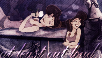
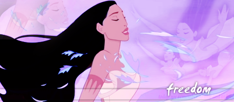
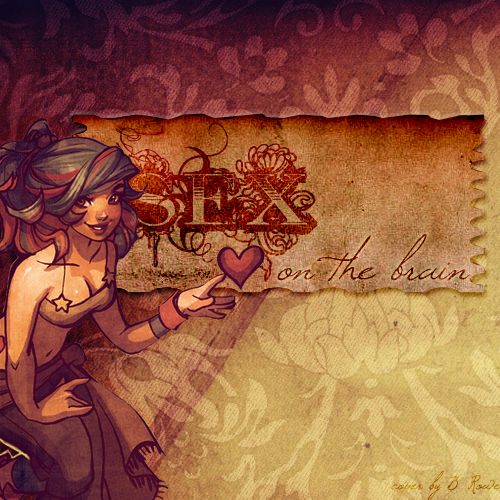
, especially the word 'sex', the effects and colours used are sublime imo.
Great job!
 
Thanks for the comments on the album cover guys! Really appreciated<33
I was trying to get back into sigs last night & played around with stuff a bit.

runthistown.png
forteganlarge.png
pocahontaaas.png


:]

megara.png

I know I should've used more colours <_< I wanted to keep it one tone. The text says 'You think it's for you, you think you read minds?' except it got lost amidst all the grad maps.

atleastoutloud.png

I got sick of looking at this damn thing.

gypsyprincess.png


Blending practice<3

allihaveleft.png


iunno~

pocahontas.png
 

I love these the most from your most recent update.

The avatars especially. <3

They're so clean and soft looking! I love the crisp look they always seem to have.

You always do such a fine job when it comes to text too! Lovely fonts and placement of it.

The signature is nice but I would suggest you take out the scan lines. I would suggest maybe darkening the edges so that the text is focused on more in the middle. =)

Keep up the great work!
 
runthistown.png
forteganlarge.png
pocahontaaas.png


Love the first one, the girl has the focal, which is good, she stands out with her colourfull outfit. I'm not to fond of the text, maybe something more subtle would've worked. It's a great icon.

I'm not too sure about the black and white shot in the second. I love colours, maybe it the little circle had a border, it'd feel less "out there". If I'm right I spot a border. :wacky:

Third, simple, yet effective. <3

megara.png


I don't think you should've used more colours. I think this keeps your attention on the focal point. You should've cleared up the text a little though. :wacky: Overal I like it, boooorders though?

atleastoutloud.png


LOL, the blending is nice. I just think the font is a tad too big. Blending is nicely done, me thinks.

gypsyprincess.png


Blending looks good, text is too hard too read. I love the hint of purple in this sig xD

allihaveleft.png


Really gorgeous. I love it. Favourite out of the bunch. The text and font are simply gorgeous, and the whole pink feel over the sig is stunning. I love it.

Review as promised, huh, babe? xD
 
From what I can tell, it feels as if you're definitely much better at making avatars because the smaller dimensions allow for you to incorporate all of your ideas in. Whereas with your larger pieces, the larger dimensions have a lack of strength and flow to them because I think you're still trying to figure out how to fill up all of that negative space, so you do so with brushes, color, and typography.

I can see that you make some improvement every so often with your work with managing to combine the right kinds of elements together to make the project successful. However, I suggest to raid (dafont.com), if you haven't already, and take a look around, to gather different font faces. On top of that, in terms of incorporating text, it works best, again..with your avatars. But with your larger pieces, really take a nice, long look at what you want your work to say to people, and find the right kind of font for that. For example, not every piece instantly becomes beautiful if you use an elaborate font face.

Technique wise, I think that you might want to branch out a bit out of your comfort zone. From what I see, a lot of your newer work is starting to flow into the same direction because the scene-images you find already have their own canvases. So, I suggest to cut out your focus-stocks individually and putting them onto your own canvases and focus on filling up the background with your own ideas. That way, you won't worry about scrambling around to find a way to make it your own with just slapping on brushes or typography because there's not much to do to it to begin with.
 
Back
Top