Navigation
Install the app
How to install the app on iOS
Follow along with the video below to see how to install our site as a web app on your home screen.
Note: This feature may not be available in some browsers.
More options
You are using an out of date browser. It may not display this or other websites correctly.
You should upgrade or use an alternative browser.
You should upgrade or use an alternative browser.
B's Experiments
- Thread starter Dolores Haze
- Start date
- Tagged users None
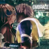
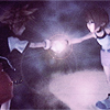
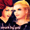
Today we have some of B's first sigs with PS! And some random avatars she's made here and there

I like this one, even if the Vincent render is a little overpowering. Perhaps lowering the opacity on the right hand side would have been good? It would have blended it more too ^^ Love the overall effect though, the scanlines are very clever. Text is perfect too.

I like this one, the text is all pretty and I love the overall effect. Simple, but brilliant.


I like these two. xD The colours used are nice, and the text matches. Only problem is the lighting. Tifa's face looks all yellow, and Aerith's is bright white O_O Not sure though if that's from the original image, or how you did the lighting.

Just check what I said in the clan's thread to know what I think of this one. I love it.

My favourite avatar from you ^^ I think if you added a little bit of text, it would be perfect. It's lovely ^^
Keep up the fantastic standards, B!
As promised, a quick reply, *gotta run for work-dinner-at-my-sis-and-groceries- *
*
Okay, so you know I'm in love with your avatars. Even though I dislike Aerith, the avatars you make are gorgeous. I'm so proud of the Icon you made me.
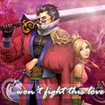
The Vincent signature that you posted here, and showed me on MSN already, is "bloody" awesome. xD I love the red, I think the text was placed really nicely too, and the overal look to it really suits Vincent's darker.... Personality. =]
I rofl-ed at your Riku&B icon.... You're such an obsessive little thing... xD *snuggles*
Keep up the awesome worksies. ^^
*Okay, so you know I'm in love with your avatars. Even though I dislike Aerith, the avatars you make are gorgeous. I'm so proud of the Icon you made me.
The Vincent signature that you posted here, and showed me on MSN already, is "bloody" awesome. xD I love the red, I think the text was placed really nicely too, and the overal look to it really suits Vincent's darker.... Personality. =]
I rofl-ed at your Riku&B icon.... You're such an obsessive little thing... xD *snuggles*
Keep up the awesome worksies. ^^
WARNING; Image-heavy. Shouldn'tve gotten behind 
Thankyou all for your comments <3 I love them~ Some more sigs and various crap

For Tipsynaruto.


Random avs from AC; a set for me, Jess and Kira's use on MSN, and some image I loved.

Random Riku LP with a render I liked..
.. you like popsicles, muscly arms?
http://i26.tinypic.com/wtcc9y.png
An LJ header made for Jess
I think that's it. Oh, and this -


To match my old av ;3
Thankyou all for your comments <3 I love them~ Some more sigs and various crap
For Tipsynaruto.
Random avs from AC; a set for me, Jess and Kira's use on MSN, and some image I loved.
Random Riku LP with a render I liked..
.. you like popsicles, muscly arms?
http://i26.tinypic.com/wtcc9y.png
An LJ header made for Jess
I think that's it. Oh, and this -
To match my old av ;3
Last edited:
I like this, but it's a bit plain and the girl doesn't really blend in very much. If she blended in and there was just a little something added to make it bright or noticable, I think this would be gorgeous.
O.O GORGEOUS. That's so perfect. I love that her eyes are behind the image like that, and even though I don't like Kairi, that's still soooooo gorgeous. The text is very fitting <3
awwwww... the image is so cute. the text is gorgeously fitting as well. WHO'S HER SPECIAL SMILE FOR? HUH? HUH?!
This is gorgeous as well. So perfect <3 I would have done something more with the colors though... hmm... The text is so pretty too... WHAT BE THE FONT?
Oh, that text is just perfect <333 I love that image of Tifa as well... GIMME. The heart looks cute too... <3333 I love this icon entirely.
you know I love you for this one <333 Although you know my views on Cid being behind her... >.> The text is readable and that font is pretty.. it couldn't be bleeding cowboys again, could it? XD IT NEEDS A BORDER. and Cid to be clonestamped out rofl.
Awww so pretty! the text is in just the right spot, and the cut is creative and pretty. <333 Tifa is gorgeous *pouts* I'd like to see you mess with coloring more.
RENO! Is that a render? because his hair doesn't blend into the background at one place... >.> other than that, it's great
") I like the text there, it's nice to see you experimenting.
I like the text there, it's nice to see you experimenting.
I.. don't really like this one as much as the others. It's not as clean and pretty. it looks a bit empty, actually, and the render has a bit of a white halo in places. So, not your best >. >
OOOOH. I loved that image when you showed me <333 Nice cut, and such VIBRANT colors <3 Colors are so cool XD the border really finishes it
*cough* I think they give Riku muscly arms to make Sora jealous. No other reason. I love that this is black and white. It adds depth that a colored version wouldn't have had <333 So pretty. perfect background O_O
http://i26.tinypic.com/wtcc9y.png
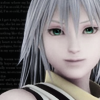
... You know I love THIS too. IT'S NAMINE/ZEXION, FFS. WHY WOULDN'T I LOVE IT? >.> Although... looking at it right now, she's not blended in on the right side XD other than that...
I love it. nothing more to say 
the text thingie: ... how'd you do that? *wrinkles nose*
Thankyou Jess <3
Been practicing sigs.

For Jess. Yes, it's meant to be not that colorful

I hate this sig, but I wanted to make it a complete set T_T Damnit Sora!

I actually love this one <3

My favourite n_n Pretty.. pink..


Some AC icons
Been practicing sigs.
For Jess. Yes, it's meant to be not that colorful
I hate this sig, but I wanted to make it a complete set T_T Damnit Sora!
I actually love this one <3
My favourite n_n Pretty.. pink..
Some AC icons
- Joined
- Jun 20, 2006
- Messages
- 2,517
- Age
- 34
- Location
- West New York, NJ
- Gil
- 3
- FFXIV
- Itami Raizou
- FFXIV Server
- Lamia
Looks quite good but I still think you should place your render a bit closer to the center, I can see you used that blue bubbles like pattern and you did good, font looks a bit floating not really kind good, also try to varies with your fonts =]
Same comment though Riku's bg ain't so much <_<
Background is great, sig might be a bit small (is that how big my sigs are? D: ) text is the same with the one above but like use captials in the start of each word D: gives more appeal.
This one is quite marvelous, nice use of colors and brushes. However, text needs working you should stop using that thing in the blending options that give you the button effect D:
As for avatars D: as much as I'm sorry to say it D: but they needs working D: I mean like try adding stuff on the avatar, make it looks like it's your own, also try another text D: not the same text works on everything.
Great work overall, B. Keep up the good work. ^^
The only thing i can say about ur avatars is that they all look fantastic, seriously. The text placement the colour and choice of stock is absolutely superb, excellent work on them all smurf.
Ypour sigs are looking great aswell the only advice i could give would be to maybe watch the placement of your stock or renders. Try to avoid putting them right at the end of your canvas and more like a third of the way in.
Your progrress so far is massive though, you get better with every post so keep up the good work =)
Last edited:
The only thing i can say about ur avatars is that they all look fantastic, seriously. The text placement the colour and choice of stock is absolutely superb, excellent work on them all smurf.
Ypour sigs are looking great aswell the only advice i could give would be to maybe watch the placement of your stock or renders. Try to avoid putting them right at the end of your canvas and more like a third of the way in.
Your progrress so far is massive though, you get better with every post so keep up the good work =)
Weeeeeell, I quoted 'cause I'm too lazy at this hour... x_x But...
Unlike Lew said, I LIKE your placement of renders/stock, that's what I do to. That's an easy use if you wanna use alot of text, which I do, but I get that it might look a bit empty if it's not filled up. I like the placement personally though.
Lew basically, actually he did, cover EVERYTHING I wanted to say about your avatars, and I LOVE the I.D. one. Although I'm thinking, maybe Shinra Inc. Would've been a better text...
Last edited:


Some new avs~ trying a new style.


Three of this one o.o; THE TEXT ANNOYED ME Dx

I don't know what this is xDD I did the heart myself with brushes and such


For my Fanfiction.net & Jess'.


Copying Mark's style once again :mark: I think I pulled it off this time. Other one is randomness o.o; Not that good Dx

What is it with me and random LP things?
 ;
;


For me, Kira and Jess.

Last edited:
These are my favourites for sure, theyre all excellent. Im especially loving the text in the first one, very creative. THe lighting in the second one i love aswell, it really draws you in.
I like the first one best. The colours look fantastic and the text is really nice, i like the heart vector to the right of 'night'.
I like the second one also but im not fond on the text. Had it not been covering her face it would be better, maybe lower it down a bit or try different angles?
Hehehe marks style? not quite
I think its a bit plain it could use some lighting in there, it would help make the lens flares look more like a part of the image. The renders placed well and so is the text its just the Bg that needs work.
Nice and simple but it looks good, i think youve positioned the text fairly well although id prefer it if the lower please was a bit higher. Maybe try adding in some brushing or focused light to make it look like more has been done to it.
They all look great tbh. I like how they glow. My only question is................................which one are you meant to be
good work smurfI'm the Kind Flowergirl, clearly -pokes sig-
It looks like Mark's style to meee! T-T
Thanks for posting xDD
-pokes sig-It looks like Mark's style to meee! T-T
Thanks for posting xDD
Some new avs~ trying a new style.
Three of this one o.o; THE TEXT ANNOYED ME Dx
I don't know what this is xDD I did the heart myself with brushes and such
For my Fanfiction.net & Jess'.
Copying Mark's style once again :mark: I think I pulled it off this time. Other one is randomness o.o; Not that good Dx
What is it with me and random LP things?
For me, Kira and Jess.
The avatars are all really pretty. You seemed to be stuck on the Axel icon, and maybe a vertical font would've worked for the fireinside text, is what I'm thinking now...
Favourite KH icon has to be "How much longer", the colours are really pretty, and I like the text. ^^
I love your FanFictionnet icon, it's simply purdy and peachy.
I love dark colours, but I think the superstar siggy is a bit too dark, the text is pretty, the stock is really nicely done, and the soft background is nice to, although maybe something lighter would've worked better... She seems to get swallowed by the background.
Second siggy is a really nice style, I like it.
The LP of Marlene, I LOVE how you added the tear. It's beautiful. Enough said. =] Keep it up!
And @ Lew; Who do you think?! xD Aerith of course, B = Pink-Lover = Aerith. xD... Obvious enough, sir?

I've been somewhat busy lately <_< Not much time for gfx I made some icons though Kinda plain but that's the point.


Off to bed with me T_T
(My favourite is the Riku one :mark
I made some icons though Kinda plain but that's the point.
Off to bed with me T_T
(My favourite is the Riku one :mark
I've been somewhat busy lately <_< Not much time for gfx
Off to bed with me T_T
(My favourite is the Riku one :mark
I like these new avatars B, now it looks like you're actually adding stuff, other than just colouring them better. xD Particularly like the Rikku and Penelo ones ^^ Although, perhaps the Rikku one would be better if Rikku didn't have the white outline?
I adore the lighting in the Penelo one though, it's gorgeous. Some great improvements here Brit ^^ I still think you have a lot of potential for sig making too ^^
Joy for random GFX drops~ Order is most recent to oldest.

For Jess' PSP. Took me FOREVER. Damn all that rendering
Oh, the fun Jess and I have making manifestions of my OC.
(Yes, that's Elena in the third one. I clone stamped out her bandage 8D)


For Jess' PSP. Took me FOREVER. Damn all that rendering
Oh, the fun Jess and I have making manifestions of my OC.
(Yes, that's Elena in the third one. I clone stamped out her bandage 8D)
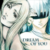
Rofl, you spazzed when Jess said she LIKED it. xD I like how this looks, the only thing I have to say about it, is that it's too... dull maybe. The image is great, the font is, but I think it lacks colour perhaps? That is just my opinion though. Beside the lack of colour I love how you made this turn out.
Oh, the fun Jess and I have making manifestions of my OC.
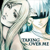
xD I like the Taking over me, best.
You two have an obsession with blue, just as much as I have with purple in my sigs. AND DONT YOU DARE TELLING ME IM WRONG.  I like this. See above about the blue. The text looks cute, and Yuffie's expression is priceless.
 Edit: OMG is Tifa staring at her boobs?!
I fucking love this. It's simple but SO DAMN pretty.
YAY. I've always thought your colourful icons were your best. The last one is my favourite by far!
I've been somewhat busy lately <_< Not much time for gfx
I must say, you have quite a talent for making avatars. ^^ These are my favorite. The stocks' angles are cut attractively and the avatars aren't busy. You have the gift of text placement (meaning you have them spot on).
 I suppose my only suggestion would be to try applying different kinds of borders.
This is a nice, attractive piece. I like the stock placement and your rendering is good. It's soft and sexy. ^^ My only suggestion would be to add some more effects and colors to it just to add some flavor.
Terrific job so far, dear! Keep 'em coming.
Lovely work on these icons!
I especially love the last two!
Evevn though I'm a Cloti and Tuna fan, I love how Rikku is merged in there to make it look like Tidus is kissing her. XD
Did you do that, or is it an image you found on the internet? I think it could do with a bit more brightness on Rikku's half at least.
The sharpness in the Cloud and Aerith one looks really good though.
Lovely work again Brittany. =)
It was a screencap from a video where someone masked it :3 I actually took a while fixing the lighting
RANDOM UPLOADS AND BORDER PRACTICE FOR THE WIN.

Mainly random things I've made here and there
RANDOM UPLOADS AND BORDER PRACTICE FOR THE WIN.
Mainly random things I've made here and there