Navigation
Install the app
How to install the app on iOS
Follow along with the video below to see how to install our site as a web app on your home screen.
Note: This feature may not be available in some browsers.
More options
You are using an out of date browser. It may not display this or other websites correctly.
You should upgrade or use an alternative browser.
You should upgrade or use an alternative browser.
SOTW 43 Voting thread
- Thread starter L
- Start date
- Tagged users None


I think 5 blends well, has a cool background and render. so I voterfied for it.
me being an amateur and not knowing anything about signatures or anything, just going by look and how well it all blends together, it was a hard choice as in my amateur opinion they were all well done. 2 and 6 stood out most because of the color and just overall "stand out", but i have to go with 2 because of the effects used and seems very creative.
1 just seems too... busy. too much going on and hard to see the guy in the middle (maybe that was what you were going for)
1 just seems too... busy. too much going on and hard to see the guy in the middle (maybe that was what you were going for)
Eidolon
Guru
#1 Render too transparent IMO, and wireframe was badly placed. Wireframes are great to create flow so maybe look at that again.
#2 Absolutely love the colour and lighting, but dislike the clipping masked face and neck.
#3 Really like the. Can't really critisize except maybe it doesn't have the "omph" that #2 has. Also anime just isn't my thing.
#4 Like it. Maybe increase the contrast a little. Edges of shapes are a bit choppy, so perhaps it is a tad oversharpened I dunno. But I really like it.
#5 Like the contrast and a nice background. A bit oversharp in areas and some effects unnecessary.
#6 Don't like the render. Too many brushes going on IMO.
I love all except #1, just too much going on and I agree with Eidolon, it's too transparent. All the others are awesome, cool use of colour and blending and the text in #2 and #4 is just wow...
I am voting for #2, love the effects, the blending and text are amazing, good job.
I am voting for #2, love the effects, the blending and text are amazing, good job.
2, 3 and 5 are most definitely the best. In the end, I'll go with 2 though. I really like the breaking up of the stock over on the right and the lighting effect around the bottom.
- Joined
- Jun 20, 2006
- Messages
- 2,517
- Age
- 34
- Location
- West New York, NJ
- Gil
- 3
- FFXIV
- Itami Raizou
- FFXIV Server
- Lamia
I voted for 5 I like how the colors blends well and I like that light.
I would say number 2 is the best. I like the way Johnny is placed in it. The lighting is also groovy and the blood splatters in the bottom left corner are a nice touch. What JR said also. >_>
I think number 6 also looks really nice though. The colours all work nicely and the swirly background is pretty.
Vote goes to 2 though.
I think number 6 also looks really nice though. The colours all work nicely and the swirly background is pretty.
Vote goes to 2 though.

Mine goes to #6, I absolutely love the colour contrast between the dark brown on the left and fawn-like brown on the right which blends really well with the render and its colour.
I also love the brushing and the light just to the right of the render, the kanji (I presume it's that) just tops it all off really. Love it
#6 for me!
I also love the brushing and the light just to the right of the render, the kanji (I presume it's that) just tops it all off really. Love it
#6 for me!
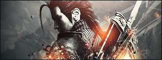
#4, because it's got nice text, C4D placement, and such. It's got a lot of negative space, but I think the creator pulled that off well. The rest of them, save 3 are too erratic-looking (poor flow). 3 still sucks bawlz because I MADE IT. 
Last edited:
1 would be better if it weren't for that wire frame...it looks like it was just tacked on because they got a little trigger-happy.
2 is made pretty well, but I'm just tired of seeing Sweeny Todd everywhere. I blame /wg/.
3 is alright, but I don't much care for the stock used, the chick's vacant stare scares me.
4 is really good. There's alot of empty space, but it actually works well. Text placement isn't bad either, usually text just kills a sig. I voted for this one.
5 is alright. I've had enough of Zack and the background just seems dull.
6 is pretty good, I love the background and the style...just don't like the stock itself.
My vote went for #2, it's just...so intricate. I really like all of the color, lighting, and snippet-effect it had. I really liked the last effect, since it goes very well with the barber-character. XD
I vote for 2 as well. I just like it more than the others, I like the border and the text ^^
I prefered number 3 as i liked the way the picture was blended into the background and how it had the multiple faded background images
- Joined
- Dec 14, 2006
- Messages
- 11,628
- Location
- California
- Gil
- 0


- FFXIV
- Mitsuki Calei
- FFXIV Server
- Lamia
- Free Company
- Gaia
I'm gonna have to go with the majority here and vote for 2. It is just fantastic! The border style was different, so that's a plus. Colors and text worked well, and the stock really matches the mood of the signature overall.
Well, since none of the other signatures have any hope of catching up, number 2 is the winner! Congratulations Mercurial/Kairi!
^^
^^