SOTW 240 Voting thread.

SOTW 240 winner?


  • Total voters
    13
  • Poll closed .

Six

𝗦𝗼𝗹𝗶𝘁𝘂𝗱𝗲 *★.• ·
Staff member
Admin Support
Social Media Team
Veteran
Joined
Mar 24, 2009
Messages
11,767
Location
Saturn.
Gil
1,984
Theme: Least favourite Character.

1.
Wakka.png


2.
Navicopy2.png


3.
SOTW240.png


* Entrants are not allowed to vote for their own entries.
* Voting will end in 7 days.
* Feedback is highly appreciated and encouraged.
 
:O I love Aerith but I'm gonna have to vote for #3 because it's just so nicely done. Even though I cannot fathom how she can be someone's least favorite character.
 
All very nice entries.

1. Wakka's not blended enough into the image, he sticks out too much. I do like the text and color though. Perhaps a gradient layer on top of everything would have finished the piece.

2. I found this one really hilarious. Show that Navi who's boss.

3. This got my vote. Stunning piece.
 
#1 The colour scheme fits in nicely with Wakka and Blitzball and you've managed to create some water-like effects. Did you use a C4D for the brighter swirls? They're nicely done and add flow to the piece, also helping to blend in Wakka as they reach around him. I'm not so sure of the yellow and purple object behind him. This makes the piece feel a little cluttered and also distracts from Wakka himself. Sometimes, simple and clean is the way to go. :) 
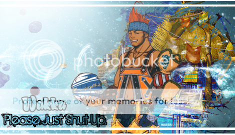
Text wise, I love the use of an outline rather than solid text, but the font itself doesn't feel quite right. :hmmm: I like the white border as it balances against the white stripes on Wakka's ball and the lighting effects. :)

#2 From what I can tell, the artist has done a great job with textures to bring out the character in this piece. The text is subtle and legible, and I like the font used for 'You Listen.'

#3 is SO gorgeous! The colours are perfect and the background is beautiful. :) Did you use one stock with vectors or create this background from scratch using a variety of brushes? :hmmm: Aerith is nicely placed within the piece. I also like the fact you've used the LittleBigPlanet Aerith, as this sort of enforces you're opinion of her. The text is stunning. :)


#3 gmv
 
I voted 2 because it looks good and it made me laugh. Srsly fuck you Navi :rage:
 
tumblr_m1yzeblYBG1r5r7s9.png


SOTW240.png


wthamiseeingplz.gif

Who da hell could dislike a character that died for the planet? :rage:

Yes, giving up her future so others can live is such a reason to dislike her
wooooplz.gif


That said, I think it's a freaking GORGEOUS signature. All the flowers and all the pink. :inlove: It's so pretty and so well made.

I don't know why using LBP version of Aerith somehow makes the gfx artists dislike for her more obvious... the LBP versions are adorable, I thought. That said, I am using this signature because that's how much I freaking love it.

And too bad because you can't stop me.
deyedplz.png


well... you can, but you know... it'll be really ebil to do. I mean, look at my sig space--it's all nekkid. :mokken:
 
I like 1's text because the theme is least favorite and the text actually suits that but I prefer 3's appearance so I voted for 3
 
Number 3 for me

I recognise those vectors :ohoho: Very nicely put together sig. Looks a a bit messy on that wee bit at the bottom but its a brilliant sig overall.

1 is good aswell but the text needs to be sorted :hmmm: The quote made me laugh tho :lew:
 
Congratulations to Six for winning this week. (Woo!)

1. Bowie
2. Pockets
3. Six

[Thread closed & archived]


Back
Top