SOTW 167 Voting Thread

SOTW 117 Voting


  • Total voters
    16
  • Poll closed .
Status
Not open for further replies.

Saga

ice ice baby
Veteran
Joined
Aug 16, 2007
Messages
3,123
Location
:inmypants:
Gil
0
The theme this week is Halloween. Please remember, that while posting isn't necessary in order to count your vote, it is encouraged.

Also, please remember that you CANNOT vote for your own entry, and you will be disqualified from this SOTW, and the next two SOTWs if you do so.

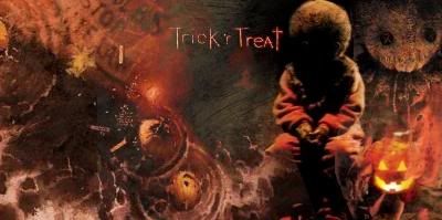
Here are the entries I received :

1:
nicehalloweensotwupdatedalmostfinished.jpg


2:
images-5-1.jpg


3:
2q9c8rm.jpg


4:
720550523.jpg


Last edited by a moderator:
4. Stands out a lot more then the rest, The border is great and the colour suits the Halloween theme
 
No contest for me, this week. #3 is the best tag there, I can't find a single thing wrong with it.
 
what mark said

love that text and the colour scheme which im not sure how to describe. great tag
 
Numbers 1 and 2 can do with a bit of work, so it's between 3 and 4 for me this week.

I'm going with #3. While 4 caught my eye immediately at first glance, its text doesn't seem to work very well for me, while on the contrary I absolutely adore the text in 3.
 
It was between #3 and #4 for me, but my vote went towards #3.
I went with it because I love the text, the colours and the sharp look it has going.
 
nicehalloweensotwupdatedalmostfinished.jpg


This one had much potential, but the direction the artist took was not for the better. Some shiny stuff would've done justice for this very much so.

images-5-1.jpg


Lighting here is nicely done, but I believe the quality of the stocks/renders themselves could use much work of improving, or hell, the quality was just bad :/

3:
2q9c8rm.jpg


This one is definitely unique, and interesting at that. The fact it's more of a photo manipulation really set it in a level of its own. The lighting at the top might be a bit high, and even the contrast was a bit high, but the way it presents itself really has to make me think.

4:
720550523.jpg


The blue-to-silver lighting here really made this one gold. Though I'm not really feeling the border all that much; I thought it was too out of place. The grim reaper set to the far right wasn't the ideal placement for me, to be honest. The text was set too far away, actually. Now, if it was closer, then it would be better.


I say after going over the possible entries, my vote will have to go to #4. The reason simply being it outbeat the others through my eyes. The concept was more present than the others.

Great job to those who entered, though. Really nice work on these :)
 
3 hands down!

It's awesome <3 I love the text and the placement. I adore the picture and the pumpkin man <3 The lighting is really really really good, too. So glossy and clear.
 
3 won me over as well. Is that a skirt I see as a texture? :lew:

I really liked number 1 as well, it represented the theme really nicely. It looks creepy, but it's the quality that kinda turned me off... >_<

I really like how bright the third one is. The pumpkin looks amazing, and the glossy feel the signature has looks absolutely stunning.

Text is fucking gorgeous. Loved that most. The glow the letters have is <3
 
1 and 2 look like JPEGs. :hmmm:

3 was by far the best IMO. Unique text as well which looks great. :ryan:
 
The poll is closed but I still have to post my vote! =0

#3 most definitely!

Fantastic lighting and colours!

I simply love the text! Awesomely positioned and gorgeous font!

I love the way the image stands out too. The highlighted white areas look fantastic!

Gorgeous half border to finish it off nicely. <3
 
Mitsuki wins this week. I have no idea who made the other tags, so if the creators of those pieces PM me, I will edit this post accordingly.

1)
2)
3) Mitsuki
4)
 
Status
Not open for further replies.
Back
Top