Navigation
Install the app
How to install the app on iOS
Follow along with the video below to see how to install our site as a web app on your home screen.
Note: This feature may not be available in some browsers.
More options
You are using an out of date browser. It may not display this or other websites correctly.
You should upgrade or use an alternative browser.
You should upgrade or use an alternative browser.
Penelo's Graphics and stuff
- Thread starter Smiley
- Start date
- Tagged users None
so, its been about 6-7 months since i started Gfx, so I'm starting a new thread. I'm starting on a new note:

Really like these two; how you used the style of Tifa's sig into those. Blue =
 colour, render and text are ver well done. Good job and keep it up!
so, its been about 6-7 months since i started Gfx, so I'm starting a new thread. I'm starting on a new note:
The second one is better than the first one, that's a given I'd say. As I have mentioned before, when you leave the edges to cut so sharply like that it makes the signature look unfinished, dear. The backgrounds of both of them looks fine enough, thought perhaps a bit of blending would be fine. The text is simple so there's no harm done on it. In any other case, the things that perhaps ruins it for me the most are the cut end edges, maybe you could make them fade a little or something but when you leave them as they are it just makes me signature look unfinished. Keep at it. <3
Looking forwards to more work. <3
This one looks rather good, though I think that the pop out part of the signature is cut off much too sharp.
Try feathering it into the forum skin more and it will look much better. =)
I love the background you've done. You did well with those brushes. =)
Cloud is placed nicely and the text is nice and close to him. =)
I think this one is my favorite!
Once again, lovely work on the background. It looks great!
Sora and Kairi fit in nicely and the text looks great!
The signature is well lit up and the size of the signature is perfect!
The border rounds this one off nicely, making it a clean and well done signature. =)
I really liked this one!
The background looks great and looks fantastic against Sora!
The colours are cool and calm and very easy on the eyes.
The texture of the background looks great too! What filter did you use?
The rain effect looks lovely and the text is placed well.
I would suggest you make it so that Sora isn't sitting over the border though. Otherwise it looks like his image has just been slapped on over everything.
Keep up the good work!
Thankies!
So basically what I did was I enlarged the render and used his jacket as the bg, then I went Filter>Distortion>Glass and thats about it
As for the rain, that was one of my brushes
*Double*

I like this one alot. I love the brushes used in it. Nice work!

Thankies lolita^^
Update-Large peices
http://amethyst-heart95.deviantart.com/art/Groovy-wallpaper-135943790
Update-Large peices
http://amethyst-heart95.deviantart.com/art/Groovy-wallpaper-135943790
Last edited:
anywho:
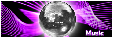
This one is very cute. Very simple. =)
The purple background looks great and the brushes work well with the disco ball.
Lovely text and simple border. =)
I really like this one.
It's simple but effective.
The background works well with Sora and the simple white border rounds it off nicely.
Great work. =)
This one looks awesome!
I like the background and Kelly is placed very well. =)
The font used looks excellent and the text is placed very well also.
Excellent work on this one!
This is really nice! The effects work well and the colours well with the render. The smokey / cloudy effects at the bottom give the signature a dreamy feel.
I read that it's a good idea to put your text on the render to make the focal point stand out more. I might also make it slightly more legible. (<---- just my opinion)
With each piece you make, you can see lots of improvement. Keep it up
")
Last edited:
Great work on this one!
You've blended Aerith in very well with the background and the lighting looks excellent around her. Though I would try to brighten Aerith up a bit more. It seems odd that there is so much light and yet she's so dark.
The background looks great and the text looks amazing! Good choice of font!
Wonderful work on this one!
This one is very pretty.
I like the use of space. The colours are pretty and I think brushes down the bottom are coming along well but need a little tidying up. =)
Other than that great work!
This one's really good, as Kandy has mentioned, you've blended Aerith into the background really well and the overall purple/white colours suit her the vector shapes have been used really effectively and I love the smokey type effects on the background, the font's good too I'd just bring it closer to the focal
Overall, really good sig. Keep it up ^^
Last edited:
Very nice signature. The colours go really well with Aerith's jacket. I think the text is nice, but maybe you should've made the decorative small text a bit of a longer line, so it sorted it out a bit. Lovely border, looks nice a real nice image overal.
Love the vector heart. It's really pretty. Although I'm not a fan of pink colours at all, this is really pretty. I love how you used black, white and a close to hot pink, those colours look real pretty together <3
Keep it up, babe.
You've blended the kid in well here. I like the brushes down the bottom and the detail in the background!
I like the font you used for the text too!
The only thing I can suggest is giving the signature a cleaner border. Just a nice simple one pixel border as you've already got a lot going on in this signature. =)
Very nice and simple avatar. =)
I like the peace symbol you've used and the purple border looks cute.
I would suggest using a neater and more simple font though. =)
Nice work on this one!
You've blended Eminem in well with the background.
The brushes in the background aren't too much or too overcrowded which is good and I like how you kept the colour theme simple. =)
I love the font you used for Eminem, but I don't like the bottom line of text you have underneath.
I would suggest enlarging it a bit, using a simpler font and placing it closer to the first line of text. =)
Other than that, well done!
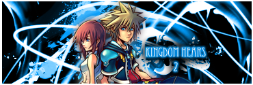
OMG guys, I'm back!
My sis took over the only computer with Photoshop on it, but shes on holidays, so i get to use it! Woot!
So i'm starting on a KH theme, 358/2, KH2...whatever pops in my head. So heres my comeback peices:
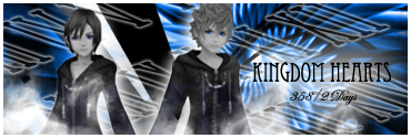

^this ones my fave
May i remind you that i've been Photoshop-less for about 3 months...be gentle^^
My sis took over the only computer with Photoshop on it, but shes on holidays, so i get to use it! Woot!
So i'm starting on a KH theme, 358/2, KH2...whatever pops in my head. So heres my comeback peices:
^this ones my fave
May i remind you that i've been Photoshop-less for about 3 months...be gentle^^