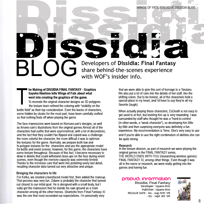
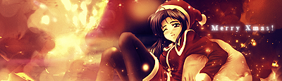
♣ • .:Castles Made of Sand:. • ♣

FFXII.png


I got bored :monster:
 
I love the KH cover. I don't know how the hell you have the patience to sit and do something like that. xD It looks amazing. Your work with big pieces is ... nothing short of spectacular tbh.

The Messi sig. I love the striking colours and the way they're really warm. I'm not a big football fan xD So I can't really say I know who the hell he even is :wacky: 
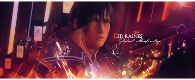
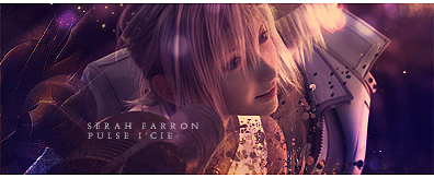
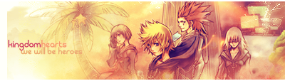
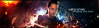
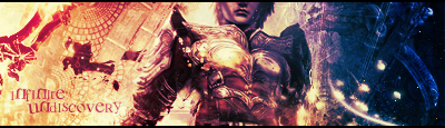
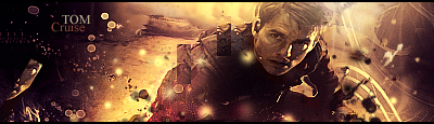
I love the border and the text looks fantastic. Another brilliant piece from you Ryan.
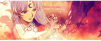
I WANT TO SEE MOAR >_>
 

Merc thats awesome man. The colours are sensational ;)) 
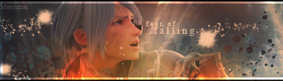
But seriously they are, i love the fiery look the signature has. I like the clipping at the bottom aswell and lets face it messi was the boy last night wasnt he xD
Awesome work :awesome:
 
Thanks gaiz and Messi was awesome :ryan:
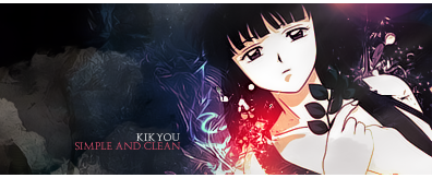
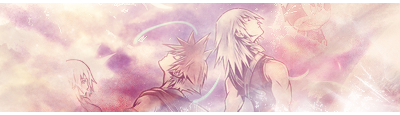
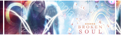
...and you'll see more Vikki when I can be arsed.
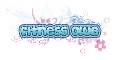
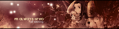
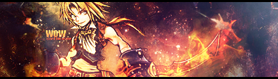
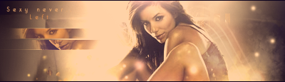
 :wacky:

FFFitnessClubTitleV1.png

Made for Mits'/Shu's fitness club :monster:
 
Ohhh that's so pretty Ryan! Makes me think of the Logos for the games where they have teh multicoloured imagery behind the font. Also looks like it could be for a game for the Wii or something. Verrrry good job Ryan. I wish I could do shiz like that. :wacky:
 

This one is very nice to look at indeed!

I love the colour theme. They really make the sig vibrant! The brightness is always spot on with your work!

Love the textures you've used throughout the sig. The ripple effect on the dude looks cool and that little grid thingy on the right fits in there nicely!

The font used is awesome! And I love the blurry background.

Also love the half border! XD


I love how you did this one!

I so want to learn how to do that! It's gorgeous!

Has a 3D effect and the design behind the text is awesome!

I love the colours used and the font looks like the graffiti you see on the walls in alley ways etc.

Awesome work on this one!
 

Wow, this is purely amazing. I most especially love the lines on the bottom-right. You'd think it was something random but it actually works. The effects are phenomenal, and the colors are vibrant and appealing. Great borders too! Although might wanna fix the bottom-left...there's a tiny bit of space there. xD


Fitness Club is amazing! Thanks for that! It's very cute. ;)
 
FFFitnessClubTitleV1.png

So pretty :awesome: I love what you did with it and the way Final Fantasy was written in a font and Fitness Club written in something else, The brushes done behind is really well done, great job Ryan. :awesome:
 
Although might wanna fix the bottom-left...there's a tiny bit of space there. xD

Fitness Club is amazing! Thanks for that! It's very cute. ;)

Thanks gaiz! :awesome: And no probs Mits, I had fun making it. :ryan:
I hate my PS for borders though, I don't even know how I missed a little bit out, I just copied the top one and moved it straight down. It's like the left hand border on my Kingdom Hearts sig which appeared out of nowhere :ohshit:
 
FFFitnessClubTitleV1.png

Made for Mits'/Shu's fitness club :monster:

I first saw this in the Fitness Club itself, and below it, it said: "Banner made by Mercurial" and I went, "Ohh. That explains it" :wacky:

I don't think I've ever seen a GFXer able to use just text as a focal point so well. I remember the Love and Sex and Magic piece you used to have in your signature. Those kinda stuff make me jealous. :gasp: 
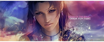
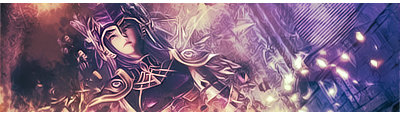
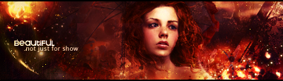
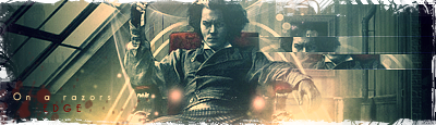
About this piece, well--there's really nothing bad to critique. All the elements in it work together to balance it. Great use of brushes, color and choice of font. :gasp:
 

This is hot!

I absolutely love the placement and pose of the image!

The blending is freakin' superb and the colours all work together really well. Though that light blue line on the right looks a bit strange in my opinion.

I love the rough texture of the background and the sharpness of the effects.

The lighting is done really well and I especially love those balls of light seeping through the dark background right at the top of the sig.

The text is placed very well and the font is well chosen though I think it needs to be a little more bold just to make it that tad easier to read.

The little lines underlining through the middle of the text look great too!

Awesome half border finishes it off beautifully! =)
 

I really like the colours and the effects youv used but the image seems a little noisy and grainy to me im not fond of the text placement either. I think a less bold font would be better and maybe move it down a little bit. The blending is magnificent tbh i like the wee feiry lines at the bottom, i wonder how u do that.
 
I ... hate you... IM JUST KIDDING!


I'ma rep you for your friggin amazing work............ Im just staring at the PSP game case like... ..............omg.... x.x -envy-

TifaFFVII.png
.....:gasp: Omnomnom.

ALL OF YOUR WORKS ARE SO GOOD....
 
Back
Top