Kitty's new Graphics

It's kinda normal for GFX threads to die. So don't feel like you have to keep reviving it every time.

As for the abstract piece, I like it. The colors stand out and they really contrast against each other. Also if you've decided to add a drop shadow behind the text, then it could pop out more.
 
abstractd.png


Its defiantely abstract. The thought/idea of this sig is solid and i applaude you for doing something differnt. I would look over the colours again tho if i had to say anything. Theres a bit of everything there and they dont really match too well. Sometimes using just 2 or 3 colours is the best way to go. Its simple but looks professional and clean.
You improve though from each post so your defaintely doing great :ryan:
 
Ooooh ok, thank you :) Yeah I think that's what I wasn't too sure about, the colour scheme of the text mainly, that's why I didn't go through with the SOTW with this.

__

Anyway another update, this isn't really as much graphics apart from colouring in on photoshop and giving them backgrounds etc, but I'm really pleased with this:

iconsos.png


These are icons of my drawings, I think they all look good, and it was a big project for me. Comments are welcome again.

EDIT: To avoid double posting again, I've got another bit of work to put up:

bffbday2.png


This is a drawing of my best friend, I'm planning on printing it and framing it for her birthday, which is Sunday, I'm quite happy with it if I'm honest, and can't wait for her to see it, I know this isn't really GFX as such, but I did, again, edit it with GIMP, I hope you all like my work :)
 
Last edited:
Update again! :)

yunas.png


New Sig!

dhum.png


Got a Gossip Girl addiction at the moment especially with this guy! But I'm not too sure about this sig and how it turned out :hmmm:

springfi.png


I was gonna enter this for the Spring SOTW, but I wasn't entirely happy with it, so I didn't enter.
 
I adore the yuna sig :)

i think the colours are great and the text works really well :) way better than what i did with that pic the other day XD

keep up the good work :)
 
Thank you :)

Got another one now, I'm kinda digging the wood texture at the moment, should try getting out of it :hmmm:

leightont.png


Comments please guys?
 
You've gotten a lot better since the first time I browsed your things (back in your old graphics thread) its always great to see improvements, so encouraging!!!

I love your Yuna sig but my favourite is the springtime one, not sure why... I think its the colours you used, I like that it all blends in and is really bright. Only crit is the text is a tiny bit hard to read, but I really love it anyway!

Great work, I love seeing people improving!! <3

Edit: I'll comment on your newest piece too.
Ok so it looks really good, but the girl looks a little out of place, I can't really describe what I mean, I think maybe because her outline is a tiny bit blurry. I love the background though and you did a great job with the text! Overall its a good piece!
 
Thank you, I think I have come a long way since joining the GFX clan and entering challenges and stuff :)

Update, Challenge 3 entry of mine, LP:

cchl3.png


Comments please, thank you :)
 
Ahh, I was so glad you entered with this. It was a major surprise seeing something like this pop in to my inbox. It's a stunning piece. The flowers surrounding Aerith are so 'her'. The text is absolutely adorable as well.

I think the only thing, that has been pointed out already, was that the purple shade over her shoulder, and on the flowers looks a tad off, but besides that... Stunning piece. You said it yourself, - you definitely got tons better.
 
OMG I adore that aerith picture :) the flowers with her it like breathtaking.. wish i was like this :)

all of your work is really good, i can see the improvements you made since you started :) like Six said.. aerith looks a bit purple in places apart from that it looks great :) can't wait to see more from you :)
 
Thank you guys, I was quite surprised with the reaction to my Aerith LP, I know I should have probably chose a different colour for the lighting around her, but it seemed a bit bland without it, but that was just my opinion.

Update!

avatar9607_41.gif


My new avi, which I quite like, I'm not really good at avi's so I don't make them much, but I like how this one turned out :)

brendonog.png


Brendon Urie sig again, haa I'm seeing him live in 6 weeks! Can't wait :) I'm happy with the glowy text I have been doing lately!

bgpressie.png


Pressie for Lew (Big Casino) :)

calipressie.png


Another pressie I made for Calico :)

Comments are much appreciated, and really what keeps me going here so please, have your say!
 
Last edited:
Another update!

New sig!

nyclights.png


I'm quite happy with the sig size I use these days, didn't really do much to this apart from mess with the lighting etc. if anyone wants to see the stock I used feel free to ask :)
 
calipressie.png


I like this. Simple lighting, and simple stock. There's not much to say about this. Nice job. :)

nyclights.png


I would like to see the stock to this one. However, without seeing the stock, I like the lighting. It definitely adds to the nighttime life. :ryan:
 

Both of these are simply gorgeous!

I adore the lighting on the second one especially and how cute and soft it comes across.

Such a lovely signature and the star behind the text really makes it stand out awesomely! I love the rouinded off edges too. It makes the signature feel more cosy. <3

The first one is also really well done! I love the lighting coming from the top and the texture of the background! Gorgeous colours border.

The only thing I would suggest is maybe making the text a bit larger and more bold.

Other than that, awesome work!
 
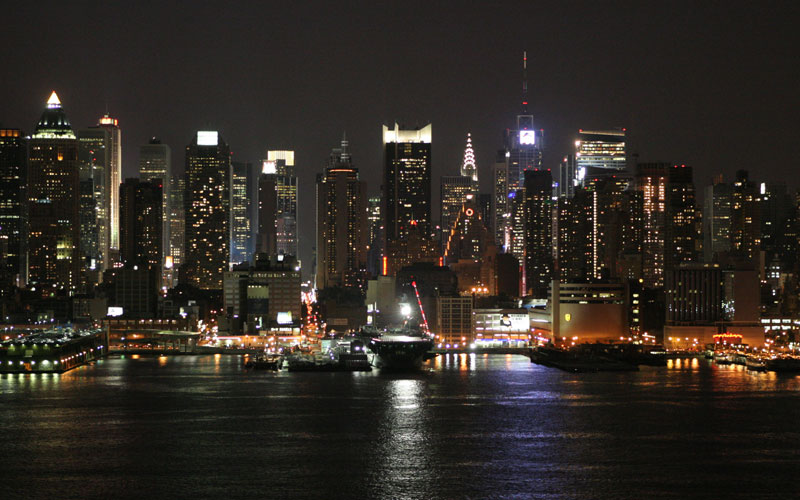
new_york_skyline3.jpg


This is the stock I used for my last sig, notice the difference? :wacky:

Thanks for the comments guys keep them coming! :awesome:

Update!

tifaxcs.png


I think it's a really cute picture ^^ something that Kira/Six would probably like. Didn't really add much other than lighting as I didn't want to ruin it.

Comments appreciated please :)
 
ooooooooooh your current siggies are so shiny :jess:

I LOVE LOVE LOVE the city one and am stealing the stock as we speak :P The sigs you made for Lew and Cali are near perfection. I'm almost a bit jealous of your skill xD I like the Cloud and Tifa sig but I think the white lighting could have been toned down a bit. Other that that that sig is sex as well -__-

You're a really good gfx artist! :P What's the text you used for "love" in that Cloud x Tifa sig?
 
Haha thanks ^^ The text I used was called Twelve weeks Pregnant (inorite) :wacky:
I got it from Dafonts.

New set:
vhavi.png


vandh.png


The pic is from my favourite scene in FF13, it's soo cute, I'm mainly happy with this sig, apart from the text was so difficult to place :rage:

What do you guys think?
 
Oh wow you really made that NYC signature come to life! It looks fantastic! =D


This one is just adorable!

First off, excellent choice of image! It's adorable. <3

Awesome colours and lighting! The text is too cute. <3 I love the fonts you've used! It really suits the feel of this signature!

The rounded off edges work gorgeously as well!

Keep up the great work!
 
tifaxcs.png


i'm adoring this one the lighting is amazing the image is just sooooo cute.... also the text you used for the believe in tifaxcloud is amazing... i'm gonna ask what is the font you used :wacky:
 
Hehe thank you guys ^^

The NYC is possibly the best if not one of the best sigs I've done, I'm getting good at this lighting lark now I reckon :wacky:

@Lady Yuna

The font I used for Tifa x Cloud sig is Trebuchet MS it's one of the cleanest fonts I know ^^

Also if anyone wants to request anything from me, feel free to visit my shop!

Linky
 
Back
Top