Forum Layout Issues?

Valkyrur

White Knight
Veteran
Joined
Dec 31, 2007
Messages
2,634
Age
31
Location
Singapore
Gil
5
FFXIV
Auralesca Vlangia
I'm not so sure if it's really an issue unique to me, or a result of my very much smaller lap top screen. Length wise, it ought to be somewhat similar to my old desktop screen, which used to show the forum properly... >.>

Then again, it seems the forum has gotten itself a lot more features than it used to have.

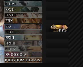
Having said that, I'm not sure if it's a problem of mine but...

AVc4IDR0v8mfAAAAAElFTkSuQmCC
Problems2.jpg


There, the Newest Reply segment appears rather shrunken. Looks like it was caused by that Newest Member part.

9u7YxwAYRAKw57gnVRthRarXt6hcTRxIBrJ+0YSxn8F6fOj6b7mvrjZ0moumqr0N9GjSSp6XSOQyXR+WMvXD4he5Z4KgOFujejvfFMBa6Go3FMBa6Go3FMBa6Go3FMBa6Go3FMBa6Go3FMBcALXlX4z9IiTmwAAAABJRU5ErkJggg==
Problems.jpg


This one's more minor. It's just the RPG button sitting right next to the forum banner... Alone. Not so sure if this is intended though.

Other than that, it's fine. Not a big problem really, but it would make the forum look nicer if these problems were fixed...

For me at least. I'm using Firefox 4 RC2 - though, Internet Explorer also produces the same problem.
 
I've also noticed the same thing for some time now. I have no idea why the RPG button shifted over to the right, and that it doesn't really bug me anymore.

But yeah, I can see why it's bugging you. It did to me at first.
 
As far as the Newest Replies box, put it in the right-hand column instead of the middle. That should fix that problem.
 
hmmmmm moving the newest reply box to the right should fix that one

the rpg button..... not sure but i get this as well..... using Chrome 10 Beta

EDIT: Triple T Ninjed me XD
 
I also noticed this when I was on my mother's laptop as well.

Maybe this just means everyone here mainly uses a giant fucking monitor :awesome:
 
I also noticed this when I was on my mother's laptop as well.

Maybe this just means everyone here mainly uses a giant fucking monitor :awesome:

Haha, we're all so rich. XD

This is beyond minor, but when checking my notifications, they overlapped into the tabs on the right side. So it was distracting and kinda hard to read. Other than that, everything looks pretty awesome. It's black without stabbing my eyes...it's a miracle! :ph34r:
 
I think the column with the FFF RPG is meant to have more buttons, it looks like there's room for more, we just don't have any. Perhaps button making is in order :hmmm:
 
hmmmmm yh i noticed XD on the profile you have to guess some stuff cuz stuff is covering it XD

I'm not on a huge monitor.... 15.4 inch...

but i notice it more at college.... monitors are not wide screen XD
 
As far as the Newest Replies box, put it in the right-hand column instead of the middle. That should fix that problem.
It still looks ridiculous. It's the fact that "Stevie" and "Mercuria" are both cut off but there's PLENTY of unused space between that cell and the next one...surely it's just a matter of extending the cells? It used to work/not look stupid.
 
The button idea is plausible, though I can only wonder what other buttons can they make to go with the RPG.

I'm not so sure about this one, but if what I'm thinking is right, I should think it wouldn't make a difference whether or not one has got larger monitors or not.

Even with my existing laptop monitor, I can still notice there some space that are not filled up, and that could be used to make that box clearer...

... Kinda brings me back to the layout. Could be some HTML settings.

EDIT:

Just realized that using up all those spaces could potentially cause issues for those with smaller monitors. Hm... >.>
 
I dunno, I have a fairly small monitor (I think?) It just depends on your resolution.It hasn't sretched anything out for me yet.

That said tho, I think buttons there could easily free up space on the main header and make that line look a lot less crowded. RPG, Triple Triad, VB Shop, Calendar, Community, Profile, User CP could easily go there and make it look snazzy I think.
 
Back
Top