~Nouveau Arte Memoirs~

Mitsuki

Veteran
Joined
Dec 14, 2006
Messages
11,628
Location
California
Gil
0
Chocobo Egg
Chocobo Egg
Barry the Behemoth
Accessory (Arms)
Build-A-Member
Mogrinch
FFXIV
Mitsuki Calei
FFXIV Server
Lamia
Free Company
Gaia
315d5ya.jpg


-------------------------


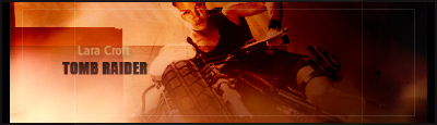
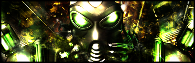
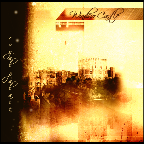
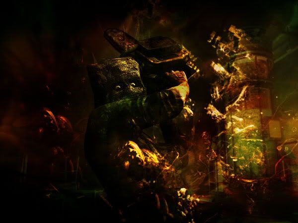
It's been over a year now since I first started Photoshop, so I figured it's time to start a new thread. Here's some tags I've created recently, along with some favorite old ones. (Most of them are in listed on the top). And just for old time's sake, here's my old GFX thread: Mitsuki's Photoshop Beginnings


Signatures


LaPrimavera5.png

Yuffie2.png

Electrivire1copy.png

8wjxvn.jpg

Smallville.png

PSPFFF4.png

Butterflycopy.png

Rose3.png

KungFuPanda1copy.png

Vintage2.png

MattBellamy.png

Aiur.png

a4ljyp.jpg

2zqyc94.jpg

Tifa.png

HourglassofSummercopy.png

MuOnline.png

HouseMD2.png

AirGear-1.png

BoyandGirl1.png

Yoshicopy-1.jpg

MarioandYoshi.png

NemesisV2.png

Genshikencopy11.png

Kristine.png

AbstractDice.png

16jofo6.jpg

eg2yhs.jpg

HalloweenNightmare1.png

2gwt25f.jpg

1ih1tt.jpg

NoctisPrince.png

Blade.png

2ezrz8n.jpg

2n89baf.jpg

Stella.png

Yuna.png

Ashelotte1copy.png

k4z72d.jpg

2rpxmp0.jpg

Samurai-1.png

Freya.png

o9pljp.jpg

Garnet.png

2430115.jpg

StockSetv2.png

2uzqhpx.jpg

AliceNine.png

210lxsk.jpg

Hellboy1.png

AirGearcopy.png

Griffin.png

DaveyHavok.png

Boy.png

WindsorCastle.png

98yk1v.jpg

29f8j9y.jpg

2hncrja.jpg

TombRaider.png

2z9be3s.jpg

2sbsav4.jpg

9hq6gi.jpg

efp9nk.jpg

2f07iv5.jpg

fau7n6.jpg

fktd6u.jpg

Neocroncopy.png

2z4z8rq.jpg

24c9ox5.jpg

ci5jr.jpg

6533u1.jpg

euhgfa.jpg

1rd6k5.jpg

2afyf7d.jpg

x5dxj4.jpg

25jz9jr.jpg

Shikamaru2.png

Doomsday.png

vzang8.jpg

mwa93n.jpg

io3wc4.jpg

2up458h.jpg

30ksnc9.jpg


~To Be Updated~


Avatars & General GFX


Vincent-1.png
Tifa-1.png
Yuffie1-1.png
JudgeGabranth.png
Refia.png
Rinoa.png
Edge1.png
Squall1.png
Seifer.png
Reno.png
PigstailGirl.png
FireEmblem.png
Britain.png
Saber.png
TazAvvy.png
PSPAvvy.png
Misasdoll.png
SoraAvvy.png
IyaAvvy1.png
Piratesofthecarribean.png
GarnetAvvy.png
Kimahri.png
ButterflyIcon1.png
ButterflyIcon.png
NarikoCopyAvvy.png
HourglassofSummerAvvycopy.png
Cloudavvycopy1.png
Mizuhoavvycopy.png
RoronoaZozoAvvycopy.png
faz9u8.jpg
69qftj.jpg
29os909.jpg
1zou6w6.jpg
dpvbjp.jpg
20fdw8i.jpg
e00fpv.jpg
5vafiw.jpg
2m424v7.jpg
LinkAvvycopy.png
NinjaGirlAvvycopy.png
Noctis%20copy.png
Gippal%20.png
Fran%20copy.png
Shuyin1.png
Stella%20copy.png


bjaaz6.jpg

HouseAvvy.png

Ichigoavvy1copy.png


Buttons

LPButtonv1.png

ArtThreadButton.png

MyPhotoshopButton.png

GFXShopButton.png


LP/Wallpapers

WindsorCastleLP.png


Resident-Evil.jpg


Miscellaneous


2vs2lba.jpg


f0ypzb.jpg

209rjiw.jpg

2qldd1g.jpg


~To Be Updated~
 
Current Signature Update


x10utd.jpg

11h4bbm.jpg

10zn33n.jpg

1zy8pas.jpg

33bmnmh.jpg

2rfasfp.jpg

2r404k2.jpg

xf92sk.jpg

30lhqhw.jpg

dha6ah.jpg

33ku48z.jpg

29nfipu.jpg


~To Be Updated~
 
Thank you. :)

Here's a few more updates:

A request for Sabriel. Didn't really have any choice for color theme since she wanted the blue icy feel to it.

21dj62e.jpg


And back to my darker theme. I must say that I really feel more at ease working with darker colors than lighter ones. David Beckham...I came across this guy at a mall the other day. I drooled at the display.

30lhqhw.jpg


xf92sk.jpg


I decided not to put a text on this tag. It's one of those rare tags that doesn't need a text, methinks.

Constructive criticisms would be nice.
 
21dj62e.jpg


Wow me likey Mits. Very rarely am I seeing lighter stuff from you these days, so this is very fresh to me. Great lighting job, and great effects, amazed the text is readable too! Keep up the good work.
 
Oh my! *fell over*
All this work is simply amazing, darling! There is nothing I can say that can even begin to describe how amazing this work is. I love your style so much! Please show us more! ^^
 
Thanks, guys. =] There's just something sentimental about old works that I like.

Here's a few updates:

11h4bbm.jpg


I saw half of the movie. I kinda liked it.

The rest are requests:

jgljlk.jpg


I really need to practice this lighter theme. I feel like there's something missing.

2j68g1w.jpg


I had to work with this sig size so it was kinda hard, but I did the best I could.

mauxs5.jpg


Critiques would be appreciated.
 
That's epic. :ryan:
It alll flows amazingly well, the focal point is nice and strong but doesn't take all the attention. The effects are great, especially on the right side of Wall-E, it looks amazing. The colour is perfect and the lighting's done brilliantly. Font is also spot on.
Keep up the great work! :)
 
30lhqhw.jpg


Wow this one is awesome O_O defintely my favourite one by you yet. The colour theme of the sig is simply amazing, the lighting over his body sets him apart from the BG but hes still blended into the tag. The stock in the BG looks fantastic and really makes it look professional. The text is perfect and looks amazing. Everything in this tag is so good, its unreal. =)
 
Thanks, guys! ^^

I haven't been keeping up with this thread but here we go:

dha6ah.jpg


This one took forever. >.> But I love it.

10zn33n.jpg


I really like how that one turned out.

33ku48z.jpg


That was a very unusual stock to work with, but I kinda like the outcome after I played around with the colors and effects.

2rfasfp.jpg


Tried for a simple and lighter look.

ny5ldc.jpg


Another unusual stock...didn't really know what to do with it but add subtle effects and coloring.

2r404k2.jpg


29nfipu.jpg


I probably should have made this one lighter, but I was aiming for that 'Four Season' wall decoration look. This is actually one image and it was kinda fun stacking them up layer after layer and erasing bits of pieces here and there.


Avatars:

122yhi9.jpg
2hr36tc.jpg
9ropld.jpg
311t4rp.jpg


Critiques are certainly most welcome.
 

Gorgeous work on this one!

The lighting is gorgeous and the richness of the colours are beautiful! It gives off a warm and lively feeling.

The angle of the image is well done and the blending is superb! The blending is of the character is beautifully done and the font chosen for the text looks fantastic!

I love the slight bits of red that emerge from the darker areas here and there too! It looks brilliant!


I really love what you did with this one! You really spruced up the original image!

The colouring looks fantastic and the glowing lights surrounding him are simply gorgeous!

I love that little line running down the left into the text, which by the way looks amazing! The mirror image of the text behind the original looks great and really adds character to the signature.


The rich and sharp colours look fantastic in this one!

The image is rather interesting and I like the use of three colours in this one.

There isn't that much to say about this one. It's great and I love what you've done with it. =)


I like the rain effect coming down over Harry and how well he's blended into the background.

The only thing I didn't really like was the use of colour. There didn't seem to be too much in the way of colour and I didn't really like that there was only one side of the border.

This is just me and my opinion though. >_<

Text looks great and the effects in the background look lovely. =)


I absolutely loved this one when I saw it. =0

The colouring is so beautiful and the texture in the background is so glossy and shiny! =0

The image used looks fantastic and the background looks so detailed.

The text looks nice, though I'm not too font of the 'the ruler' written in red. I think a lighter colour would look better.

The border rounds it off nicely. =)


I'm not a real fan of having only one colour apparent within a signature, but aside from that this one looks great!

The blending is done well and the effects surrounding him look like debris falling around him.

The font chosen is gorgeous and is situated well, ensuring that the focal point is established.

The lighting is well done and the border works well being black as it matches with the black and green colour theme.


This one is lovely.

It gives off a serene feeling.

The image is gorgeous and well blended with the colours used.

The border is rather interesting. It makes it look like a picture hanging on wall in a frame. =)

Lovely work on this one.


The Wall-E avatar is gorgeous! Lovely colours used and the effects are brilliant! The lighting is fantastic and the overall image has a glossy look to it.

The line going down the middle adds a bit of character to the avatar too.

I love the border down the bottom! Very unique!

The same comments for the Sativo avatar as the signature.

Lovely work on the remaining avatars. Gorgeous colours used, the lighting is in all the right places so that we know where to look and the borders are all stunning!

Keep up the awesome work Mitsuki!
 
33ku48z.jpg


Ahah i have this stock floating about my computer somewhere. THe colours are stunning and the depth is awesome. The light is focusing towards the centre at the end of the path. Looks as though you could jump in and walk through.
2rfasfp.jpg


This one was overlooked in that sotw this was my favourite and would have been my number 1 choice had i voted. Definately a lot simpler than your usual work but its still effective. The lighting of the tag is just right, you have the 2 light sources in the right place and hes blended in rather marvelously. Im not fond on the bottom border but thats the only negative thing i can say about it.

ny5ldc.jpg


I think the green round the edges throws it off a little it doesnt really go with the deep red and the yellow. Text seems a little below average aswell. I can see what you mean though. Its a weird stock, the sizes of cloud and sephiroth dont really help to make a good tag. I wouldnt have liked using that stock myself.

2r404k2.jpg


How did this one not win :gasp:
I love this one. Its the plain colours that i love it contrasts the light and the shadow amazingly i think theres a few spots that would look better if the burn tool had been rubbed over them it wouldve gave the shadow a more realistic look... but on the whole this is a fantastic signature. The darkness on his left hand <3


122yhi9.jpg
2hr36tc.jpg
9ropld.jpg
311t4rp.jpg


Colour depth again is amazing. I wish i could make avatars like this i really do. Lighting + colour perfect.
On another note i love the border uv used on the 3rd one (sakura) Did u emboss it to make it pop out? I like it. I think it looks good on icons.

Great work Mitsuki ;))
 
Thanks guys! Yeah I can see what you guys meant by the one-line border thing. I've done it in the past before with a black border and on a much smaller signature, but the white border does look rather odd.

SOTW

x10utd.jpg


More of a texture-type signature. I like to try something different every now and then. This is two stocks combined into one and I kinda like the emotion it shows. I think adding the letter stock completed that. Overall look though - it may not be quite an eye-candy, I have to say...I guess I tried to focus more on the 'feeling'. As for the color theme, I was aiming for that 'tale as old as time' look.

V1

2prh8qd.jpg


V2

33bmnmh.jpg


Definitely like V2 more due to the added effect on the stock and change of text, but I can't decide which color theme is better...

1zy8pas.jpg


Stock was kinda poor quality...and erasing the white background was such a pain in the ass, but I managed to make it look ok by adding lighting behind him. Otherwise, it would have looked tacky and the lining around Cid would have been more apparant.

So CnC would be nice. ^^
 
I wanna comment on these two pieces real quick, it's nearing 6.10am and I gotta work tonight :gonk: I'll get to the rest later when I get home tonight. xD I need catching up.

1zy8pas.jpg


Love this sig, Cid is awesome. I love how it seems he's coming out of room filled with light, just offering help to the person who's in need in front of him. (image it's there) I really love this sig, the text is placed nicely... Hm... I might throw in a request for you... :awesome:


33ku48z.jpg


Und this one. It's a very damn good sig. Love the colours, the text is awesome, and how Lew said, the dept is dropdeadgorgeous. Omnomnom-siggy is the best I can describe it... xD I love how you messed with the colours in this sig. Awesome work Mits.

Also, thankies for the posty in my thread. =]


I totally overlooked this one when I voted last week. I saw it, but I also saw Lew's who used an image that really stood out to me.

I would have voted for this one otherwise.

The colours look brilliant and gave off the look of stained old paper within a book. The texture looks amazing and the blending is superb!

The text is blended in so well with the background and has a brilliant effect.

I like that you can't really see the person's face either. It has more of an effect that way for me personally.

The lighting is spot on and overall this is just a lovely piece. =)


I also prefer this version.

I like the slight change in colour theme more and the shining beams of light coming off his armour. It looks fantastic!

I also like the change in font, though it does look a bit dull at the moment. I would suggest taking the shadow off it slightly.

The eyes really stand out make you focus on him more which is a good thing. The lighting behind him is really well done and helps you focus on him more also.

The black border is appropriate given the theme of the signature, and helps it seem darker.

Well done!


I love this one!

I love the blurriness behind Cid and the lighting is just gorgeous behind him!

The darker sides look fantastic and establish the focal point more too!

The colours used look great and I love the font used and that little line underlining it and then fading out of the black and then into the light.

Brilliant work on this one! It looks absolutely gorgeous! It's hot! :gasp: XD
 
x10utd.jpg


Oh what this is stunning. I think :hmmm: 
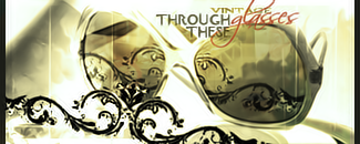
the writing on the left is a stock image yeah? Its been blended in fantastically. The golden colour gives the sig a rather old/antique painting look to it. I actually thought this was mr warbournes tag as i remember he used a similar idea on that germany tag, he blended in all those stocks.
I think theres maybe a tad to much focused light around him although i think that bright light is a river? Id prefer it not so bright but thats just me.. This put my entry to shame. Nice job :)

EDIT i basically wrote what u said in your post. I swear i didnt see it til after though :wacky:
33bmnmh.jpg


I prefer this one too. Its more energetic than the previous although i really really like the text on the first one. AS usual colour depth and light = stunning hahaha its really something to look at. I love the border aswell. imo perfect in everyway =)
 
Last edited:
Whoa, almost a year of no updates. :hmmm:


----


21kfioy.jpg

ablfkh.jpg

2rpbkmw.jpg

52zapy.jpg
14d3wcy.jpg

2j4oio1.jpg

2w5pweu.jpg

2ronfi1.jpg

29l1r2c.jpg

339kao9.jpg

Low-quality image. >.>

j6r1xz.jpg

Can anyone see another face here?

2hoen1t.jpg

33oiczd.jpg

2mwtt0m.jpg

1631hu.jpg

eqtohs.jpg

wret00.jpg

314qbyc.jpg

ziw0n4.jpg

ztja7l.jpg

1okhgw.jpg

69dcm0.jpg

x6hdlx.jpg

34yzmys.jpg

2nsufpi.jpg

29e26om.jpg

Ignore that transparent border on the bottom. That was intentional since I was trying something out for James but I didn't quite get it right.

20hk0fq.jpg

dh7r.jpg

ixxctz.jpg

2vufupv.jpg

2rf99ub.jpg

13zd6z6.jpg

fc1t1f.jpg

15f215d.jpg

2czu52a.jpg
1463qf.jpg

6j0tmt.jpg

n38302.jpg

34iqvc3.jpg

2cfeiog.jpg


More sigs to come!


----

Experimenting in Photoshop. I plan to do some graphics art design as part of my career so I was inspired to think 'out of the box'. This was from several months ago:

sdckjp.jpg

28ng5f.jpg

6f6wpx.jpg


----

I'll add a few other miscellaneous stuff tomorrow. This is already quite a huge update.
 
Oh my gosh, Mits. Your work never ceases to amaze me <3 :awesome:

52zapy.jpg


Okay, first of all, really like that border, makes the sig look complete. The lighting gives a gentle and appealing feel, the BG and the effects of it looks stunning, and the text: nice font used.

2ronfi1.jpg


Pandas x333

Ver nice colour scheme, I particularly like the yellow splashes of colour.

j6r1xz.jpg


Is it Kefka :hmmm: 1, because it looks like a clown hat at the bottom right of your sig, and 2, the text above Onion Knight says Kefka, amirite? :wacky:

Rough texture and lighting are ver appealing, the text is a nice touch etc.

2nsufpi.jpg


The background images are awesome; like how you amalgamate those into this sig. The colour scheme represent the theme ver well, just one question, what's in the middle of the girl?

2czu52a.jpg


Nice font used for the tect. The white spots of colour near the bottom are a nice touch, the stock is gorgeous :3

sdckjp.jpg


I prefer this version TBH. The white and grey/black contrast much more than the other one. I like the box aroung 'Introspect' and the actual text as well. Texture is ver appealing (repeating myself)

Keep it up Mits, you're doing great :tighthug:
 

Out of the update these were my absolute favourite, though they were all truly amazing works of art!

You are so detailed with your work and it really makes you look deeper into the pieces.

Everything looks like you took your time with it to perfect it.

I love the variation in your work!

You always use fantastic colours and always seem to produce something amazing!

I really am wondering why I have NEVER requested anything of you. =0

I think I might now if that's okay with you. XD

Keep up the fantastic work!
 
Back
Top