Navigation
Install the app
How to install the app on iOS
Follow along with the video below to see how to install our site as a web app on your home screen.
Note: This feature may not be available in some browsers.
More options
You are using an out of date browser. It may not display this or other websites correctly.
You should upgrade or use an alternative browser.
You should upgrade or use an alternative browser.
Squids Graphics
- Thread starter Squid
- Start date
- Tagged users None


Hm. Looking at the more recent stuff, I think you're making the blending stand out too much. You want to make it look like your character is part of the image and all, but you also don't want it to look like your character is being sucked into the background. Aside from this, I think your work is pretty good.

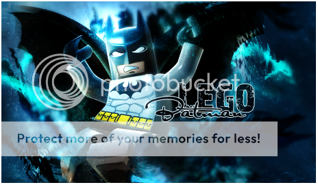
I still think that Batman piece is friggin' amazing.  For obvious reasons, it's extremely difficult to take Lego seriously. But you really captured the whole 'Dark Knight' theme. The piece looks like it's set in a rainy Gotham, looking down at a puddle to see the reflection of Batman leaping down from god-knows-where. It's awesome!
I really like the ones you made for Jay. Out of the three, the first and second ones are definitely the best.

I'd probably be more inclined to say the second one is my favourite. It's all just incredibly easy on the eyes. I how much contrast there is between the background and the floral pattern and that lady. But it's not the really harsh kind of contrast either. Everything just looks soft and it gives off a very relaxing vibe. You seem to be extremely good with making some more mellowed out graphics!
Good job!
For obvious reasons, it's extremely difficult to take Lego seriously. But you really captured the whole 'Dark Knight' theme. The piece looks like it's set in a rainy Gotham, looking down at a puddle to see the reflection of Batman leaping down from god-knows-where. It's awesome!I really like the ones you made for Jay. Out of the three, the first and second ones are definitely the best.
I'd probably be more inclined to say the second one is my favourite. It's all just incredibly easy on the eyes. I how much contrast there is between the background and the floral pattern and that lady. But it's not the really harsh kind of contrast either. Everything just looks soft and it gives off a very relaxing vibe. You seem to be extremely good with making some more mellowed out graphics!
Good job!

I'm SO upset!  I wish I knew where to start and you make everything so effortless looking!
I REALLY like everything you have done! Keep up the great work, Toni!
I wish I knew where to start and you make everything so effortless looking!I REALLY like everything you have done! Keep up the great work, Toni!
Thank you Cody Deux, if you ever want to get in to graphics or anything and have photoshop downloaded I am happy to help you here and there. I'm not that great but Lew taught me a lot of neat things and I am happy to show you some stuff (will keep some special things secret though  )
)
Thank you for the comments again!
)Thank you for the comments again!
Gift for JeriKane

I used a tut to help me with this one, I added my own touches to it but it's mostly quite similar

Then I tried to do it on my own without using the tut and using different flowers and effects and stuff.
Ignore the bad text haha I didn't know what to have it say


I used a tut to help me with this one, I added my own touches to it but it's mostly quite similar
Then I tried to do it on my own without using the tut and using different flowers and effects and stuff.
Ignore the bad text haha I didn't know what to have it say
I actually like this one. Love the flowers, and the quality of the piece.


Hahaha Cali Alex Mason you know what's funny? I was actually searching like hell for an Aerith image when i was making that sig because I thought she'd go well with flowers but I couldn't find one I really wanted to use
I'd be more than happy to make you a sig. It'd be good practice! I'm glad you like my graphic enough to want a similar one haha it's very flattering!! Thank you!
Is there anything you'd like it to say?
Also thank you Seiji for the nice comment!
I'd be more than happy to make you a sig. It'd be good practice! I'm glad you like my graphic enough to want a similar one haha it's very flattering!! Thank you!
Is there anything you'd like it to say?
Also thank you Seiji for the nice comment!
I'm not a big fan of the colour combinations, and I think the red text (the colour) could've used a black outline to make it pop a bit more, or make the red a different colour. In tags like these with small text, don't be afraid to use bolder colours, they won't take away from the focal point.
Now this is a whole other story. Great placement, great colour combination. Text combination, I'm personally not a fan of the top font used, maybe like in the Summoner tag, having it capitalized or a bit smaller font but stretched out would've looked a tad more complimentive. VERY nice combination with the bottom font, really liking that. Lighting, placemement, colour. Really liking this tag. Great work. =]
Your sigs have been absolutely stunning as of late. You have improved so much lately its unreal. Your placement of resources is really whats striking me as the best. Everything is where it should be and your colouring has improved so much. Your using colours that compliment eachother but still let your work pop out and make me go oh wow.Your text is getting much better too. Still needs work at times but i think you have pretty much got the hand of mixing fonts and placing them in the right area. Keep at it buddypop. Your doing better than fantastic  xxx
xxx
xxxThank you so much guys for the comments < 3 It's really great to hear stuff like this and I'll take the tips you've given me and try to put them to good use.
Here are a couple more things i made:
This one is for Cali, I'm actually very proud of how this turned out. There are some things I'd change but overall I am happy

*Big thank's to Lewis for cutting the image of Aerith out for me, he did such an amazing job <3
For this Lewis and I each used the same resources and created a Large piece each, this is how mine turned out:

C&C would be lovely thank you
and I'll take the tips you've given me and try to put them to good use. Here are a couple more things i made:
This one is for Cali, I'm actually very proud of how this turned out. There are some things I'd change but overall I am happy
*Big thank's to Lewis for cutting the image of Aerith out for me, he did such an amazing job <3
For this Lewis and I each used the same resources and created a Large piece each, this is how mine turned out:
C&C would be lovely thank you
Last edited:
omgosh, that is so weird!Hahaha Cali @Alex Mason you know what's funny? I was actually searching like hell for an Aerith image when i was making that sig because I thought she'd go well with flowers but I couldn't find one I really wanted to use

EEEEEEEEEEKThis one is for Cali, I'm actually very proud of how this turned out. There are some things I'd change but overall I am happy
*Big thank's to Lewis for cutting the image of Aerith out for me, he did such an amazing job <3
omg i love it SOO much! thank you thank you thank!!
Holy, crap!This for this Lewis and I each used the same resources and created a Large piece each, this is how mine turned out:
C&C would be lovely thank you
Toni is it possible I can use this once Im done with kira and your aerith sig? I know it's big but.. could you or i crop it somehow? it's just so freaking gorgeous. i should have asked you for a nate sig back when i was named nate drake

not a thing about it that I don't love. jolly good LP pal

Thank you so much guys for the comments < 3 It's really great to hear stuff like this
Here are a couple more things i made:
This one is for Cali, I'm actually very proud of how this turned out. There are some things I'd change but overall I am happy
*Big thank's to Lewis for cutting the image of Aerith out for me, he did such an amazing job <3
For this Lewis and I each used the same resources and created a Large piece each, this is how mine turned out:
C&C would be lovely thank you
Really nice job with the Aerith sig, Toni. I think the font (and it's placing), the coloring, and the size are all perfect. The only thing that rubs me even the slightest wrong way with it is how the h is a little farther away from the t. I really like whatever stock that is that you've found..I like the cartoon cute Aerith
 the best part is how her little bow sticks up from the top of the sig.
The Nathan Drake one is really nice too, its really big, but the coloring, font and everything are all perfect.
As far as the other stuff you've posted at the top of this page, I really like the Yuna sig...but I agree with Kira, I think it just needs some black around the red text so you can set it apart from the red flowers a bit more. I really like the coloring though. The flowers and everything match really well with the font and Yuna's outfit.
The second anime sig is really cute and well done. I like how you are using the flowers to make the character in the middle of them pop out, like you did with the Yuna sig.
You've gotten really good with your work for doing it for as short a time as you have, I've just been too lazy to get in here and say so! Keep it up, I like seeing your stuff

@Alex Mason Thank you so much Cali, I am super glad you like the Aerith sig. The image was so cute and fun to work with haha.
And ofc, I am happy for you to crop the Nathan Drake one whenever you feel like using it. Or if you want me to do it just let me know when
@Melvia Thanks so much for taking the time to comment!! I know what you mean about the H thing in the Aerith sig haha I didn't even notice it until I had posted it up That's one of the things I'd change!
And ofc, I am happy for you to crop the Nathan Drake one whenever you feel like using it. Or if you want me to do it just let me know when
@Melvia Thanks so much for taking the time to comment!! I know what you mean about the H thing in the Aerith sig haha I didn't even notice it until I had posted it up
That's one of the things I'd change!

Wow these are awesome!
I hadn't really seen much of your work since you first started and I was so shocked just now when coming into this thread.
You've improved so much!
I adore the second one with the girl saying 'What is she looking at.'
It looks so soft and pretty. <3
You've really come a long way and look like you know what you're doing.
")
your work with the flowers is excellent, i love the tags in post 47. youv worked the colours in perfectly and its very obvious now that youv got the hang of placement. the contrast between the basic white and the bold red of the flowers is really nice. As for the text i think youv nailed it very well. The white stroke was a good coice as black would have definitely overpowered the softer colours and as the theme is white it would have ruined it a little i think.
As for the text i think those 2 pieces are your best examples of text yet. Youv used two differnt fonts and combined them both nicely in colour and in composition. I think you have the potential to be one of the best text users on the site as in those 2 signatures youv nailed it perfectly and its some of the best ive seen on FFF definitely. You know we made the uncharted and superman sigs together and you know i think you made an excellent job of both of them. I actually prefer your superman tag to mine.
Your skills as a good drawer really shows. Your sigs get better and better with each post. I know its been a while since youv made anything and youv been on a slight hiatus for a while now but youl get back into it no problem. I have this theory that for every 20 GFXrs you find 1 who has the natural eye for it and your one. I think if you keep learning and making sigs in a few months time your gunna be able to go toe to toe with the best on this site when you enter sotw and other competitions
EDIT: Also Sigs where the character pops out transparently at the top of the sig may be fun to make but they are extremely difficult to make look good i think. I think youv done a good job but i reccomend if your gunna use transparency then go all the way and make sometning with a totally transparent background Thats just my 2 pence on the matter.
As for the text i think those 2 pieces are your best examples of text yet. Youv used two differnt fonts and combined them both nicely in colour and in composition. I think you have the potential to be one of the best text users on the site as in those 2 signatures youv nailed it perfectly and its some of the best ive seen on FFF definitely. You know we made the uncharted and superman sigs together and you know i think you made an excellent job of both of them. I actually prefer your superman tag to mine.
Your skills as a good drawer really shows. Your sigs get better and better with each post. I know its been a while since youv made anything and youv been on a slight hiatus for a while now but youl get back into it no problem. I have this theory that for every 20 GFXrs you find 1 who has the natural eye for it and your one. I think if you keep learning and making sigs in a few months time your gunna be able to go toe to toe with the best on this site when you enter sotw and other competitions
EDIT: Also Sigs where the character pops out transparently at the top of the sig may be fun to make but they are extremely difficult to make look good i think. I think youv done a good job but i reccomend if your gunna use transparency then go all the way and make sometning with a totally transparent background
Thats just my 2 pence on the matter.- Joined
- Feb 25, 2010
- Messages
- 3,732
- Age
- 33
- Location
- Southend, UK
- Gil
- 0
- FFXIV
- Yuno Mizuno
- FFXIV Server
- Lich
- Free Company
- Silver Lining
I was about to go to bed, but I just had to comment on this before I go, you improved sooo much since you started with your gfx work, i think the size you used is really cute, and the right size for the signature. The lighting is great on it if not prefect, I love the flowers you used for the background, makes a great touch. Finally I think your mastered blending, the blending on this is just god like, The text i'm not a huge fan of, but it still great
")
good work, keep it up