Yumiko's Graphics Dump (*warning* very image heavy >.<)

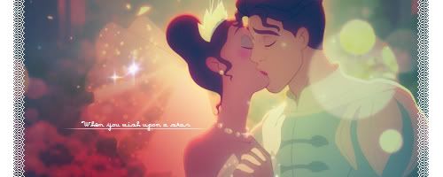
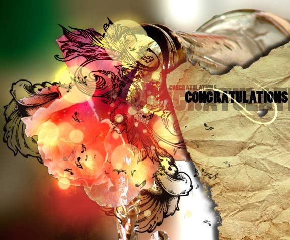
Alright, well I'm just going to update my thread with all my recent graphic scribbles that aren't up here yet hahaha:

These are from request threads. Gives me a chance to practice hahaha.

So this one I decided to use as little brushes and stock as possible, sooo I ended up with using only two little grunge brushes for border and that splatter behind the shadow x3 as for images, I only used 1: Neku. (´・ω・`)

twewu.jpg


Untitled-2-1.gif


xiaoyuavi.gif


xiaoyusig-1.png


sabersig.png
 

I love you style. It's very unique!

This set is quite striking and I love how you manage to make the signatures large but fill them appropriately and keep them interesting!

The colours look fabulous and the character fits in so well within the signature! The background looks fantastic too! It looks busy in a good way and alive!

The text is also brilliant! I love the font you've used and the location of the text. The two shapes in the background that are the base for the text look fantastic and really spices up the text a lot more.

I love the white tips on the bottom of 'Nina' too.

I also love it when people don't simply crop the image from the signature in order to make the avatar. I like that you put some thought into the avatar and that it came out looking amazing!

The entire set looks superb!


I love the pop out signature you've done here.

The girl and the flower slightly popping out looks very cute and the background for the signature is so detailed and pretty!

The lighting is excellent and the colours are beautiful!

I love the border on the signature too! It's very different!

The avatar is yet again amazingly gorgeous and I love the rounded shape you've given it.

The black line down the right hand side with the pink border and the little pink squares and the text are all just brilliant!


Lovely work on this one!

The detail is gorgeous and the blending of the pop out into the colour of the forum skin looks amazing! As though it's a part of the skin.

Love the lighting and the text! The patterned border looks fabulous and the colours are gorgeous as usual.

Keep up the great work!
 
B'aww, thanks~ ∑(。。)

I've been M.I.A. because of school hahaha.
Anyways I'll update with recent graphics from the least to most recent:

Okay, so I remember entering this in a graphics battle sometime last year, but it never got posted, so I really don't care anymore. Battle's long dead, HA!

teasig.png


This was for my new phone's bg:

phonemainbg.jpg


This was for my professor's doctorate recital. Yes, there was text in the right area, but I removed it because it was personal thanks, haha:

congrats.jpg


This next one was done most recently for tipsynaruto... the chains were a mother to work with....:

teasig-3.png
 
Actually, come to think of it, the borders seem to oddly remind me of a sardine can, XD

The white border is the tin and the ribbon is the rolled back top. Maybe its just me?

in any case, cant thank you enough for it.
 
Thanks guys (´・ω・`) I'll keep practicing!
Hahahaha, the sardine can thing, I totally see what you mean.

Well, I have another thing to put up. Something I've been working on for a while out of boredom if I couldn't sleep at night (´ε`)

It was kind of an experiment with different things. ie: shapes, text, blending, colors, manipulation, etc

graphx.jpg


crits welcome ❤
 
  • Like
Reactions: Six
asjkhakjdhwieurwetrwpo!!!!! :gasp:!

That's goooooooooorgeous!!!! I love what you did! That looks so creative and inspiring!

You placed everything gorgeously, the sharpness and softness are both great, the colours really stand out, and I love the bold dark outlines to the shapes you've edited!

Gorgeous piece!
 
B'aww thanks so much!!

(*゜―゜) I'm so glad that you find it inspiring. I mean I've seen your works and they're aaawwweesooome!!
You have no idea how much that means to me XD
 
Oh wow that is really well done!

I love how you've manipulated the photo using those shapes! It looks like it's popping out at you.

The texture and patterns are all very appealing and the colour use is fantastic!

Gorgeous lighting and I love the soft look of it all.

Keep up the fantastic work!
 
graphx.jpg


:x3:

This is just sexy. The design, color, everything is very professional and exuberant! I just love it. The color scheme is very pretty and brilliant and the different effects are gorgeous. I love how the focal is brought out and showcased. The piece looks very high quality and I just have to say it is brilliant. Awesome job! :jess:
 
Thanks so much guys!

Well, this afternoon, I had a strange and vivid dream that we had these fantasy-like birds living with us, and when I woke up from my nap, I couldn't get the images of the birds out of my head, so I decided to use it as inspiration for this piece XD

feathered.jpg


I also used it as another chance to practice photo manipulation.

original stock: http://katanaz-stock.deviantart.com/gallery/#/d13ypt0

Crits. are welcome ❤
 
Wow! that looks great Mei!

I know this is a GFX dumo, but you should like totally make me a signature :D

If you want, I'll PM the details.
 
Yes, sure! You can PM me the details (・w・)
I may get it in a few days though, I'll be really busy these next couple.
 
3-4 Hours the piece by itself, looking for the right stocks, maybe another hour or two.


feathered.jpg


Crits. are welcome ❤


Nooo no criticism

That is amazing :gasp:

The stock youv blended in to her face has been done to perfection. And the whole concept about the piece is magnificent :gasp:
I love what youv done with the splatter brushes and her hair.
You should well enter the large piece competition :ryan:

EDIT: i downlaoded/saved the stock aswell gunna see if i can do anything with it
 
Last edited:
Awh, thanks so much! It's nice to hear that from you. I'm one of your graphics fans, hahaha.

I'll see if I can enter the large piece competition... it'll be good practice. I just have to look for the thread (・w・)

Post your finished work with the stock!! I'd love to see it up there with your other epic works.
 
This is something I've worked on since last week. It was an experimentation to another whole bunch of things, haha. Anyways, ran into an inspiration block for a LOONG arse time... but in the end... I finished it.

Maybe it's just my monitor... but the colors don't seem to be saving correctly. It looked much more vibrant on the original document so I tend to have to amp up the vibrancy (not sure how this looks like on monitors other than my own)... anyone know anything on this?

Stocks used:

Model: http://katanaz-stock.deviantart.com/
Smoke: http://isostock.deviantart.com/
Rose: http://www.sxc.hu/profile/torvald
Texture: http://miss-deathwish-stock.deviantart.com/
Wings: http://solarka-stock.deviantart.com/
Brushes: Custom made

wings2.jpg

C&C = ❤
 
Wow, you have a lot of really nice work :yay: 
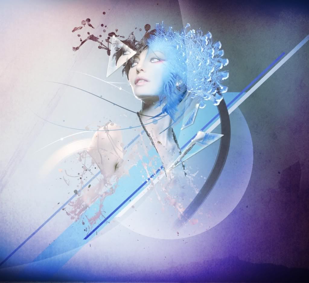
I especially like the most recent two. I love how complex each image is, there's a lot to look at in each picture and they evoke a lot of different thoughts/emotions/ideas as a result. Very cool :)
 
Thanks! (・w・)

This one is from the last SOTW. Unfortunately, I submitted the wrong version. I had two versions - one a color test (because my photoshop's been retarded with keeping its colors), and two the one I was going to submit.

This is the one that was supposed to be submitted:

princessnfrog1.jpg


Aaaand, this is the test one that got submitted (^◇^;) :

princessnfrogwhite.jpg


/fail

again, C&C is welcome
 
Back
Top