SOTW 95 Voting Thread

SOTW 95 Voting


  • Total voters
    16
  • Poll closed .

Saga

ice ice baby
Veteran
Joined
Aug 16, 2007
Messages
3,123
Location
:inmypants:
Gil
0
This weeks theme was Animals

here are the entries I recieved!

Please post in order for your vote to count! =]


#1:
lovecatsz.png


#2:
parrotsigcopy.png


#3:
1zdltlg.jpg


#4:
2z9be3s.jpg


#5:
KingofSaxony-sig.png
 
Wow number 4 is so Cute! I love the colors and text. beautiful background colors. The image is just so :awesome: Vote goes to number 4! One of the best siggys I have ever seen!
 
2 really caught my eye due to its wonderful colors, but I couldn't tell what it was until just now actually. At first I was seeing a cat, but then I realized that white part was the parrot's face. xDD Great blending definitely and I would have voted for it if it weren't for 5.

Talk about great elements there. 5 is the type of signature that seems quite busy but in a very maintained and clean way. The border is very unique and it makes the overall tag look a bit 3D-like. The scanlines are subtle and I love it. Everything just flows well, and the lighting is quite superb. The dash of tiny splatter on top of the blurry blackground really added some depth. No flaws here really. Everything about it just screams 'professional'. As expected from the artist. xD Glad to see him back on the playing field!
 
Oh wow, all such lovely entries! It's so hard to choose!

#1 feels a bit big for my liking. I'm not very fond of the embossed look or the text being so huge and covering the cat's face.

#2 the colors and vibrancy! So beautiful! A lovely piece indeed! But I feel there's just a bit too much effects surrounding the bird itself.

#3 another lovely piece, but the horse almost feels somewhat washed out. Maybe too much contrast and lighting around it's back? Still a beautiful job!

#4 LOVE this one! The panda sticks out so well and the use of effects and lighting is very well done! 4 is definitely going to be hard to beat.

#5 Another well done piece. I like the use of effects in this one, but it just didn't strike me as much as #4 for did. Excellent job to whoever made it!

#4 gets my vote. ^_^
 
I'm going to go for #5, the text is well done and the colours aren't glary at all. The border kind of annoys me, but doesn't take away from the piece.
 
I voted #4. I like the ephemeral. dreamlike feel to it. The lighting is nice, though I think the object on the right is a bit...'obstructive'? The other side is perfect. I like the smudgy feel to the area around the text and it complements the darker panda well with its pinkiness. xD

#1 - I think this entry could've used a bit more work. The stock was obstructed by the linear effect, taking away much of the focus on the cat. Maybe next time you could try to erase a bit of that in order for the viewer to get a clearer view of the subject. Also, like someone said above, the text was in front of the focus as well. Maybe a slight size tweak might've helped. :monster:

#2. I like the transition from vectors to parrot. Like the tagline suggests, very colorful, very clean. Wonderful ambiance. The main qualm I have is with the exposure of the subject, as it is too hidden. xD
Nice effects though.

#3. The background could've used a bit more work, as it feels slightly empty to the right side. That being said, the action of the left is very nice. A bit bright, but it blended in so perfectly with the lighting of the horse that it doesn't even matter. >.>

#5. Meh.
 
It was between 2 and 4 for me.

However, #2 stood out more due to the bright colours and such. I feel that the parrot was a little too blended, in the way that I really had to 'look' to make out what it was amongst all that colour, but once I realised what it was I thought it looked great. =)

Wonderful colours and effects used.

The text is placed nicely and the font chosen is very nice.

I like the use of the half border too. =)

Well done to all!
 
#1 really stands out for me. A lot of people say its too big and the text at the bottom is a bit to big, I'll agree. But it has the sense of originality that its not just your ordinary sig, personally I think its been done really well.

Special mention to #3 and #4. #3 really caught the 'freedom' sense, #4 is very cute!
 
Number 2 stood out to me straight away, the colours are really good, and suit the parrott image perfect, it's realy good
 
Number 3.

The text; Freedom, and the horse did it for me. Typical form of freedom. Horses running in the wild. Love the feeling that gives me. ^^

I also really liked number two 'cause of the different colours.
 
I am voting for #3. My reasons are because this signature displayed the best image and also text, for the animal. Everything in it conveyed the horse so well. :) I did nearly go for the gorgeous panda in #4 cos it caught my eye the most, but after studying them, I got the best 'feeling' for the animal, from #3.
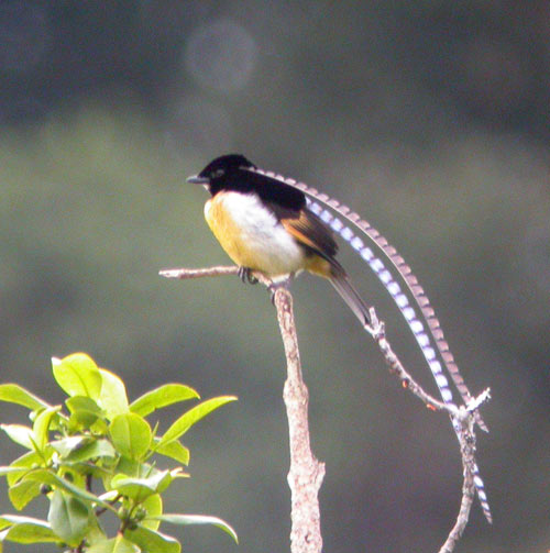
Just the text "Freedom" has more emotion to the image, than the other entries. The effects of the light behind the horse were very striking, and although it did leave it a bit plain to the other side, it didn't really matter too much. The text just clinched the vote for me. :)

#1 was decent but needs more colour. I can also think of much cuter images of cats to display than the one presented. I like the transparancy with the paws - gave it a bit of originality from the others - but overall it didn't stand out against the vibrancy of the other entries. But I do love my cats. <3

#2 had gorgeous colours; very striking. However I feel the parrot got lost in the details.. >_> it seemed to become more about the colour, than the parrot itself. Still, very nicely done.

#5 looks very professional.. it nearly got my vote. However, I prefered the smoother look of some of the other entries. I'm not fond of the texture over the top of the image, but it is still certainly one of the best of the lot. Great job to everyone!
 
I vote #5 cause I really like the colors used in it. Greens one of my favorite colors and this one uses all shades of it, calming and relaxing to look at. Is that a penguin or a bird?
 
Number 3 for me. Im a sucker for horses. It was close between 2 and 3, but 3 is more gentle and the colors and image all come together nicely.
 
I vote #5 cause I really like the colors used in it. Greens one of my favorite colors and this one uses all shades of it, calming and relaxing to look at. Is that a penguin or a bird?

It looks like it says Bird of Paradise on the bottom there. It's tough to make out though...

EDIT:

20061108120924.jpg


I think this is it...>.>
 
It was between 2, 3 and 5 for me this week.

I liked number two for the variation of colors, and also the great use of brushes and the blending. <3 It's just the text that puts me off a little--I don't think it needed it.

Number three looks powerful. It really caught my eye. The text is spot on and the rugged textures bring it all together nicely. I think the stock is a little low quality, but that's just nitpicking. It's a great tag. :gasp:

When I saw number five, I thought it looked very well-designed. It feels like spring. So many great elements and I especially commend that white, curvy...thing on the right--it proves the maker has great taste. I do think the text is too small, but that's it.

So, after about 5 minutes of just staring at these entries, my vote goes to number five. Great job!
 
#1: Too much gray for my taste, and the eyes don't pop enough to counteract it.

#2: A whole lot of color. I like the parrot and the concept in general. Just toooo much color.

#3/4/5: Are all pretty close, in my book. #5 just stands out to me a little bit more than the others. I like how the bird is perching on the branch. Just a coy little angle to him. All three could have gotten my vote easily, but #5 gets the click.
 
the only one that really stands out as a neat signature for me is the parrot one, the parrot is blended very well into the effects on the sig
 
This weeks winner is Arcsine Sigma!!!

Congrats on his FIFTH sotw win!

Well done to everyone!

#1: LockheartAvenue
#2: lagunas dream
#3: Rubedo
#4: Mitsuki
#5: Arcsine Sigma
 
Back
Top