SOTW 62 Voting Thread!

SOTW 62


  • Total voters
    22
  • Poll closed .

Daenerys

The Last Dragon
Veteran
Joined
Nov 26, 2006
Messages
11,178
Age
34
Location
Suburban hell.
Gil
1
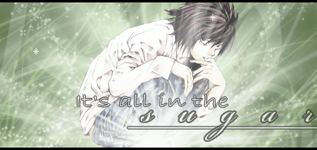
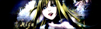
Theme for this week was Death Note. I received 7 entries. You must post for your vote to be counted =]

1)
MC.png


2)
LSign1.png


3)
sotw62.png


4)
5ewwvl.png


5)
Untitled-1-21.png


6)
DeathNote2.png


7)
DeathNoteJustice.png
 
I'm voting for One.

I, for one, think the text on One is fantastic. Simple, yet it seems to fit just right with the overall flow of the piece. The lighting also catches my eye also.

It was a difficult choice, because all of these entries are quite good...but One just stuck out to me.
 
Number 3. Some entries were too bright for me, some too dark. Number 3 was perfect in every way =D
 
Very difficult choice between 1 and 7, but I think 7 suits the theme better.

#7
 
I liked all of them, but I really liked the first one. It was simple, and the text fitted the image, and I like the lighting effect used.
 
Was pretty easy this time.
There was only 3 that really looked good and that is 4, 5, & 7. The rest looked descent, but not as good as them 3.
 
So many good entries this SOTW.
But im voting for #3, i love the background, brushes and the effects used, its perfect.
 
Number 3, 6, and 7 all looked fantastic. I had a very hard time deciding between them.

In the end though, my vote goes to 6. The text looks fabulous and the stock used is far more interesting than any of the others. It caught my eye right away.
 
It was a really tough decision between 6 and 7 for me. But I ended up going for 6, I really like the lighting and colors.
 
This week The Hunters vote is thrown at 5.

The overall effects of the image coupled with Lights name picture and golds and thrown to make light element colors gives the image a good bight and breathtaking theme.

This sig gets the 8/10 with both a WOOT and BOYA for appealing to the element I like, good job.
 
i think that 6 is the best, it is a good use of colour how the picture in the middle appears to have a higher contrast on the darker background, it looks amazing.
 
1, 3 and 7 are just plain hotness! But my vote is going for ...

3!

Beautiful image, nice brushes, sexy font and a nice border to boot. Really stunning.
 
While all of the signatures are phenomenal, I voted for #1. The lighting, soft effects, bubbles, lines... it's too delicious to pass up. :D
 
Back
Top