SOTW 48 Voting Thread

SOTW 48


  • Total voters
    28
  • Poll closed .

Daenerys

The Last Dragon
Veteran
Joined
Nov 26, 2006
Messages
11,178
Age
34
Location
Suburban hell.
Gil
1
Theme this week was Super Smash Brothers, I only received three entries D= You know the rules, you need to post for your vote to be counted -

1)
SSS.png


2)
Samussotw.png


3)
SSB-SOTW1.png
 
1st one, I would say third, but the blinding light in Link's face is very out of place and distracting. Second one, waaaaay overkill with the blur effect..
 
I really like them all -__-

I hate it when none of them stand out because they all like....stand out :wacky:

I really like the colours and the effects on them all, but I guess I will go with number one just because I really like the images, whatshis face in the background looks pretty darn scary, and like I said I just love the backgrounds in them all

Ugh, that was hard -__-
 
I voted for #1 as I think the stocks are well placed and they blend in well with each other and the background. No thrills, just a neat looking tag.
 
I really really like how 2 is so different from all the signatures style I came across with. The blur effect made a 3D look on the whole signature box, and the black background was a nice touch, although I think it would've been better if it was a tad bit smaller. Overall though, much effort is surely shown here and the background effects are quite lovely, albeit colorful.

3 is also good. I like the texture and the black line but the light shouldn't have been in Link's face, or at least the opacity could've been lowered down. =/ The render matches very well with the background color theme though, so thumbs up for that.

In the end I went with 2 for its creativity and unique style. It makes it seem like the subject is emerging out from the signature itself. xD
 
i went for 1, as more effort seems to have gone into it then for the others. that, and the others are way to bright for my taste.
 
As much as I liked all 3, I ended up going with 2.

1 was really good, but I just felt as if it was all one colour, and it was kinda hard to see Bowser in the background.

3 was excellent, font was good, and I love the use of green, but, that one white spot on Link really didn't seem right.

So, my vote ended up being 2. The blurring made it look 3D on the black background and I did love the blue background behind Samus
 
#3, by far. It's the only one that demonstrates a good use of effects and a good focal point/stock placement.

#2 has an unappealing border, and its effects are too erratic. It generally has a messy appearence, in my opinion.

#1 limits its colors to only green and orange, which happen to be my least favorite colors. The focal point is also very poor (there are two), and not to mention, the effects are very distracting.
 
I'd have to go for #3.

Very nice shade of green, Link is awesome ^_^
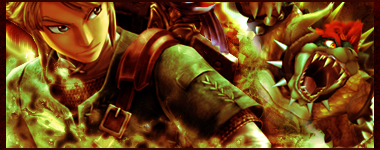
. Would be better without that damn white smudge on his face.

>.>
Green is my favorite colour
<.<
 
I voted for 1, it's the best one of all I was going to vote for 3 but the light was no no
 
Last edited:
I voted for one. I liked the mix of green and orange. I also liked how the two stocks were used.
 
whatshis face in the background looks pretty darn scary,
Bowser :neomon:

Anyway, after much deliberation I've decided to go for #1. The stock/render seems much clearer and the effects and colours seem to flow together really well. So #1.

Well done to everyone who entered. :wink:
 
1 feels too filled up with images, while the others don't have enough depth to their bgs in my opinion. >.<
And isn't 3 technically just Zelda...? :/
Anyway, I'll vote for 1 since it does give a feel for what the game is actually like and there do appear to be some nice effects in there too. It could benefit from text, but a sig like that is quite hard to place effective text in so maybe no text was the easiest good choice. (Text makes or breaks a sig, and it would have been easier to break it.)
 
I say #3 most definitely. (Wow I'm a poet and didn't know it :P) I love the use of affects and color in this one. So yeah, 3 has my vote. ^^
 
Number 1 is great!
Whoever made it; he got talent in putting two characters into the pic. The others were therefore a bit... empty. (But I think all three were great!)
 
I choose number 1.I didn't find this time's entries fascinating,but number 1 caught my eye.Overall it's a good work but still I'm feeling like something is missing from it.
 
I'd have to go with #1. The stock and the colors used in it look the best out of the three. The last choice could have been good if it didn't have that patch of white on Link's face. As for the second choice, it just had too much going on imo.
 
Back
Top