Navigation
Install the app
How to install the app on iOS
Follow along with the video below to see how to install our site as a web app on your home screen.
Note: This feature may not be available in some browsers.
More options
You are using an out of date browser. It may not display this or other websites correctly.
You should upgrade or use an alternative browser.
You should upgrade or use an alternative browser.
SOTW 45 Voting thread
- Thread starter L
- Start date
- Tagged users None


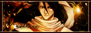


Oh these are all pretty good. Gotta admit it was a tough pick, but I'm going with No. 3.
Initially I was going to vote for No. 1 but the effects that were used on No. 3 made it look like the more creative one of the two.
Critiques:
1.) I like the C4D render and the hazy blue effect. There're a lot of empty spaces though (which I personally don't like, for some reason...).
2.) The stock is way too blurry. I guess you were trying to go for that 3d look by making the elements on the outside sharp. Other than that the sig is fine.
3.) What made this one stand out was the multitude of elements that were put into it. The grainy elements were a nice addition too.
4.) A bit too plain in my opinion. I don't like the borders, for some reason.
I guess there just wasn't too much going on for my taste.
5.) Concept was nice, but there wasn't anything special or eye catching. The stock is pretty blurry too as well as everything else. The light that runs along the bottom of the sig was a good idea, but next time try to bring it out a bit more. Make it brighter, or create some interesting effect with it. (Though to be honest, I don't see where that light would come from [think of the light source]).
6.) Good sig overall, but there isn't any special thing that makes it stand out. The texture was nice, but it takes away from the overall effect of the stock.
The grainyness of 3 in my opinion made it look great. it blends very well, and I think it stand out from the rest.
Was there a theme to SOTW  .
.
1, Is pretty good but a little big.
2, What happened with the render? it looks so blurry would have looked better wit the render not so blurry.
3, I really like the render and how it all just blends.
4, I like it, but i just don't really like the colour of it. Boarders are a bit plain .
.
5, Wasn't much detail too it. I don't really think purple matched the Hokage.
5, It's pretty good overall but not much going on like could of added maybe a boarder or maybe a bit more colour.
.1, Is pretty good but a little big.
2, What happened with the render? it looks so blurry would have looked better wit the render not so blurry.
3, I really like the render and how it all just blends.
4, I like it, but i just don't really like the colour of it. Boarders are a bit plain
.5, Wasn't much detail too it. I don't really think purple matched the Hokage.
5, It's pretty good overall but not much going on like could of added maybe a boarder or maybe a bit more colour.
I just noticed that No. 3 had a rounded border. Added plus. 
- Joined
- Jun 20, 2006
- Messages
- 2,517
- Age
- 34
- Location
- West New York, NJ
- Gil
- 3
- FFXIV
- Itami Raizou
- FFXIV Server
- Lamia
I like number 4 the colors are awesome and I like the effects in it.
Was there a theme to SOTW
Selected stocks, actually. I totally cheat at putting selected stock packs together.
I'm trying to pull others over to using stocks of real people lately, though

XD I was actually gonna enter this SOTW; I had a tag ready and everything, but I just cba to press the message button.
#1, because it's got good coloring, demonstrates good use of lighting and C4Ds, and is the most unique out of the bunch. #3 was also pretty good, but it has focal problems because of all of the effects near (lol pun) the stock. It also has a bit of a case of Floating Head Syndrome.
#1, because it's got good coloring, demonstrates good use of lighting and C4Ds, and is the most unique out of the bunch. #3 was also pretty good, but it has focal problems because of all of the effects near (lol pun) the stock. It also has a bit of a case of Floating Head Syndrome.
Eidolon
Guru
#1 for the same reasons as Claymore really.
I normally liked fixed stock themes, but just didn't fancy any of these stocks. Next time perhaps include more variety...just cause the anime ones were similar, and the Kurt Cobain and 2 Matt Bellamy ones were also similar.
I normally liked fixed stock themes, but just didn't fancy any of these stocks. Next time perhaps include more variety...just cause the anime ones were similar, and the Kurt Cobain and 2 Matt Bellamy ones were also similar.
#1 for the same reasons as Claymore really.
I normally liked fixed stock themes, but just didn't fancy any of these stocks. Next time perhaps include more variety...just cause the anime ones were similar, and the Kurt Cobain and 2 Matt Bellamy ones were also similar.
sorry, I was trying to add a little variety as well as something I was interested in working with. Perhaps I'll ask you lot to help me put a stock pack together for the next fixed stocks competition.
")
I'm voting for 4 because it appeals to me more than the others. And I love the text.

well 3 has very clear colouring, my type of sig ^^ 1 was really excellent but I think that it would've been nice if had some kind of bordering. I'm not so sure that it was a good idea to leave Princess Peach in the blur-thing on #2.
I'm not an expert on sigs but I still had to write my opinion
I'm not an expert on sigs but I still had to write my opinion
I'm not sure why, but i think that 3 is the best there, i am unsure of my reasoning but for some reason my eyes are drawn to it no matter where i scroll to, it just screams look at me, and it is rather cool
#4 ftw!
Colors Match great, lighting is not overkill and the stock is well placed. Text fits very well too and the border isn't just a line of color around the outside of the image
Colors Match great, lighting is not overkill and the stock is well placed. Text fits very well too and the border isn't just a line of color around the outside of the image
#4, easily. It's not so fuzzy and has excellent colours.