Navigation
Install the app
How to install the app on iOS
Follow along with the video below to see how to install our site as a web app on your home screen.
Note: This feature may not be available in some browsers.
More options
You are using an out of date browser. It may not display this or other websites correctly.
You should upgrade or use an alternative browser.
You should upgrade or use an alternative browser.
SOTW 41 Voting Thread
- Thread starter L
- Start date
- Tagged users None
- Status
- Not open for further replies.


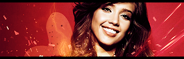

4 really called out to me. I think it's because it's very easy on the eyes in terms of colors and contrast.
Eidolon
Guru
Lots of really nice entries this week. I'll just run through them.
#1 I like the concept, but could definitely have pulled it off better. Too grainy. I'm guessing used Threshold for this. If you have Illustrator it is much easier to do stuff like this on that program than Photoshop.
#2 Render has been stretched. A definite no-no. Background messy and far too bright. Colours don't match render.
#3 LOVE it. Really nice use of Topaz as well (God I love that plugin") ). My only objection would be the white/grey on the top left. Thinks it would be better off without, or if it was part of the C4D, maybe erased or duplicated over.
). My only objection would be the white/grey on the top left. Thinks it would be better off without, or if it was part of the C4D, maybe erased or duplicated over.
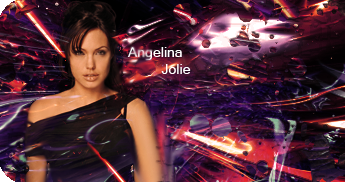
#4 Definitely like it, but text could definitely be better and perhaps missing that wow factor. Nice depth and lighting. Hard to criticize but missing something IMO.
#5 Someone went a bit C4D trigger-happy Try to create flow with the C4Ds, that flow with the render, and not just place them anywhere. Used to many effects, and PLEASE pick better renders. No matter how good you are you cant make a sig with a rubbish render.
#6 Really like how it is really RED I like it a lot, the only thing would be perhaps blend the render just a little, and maybe tilt so it covers that little bit more of the canvas.
#7 Hm I see some good techniques in there, but for me, it just doesn't come together. I'm not positive, but to me the render looks a tiny bit squashed. There is no flow and the text is poor. The duplicate face in the corner is definitely not my thing, though others may like it. The soft dots of light are nice, but don't go at all with the very sharp rest of the sig. Like the clipping masked areas. A bit monotonous as well.
lmao can you tell from my opinions which one is mine....haha
#1 I like the concept, but could definitely have pulled it off better. Too grainy. I'm guessing used Threshold for this. If you have Illustrator it is much easier to do stuff like this on that program than Photoshop.
#2 Render has been stretched. A definite no-no. Background messy and far too bright. Colours don't match render.
#3 LOVE it. Really nice use of Topaz as well (God I love that plugin
). My only objection would be the white/grey on the top left. Thinks it would be better off without, or if it was part of the C4D, maybe erased or duplicated over. #4 Definitely like it, but text could definitely be better and perhaps missing that wow factor. Nice depth and lighting. Hard to criticize but missing something IMO.
#5 Someone went a bit C4D trigger-happy
Try to create flow with the C4Ds, that flow with the render, and not just place them anywhere. Used to many effects, and PLEASE pick better renders. No matter how good you are you cant make a sig with a rubbish render. #6 Really like how it is really RED I like it a lot, the only thing would be perhaps blend the render just a little, and maybe tilt so it covers that little bit more of the canvas.
#7 Hm I see some good techniques in there, but for me, it just doesn't come together. I'm not positive, but to me the render looks a tiny bit squashed. There is no flow and the text is poor. The duplicate face in the corner is definitely not my thing, though others may like it. The soft dots of light are nice, but don't go at all with the very sharp rest of the sig. Like the clipping masked areas. A bit monotonous as well.
lmao can you tell from my opinions which one is mine....haha
Number 4. Just ... wow. The colour, the shading, the stock, the effects ... are epic.
#3.
It just seems to have more of a professional (I can't think of the right word for it) look than the rest...and it stands out as being different. The effects are placed in perfect postitions, the font is amazing and overall the general flow of the sig is fantastic.
Therefore, # 3 for me.
It just seems to have more of a professional (I can't think of the right word for it) look than the rest...and it stands out as being different. The effects are placed in perfect postitions, the font is amazing and overall the general flow of the sig is fantastic.
Therefore, # 3 for me.
4, because it has really nice, soft lighting, with good depth and beautiful, matching brushing in the background. The text is okay, but it's not reallly that big a deal.
The second best tag I think was 3; it was generally appealing, but then I noticed that the stock was too small for my taste and that the background felt a little awkward.
The second best tag I think was 3; it was generally appealing, but then I noticed that the stock was too small for my taste and that the background felt a little awkward.
Eidolon
Guru
L i g h t ♥;351775 said:4, because it has really nice, soft lighting, with good depth and beautiful, matching brushing in the background. The text is okay, but it's not reallly that big a deal.
The second best tag I think was 3; it was generally appealing, but then I noticed that the stock was too small for my taste and that the background felt a little awkward.
Actually there was no brushing involved, but thankyou very much
")
And garr the more I look at it the more I hate the text...I want to change it now

Hana
Mother's Favorite
I think a certain persons winning streak is finally over, lol.
My vote goes to #4. Great depth and lighting. Really simple design and text that I find very appealing.
I would have voted for #3 which was very nice but the stock is just really small.
My vote goes to #4. Great depth and lighting. Really simple design and text that I find very appealing.
I would have voted for #3 which was very nice but the stock is just really small.
Enrage The Sky
Narmy's Army Class 1
3 because it stands out more to me 
- Joined
- Dec 14, 2006
- Messages
- 11,628
- Location
- California
- Gil
- 0


- FFXIV
- Mitsuki Calei
- FFXIV Server
- Lamia
- Free Company
- Gaia
I'm really liking 3, 4, and 7.
3 is very smooth and quite glossy, which really appeals to me. I like the artistic style of colors used and the flow of the overall signature...but somehow the stock doesn't match the background and it was placed exactly in the middle. =/ The signature length is a little too long, but other than that, it's one of the best there, especially the text. Wow I just love that text! Looks great!
4 is smokin' hot. =] I quite like the tiny red flares (?) flickering here and there - it just added cool effects to the already amazing sig. The lighting used was really good and last but not least, nice choice of render. Quite dramatic and classy. Again, the only problem is the text. It's not so bad though, but I thought it could've been better.
7 is an amazing sig as well. I like the colors used and the effects are definitely up there. But...the text could use some work. Overall though, signature is simply easy on the eyes and would have probably voted that as my second choice.
But number 4 really do give me that WOW factor. I just love it.
Number 3, definitely. The brightness around the stock really works well.
4 is faaar too big.
4 is faaar too big.
Just for the record, 4 hardly classifies as big. I think you have it mixed up with 5. 5 is a bit too big for my personal tastes.
Anyway, I'm absolutely loving 4 as well! Very nice work with the effects and the stock is just gorgeous! My vote goes for 4.
Anyway, I'm absolutely loving 4 as well! Very nice work with the effects and the stock is just gorgeous! My vote goes for 4.
- Joined
- Jun 20, 2006
- Messages
- 2,517
- Age
- 34
- Location
- West New York, NJ
- Gil
- 3
- FFXIV
- Itami Raizou
- FFXIV Server
- Lamia
I like #4 I like the colors and the effects in it, so I'll go for it.
Eidolon
Guru
4 is faaar too big.
I'm trying very hard not to sound defensive here, but I would rarely say most canvas sizes are too big. The choice of canvas size should depend on the choice of stock. Some stocks look better on long/thin, some suit a more even shape.
I would say the reasons sigs are generally smaller, is because it suits the forum (and not having to scroll down loads) or the stock/render.

- Status
- Not open for further replies.