SOTW 39 voting thread

Which signature is best?


  • Total voters
    17
  • Poll closed .

L

Iller than Radiation
Veteran
Joined
Jan 15, 2007
Messages
4,103
Age
35
Gil
0
FFXIV
Ellen Stone
FFXIV Server
Adamantoise
You guys should know the drill by now. If you haven't read the updated rules, you can find them here.

Votes that fail to comply with the rules by the time the competition ends will become void and null, and will therefore not count towards a signature's overall number of votes.

1).
fireemblem.png


2).
Jaffarsig.jpg


3).
fireemblemsotwentry.png


4).
Fire-EmblemSoTW.jpg


5).
Soren1copy.png
 
Definitely 4, the colors blend amazingly well and it just looks awesome in general. Second choice would be 5, it's done really well too, I just don't like the choice of color too much.

2 is just... *shakes head*
 
I like 5 the best. Colors blend well and I enjoy the background and border.
 
#4 Had nice colors and border but I can't really make out the render in it.

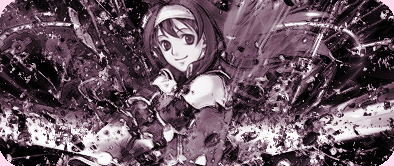
So I voted for #3. It had an interesting border (4 corners ftw?) and the stock was clearly seen.
 
#3, because it looks like the anime is blended in with some real drips of water (not sure if that's what it's supposed to be, but it looks awsome), and I like the colour used.

#5 was prety close, me thinks. I just can't remember where that character is from...

But yeah. Three.
 
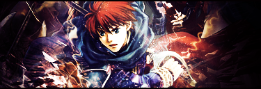
It's between 1 and 3 for me, but I'm gonna go with 1 here as the stock really blended well with the background's color and effects. The effects weren't just placed randomly for the sake of "cool effects"...I mean, the whole signature just gives off that energetic feeling and is just awesome!

3's effects also matched the stock (looks something like a blowing upward effect and the girl's hair has that "flyaway" feel to it, so yes, it matches well enough.) and you can also feel that energetic vibe, but I thought number 1 was just a tad bit better as I prefer clear, smooth-looking sigs. 3 was a little too sharp, but stilll a great sig though, and I'm loving the borders. =]
 
i think that 4 was the best as the colours used in the background blend well with the characters suit of armour and it all round looks cool
 
1 all the way. It has nice coloring, nice effects, good focal point, etc etc, although it was a little busy.

2 is just... um...
3 lacks color and is a bit busy.
4 is good, but the colors and depth are unappealing.
5 is okay, but it also lacks color, effects, and is generally washed out by the overwhelming yellow.
 
Fire Emblem?! This pleases my inner fangirl quite a lot.

My vote is for 4, the colors really catch my eye.
 
1 for me. The lighting, colouring, depth, distortion, and just the overall feel of the signature were executed very well.

Though the right side of it puts me off a bit, it's colours are pulling my eyes away from the other entries. :monster:
 
I'm going with #4. The colors are awesome. They blend well, too. Ooh, and the armored dude is badass looking.

I'd vote for #2, but I couldn't back that vote with a good reason. The text is pretty funny! If the target was humor, that one'd take the gold.
 
I voted for 4 it's the best, my second choice would be 1 , however 2 is just . . . I can't say
 
1 is awesome - it's very well done, graphically eyecatching. The others are alright, but everything just seemingly fits into place. Kinda like sigs I have had before in the past.
 
I'm going to go for #1 purely because, although I like the colours more in #4, the render in #1 looks more clear and has much more depth to it...and well, it just generally flows better.
 
Not particularly a fan of any of these I'm afraid.

#1. is pretty good actually. maybe a bit cluttered, but it's just not really my style. also it looks a bit grainy in places.

#2. well I'm pretty sure the maker is a novice. not much to comment there, just keep working to get better

#3 aaaaah with the monotone. this is one of a number that have this same monotonous purple look. please add some different colours or at least some contrast. however I will say there looks to be improvement from previous, since I now see effects in front of the render also, helping blending + depth.

#4. generally a bit too blurry. no sharp effects. I like the blending on the render and the way that it is in the foreground, but needs foreground effects. missing that wow factor.

#5. generally nice but make the render stand out. at the moment it is just a very flat background. the screen thingy is cool, but maybe duplicate the render layer, move it above, and set on overlay (with a bit of smudge to blend)?

yeah so my vote to #1
 
Back
Top