Navigation
Install the app
How to install the app on iOS
Follow along with the video below to see how to install our site as a web app on your home screen.
Note: This feature may not be available in some browsers.
More options
You are using an out of date browser. It may not display this or other websites correctly.
You should upgrade or use an alternative browser.
You should upgrade or use an alternative browser.
SOTW 22 Voting.
- Thread starter Six
- Start date
- Tagged users None
- Status
- Not open for further replies.

 I love the lighting in both pieces, and the texts too. Great job to the both of ya
 ")
DAMN GOOD.
*phew* Hot damn.
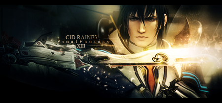
Very hard choice but in the end, I went with #1 . It just appeals to me more and I like that is is dark, but has clarity of color and image. It looks very sleek and dynamic and I like looking at it, so it got my vote. The other one was beautiful as well, but I just liked the asthetic in the first one more. Really, these are both superb entries.
Damn, if I had known of this theme, I would've entered. XD
*phew* Hot damn.
Very hard choice but in the end, I went with #1 . It just appeals to me more and I like that is is dark, but has clarity of color and image. It looks very sleek and dynamic and I like looking at it, so it got my vote. The other one was beautiful as well, but I just liked the asthetic in the first one more. Really, these are both superb entries.
Damn, if I had known of this theme, I would've entered. XD
Both are very well done.
I love how clean they both look.
However I voted for #2 because it appealed to me moreso.
I love the colours used and the different fonts.
The splash of colour coming up from the bottom and over into the right hand corner flows awesomely and the empty space over the top left side makes it look uncluttered and the focus stands out more.
Great work to both. =)


Oh wow, I was a bit unhappy about having not had the time to enter this, but these are absolutely stunning and I would have had no hope of even getting a single vote. 
#1 - The lighting and colours are incredible. I love the contrast! The effects are subtle but absolutely gorgeous!") The text is perfect - I love the font, size, placement and use of a line to balance it out. The black border works perfectly to balance and frame the piece.
The text is perfect - I love the font, size, placement and use of a line to balance it out. The black border works perfectly to balance and frame the piece.
#2 is also quite gorgeous. I absolutely love the splashy effects. How did you create these? *wants to have a go* If you COULD send me a tutorial or something, that would be awesome! The render is very well placed and the blending us super. The text is gorgeous and works incredibly well with the colour scheme.
My vote goes to #1 . The colours in this appealed to me more and consequently the piece feels a little more glossy. Both are excellent in terms of technical effects, composition and text, but in the end, #1 just appealed a little more for its colours and contrast.
#1 - The lighting and colours are incredible. I love the contrast! The effects are subtle but absolutely gorgeous!
The text is perfect - I love the font, size, placement and use of a line to balance it out. The black border works perfectly to balance and frame the piece.#2 is also quite gorgeous. I absolutely love the splashy effects. How did you create these? *wants to have a go* If you COULD send me a tutorial or something, that would be awesome!
The render is very well placed and the blending us super. The text is gorgeous and works incredibly well with the colour scheme. My vote goes to #1 . The colours in this appealed to me more and consequently the piece feels a little more glossy. Both are excellent in terms of technical effects, composition and text, but in the end, #1 just appealed a little more for its colours and contrast.
I really like both of these! :3 Great work to the artists~
#1 GMV because the darker color scheme appeals to me more, && it really fits Cid Raines well.
#2 is very pretty though! xD
#1 GMV because the darker color scheme appeals to me more, && it really fits Cid Raines well.
#2 is very pretty though! xD
 Sorry for the late announcement.
- Status
- Not open for further replies.