SOTW 212 Voting Thread.

SoTW 212 Winner?


  • Total voters
    14
  • Poll closed .
Status
Not open for further replies.

Warbsywoo

Hellodia.
Veteran
Joined
Apr 15, 2007
Messages
4,891
Age
35
Location
California
Gil
2
The theme this week is: Freestyle.

Here are the entries I received:

1.)
Mieu%21%20SOTW.png


2.)
sotwentry.png


3.)
35jjr7m.jpg


4.)
dancestyle.png


5.)
yunasigcopy-1.jpg


+ Voting ends in 7 days
+ Entrants cannot vote for their own entries.
+ Although posting is not required for your vote to count, it is highly recommended.
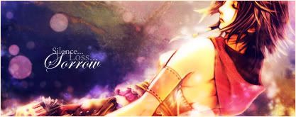
 
#4

This one is just brimming with creativity and vibrant colors and instantly drew me in. She melded perfectly into everything around her, and while her shattering arm doesn't exactly get me in a frenzy it's refreshing to see things like this in pieces.

One feels really rather empty and much more could have been added. It just seems very incomplete with it's simplicity.

Two was my second pick for my favorite. The imagine, while still very clear is just a tiny bit chaotic (emphasis on tiny, mind) and could perhaps use a border. Still a nice signature.

As for three, the flare effect in three is simply too overwhelming, and the lightness of the signature did not seem to suit the image very well.

Finally, number five is a good piece. It's position seems right with both the image and text, however, the colors don't seem to meld very well at all. It's a bit too much contrast for me and makes the focal point very hard to focus on.
 
#1. I think this signature was a little too simple. There might have been put a ton of work in to it, but the the even colours it just eyes very plain. I think had it had some more darker effects or some complimenting colours it would stand out a bit more than it does right now. I don't think the text suits the piece that well either. :sad2:

#2. Not a big fan of multiple people in one signature. This is my personal preference, which is why I think this signature is a bit overwhelming. Had you taken number 2's effects and put them in one it would've worked, but three people + a crowded background... Is hard to pull off.

#3. I'm gonna go with Jeff on this one, however, while I do think that the light source is correct, and fine as it is, I think it's too overpowering, it's basically all you look at. Not a fan of the font on this signature either. :gonk: Sorry...

#4. It was nice enough, wasn't a fan of the line at the right side, of course, all of the feedback I'm giving is based on my personal opinion, so while others might like it, I'm just stating my opinion, no offense meant to anyone. :gasp: I like the effects in this one, and even though the girl doesn't really seem blended in - I actually like the effects on her arm. :D

#5. Definitely got my vote. I think the whole signature is composed well, and presents itself very nicely. The text is pretty, the effects around Yuna is pretty, and there's a bit of a split focal, you have the text which is a tad distracting, and you have the render which is distracting too, so a bit of both, which makes a perfect balance for me. Love it.

:ryan:
 
and my vote goes to number 5 :grin:

nice background.. the effects around the render are amazing :grin:.... the text is just beautiful.. and come on.. it yuna XD

I agree with the others on number 3... it too overpowering :hmph: that light is soo bright that it almost killed my eye XD.. need to tone the lighting on that one a bit.. or set the layer to overlay
 
I voted for 5. I looked them all over and it was a really close call as to what to pick...but for whatever reason I went with 5 :lew:

One is cute but a little on the simple side for me. I do like the coloring and the boarders...and the stock image is so cute though :ohoho:

Two is nice but to me there really isn't a focus on any one thing in the signature. The colors blend really well together...but there is no text and real oomph to it.

Three is really nice, and would be my second choice for a vote. The spiderman image has a very nice quality to it...and I like how the background emphasizes that.

Four is also nice...the stock is very crisp and clear...and the coloring is very well done...I just don't think I particularly cared for the image too much itself.

I voted five because I like the coloring and the stock that was used. The effects are very gentle and the text is very pretty and in a nice spot.


  • Like
Reactions: Six
I voted for number 3. I liked the dusty kind of colour wash over it and thought it suited the picture nicely. It's a little big but I still like it and I am a really big fan of simple crisp text like that if it's done right :D

my second fav was 5. Nice colours and picture and technique. Very good job.
 
1. Sorry but just too hard to tell what it really is for me

2. I do like the design very well and how you added multi people so well, but at the same time it is a little bit hard to do but still very well done.

3. If it would of stayed all dark It might of gotten my vote, but the bright light seems to kill the evilness in the picture

4. :jess: all i can say

5. very creative and well done. I like the colors and the image very much.

So 5 wins it for me.
 
If number 2 would've had a bit more cleaning up done to it, I would've voted for it. However, seeing as how that's not the case, I'm gonna give my vote to #4. Despite the not-so-appealing background, I just felt it had more to give then any of the entries overall. Not to disallow any of the talent to the artists who did the other entries cause all of them are fab. ;))
 
Congratulations to Dragon Mage for winning this week's SoTW. :jay:

1.) Draklor
2.) Emperor Lelouch
3.) Ryuu
4.) Dragon Mage!
5.) Lirael
 
Status
Not open for further replies.
Back
Top