SKX Creations...

Exoskeleton

Pale Flesh
Veteran
Joined
Apr 5, 2009
Messages
3,389
Age
33
Location
Locked Away
Gil
9
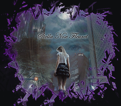
These are wholes of double sigs I have been using lately. My old thread has been lost in the sea of GFX by now! XD So I guess I'll start a new one!

haha so here we are! My recent works...

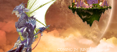
This is an add for the RP I'll be creating in June. Working on it as a project now...
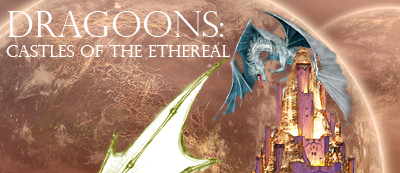
Drag1.png

Darg2.png


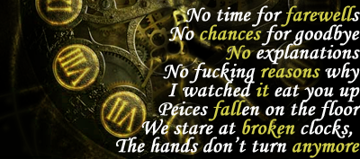
Clock thingy...The lyrics are from the song "Suicide Season" by BMTH.
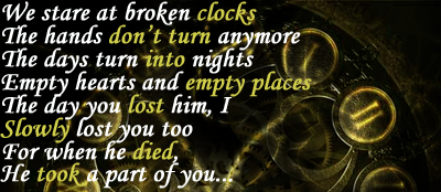
C1.png

C2.png


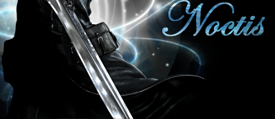
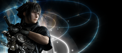
And this is a recent one I made from a rendered Noctis!
N1.png

N2.png


haha tips and comments are appreciated! I really want to make a carrer out of this so I need to practice as much as I can!
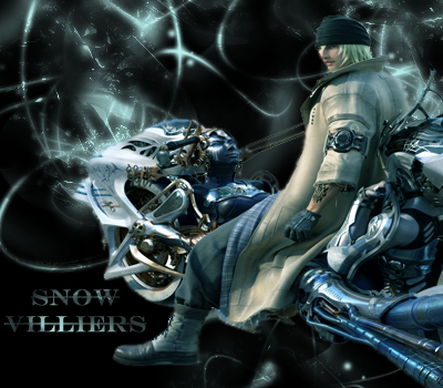
 
Very nice man! Only thing I can suggest is making them smaller maybe? C:
 
More...no comments :sad3: But oh well! I gotta keep experimenting!
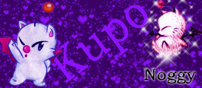
Here are more: These are siggy and avi sets:

Moogle:
moogle.png

moogle-1.png


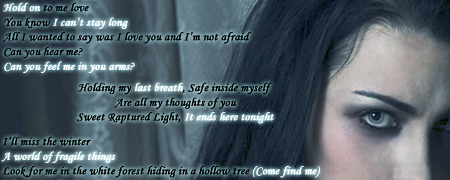
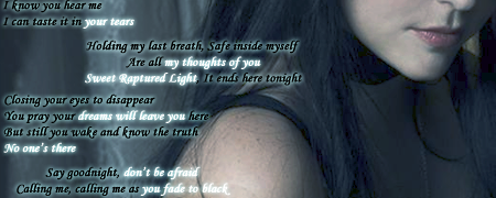
Amy Lee from Evanescence:

Amy1.png

amy2.png

Amy.png
 

This is a cute set.

The colours are cute.

The signature I think has a bit much going on. I would limit the text to one line in one section of the signature. Too much text all over the place tends to look a bit messy.

Same thing goes for images. Though it's not too bad in this signature.

The avatar is really nice though. Simple and cute. A one pixel border would make it stand out more in my opinion.


This doesn't really strike me as a signature.

The size of it makes me think of it more as a album cover.

I think that there is too much writing on there as well.

Limit it to two or three lines and it will be more effective in my opinion.


This one is much better!

Nice and clean looking.

The light near her face is a bit much but other than that it's nice and simple. =)

Keep it up!
 
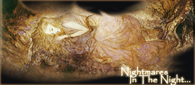
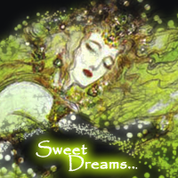
I've been looking into some of my favorite artists for images I could use as sigs and Avitars. I love these images and the artists who made them! :P

AMG.png


dream.png


ayam.png
 
I've been looking into some of my favorite artists for images I could use as sigs and Avitars. I love these images and the artists who made them! :P

AMG.png
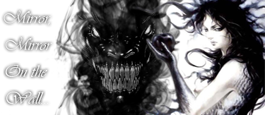
/eyegasm

This one is amazing IMO. Just the black and white smokey look works so well and clashes with the clarity of the face in the smoke. The text seems to be visible only by the shadow it casts, which is nice...This one gets a 10/10 from me

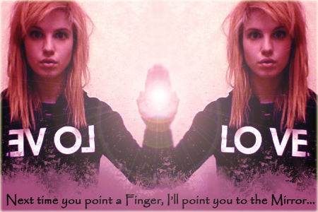
Haley.png


more shiz
Well, the text is nice...Bit I'm not too fond of the choice of lighting in the middle. It's placed perfectly, but it seems to be too clashing of a style. I think it would look better with a softer lighting right there. . I do like the choice of colors though. I give it a 7/10, I've seen you do better.

Keep it up :jess:
 
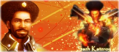
Made a new siggy for Joey. Hope he finds it here :hmmm:

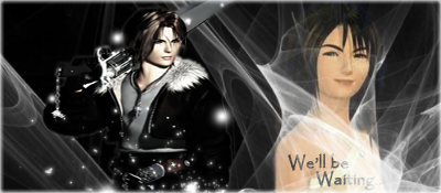
Anyways this was a fun peice. I learned so many techniques during it that I've found some new types of layers now! :yay: here it is! Feedback appreciated!
Sazh-1.png
 
Okay So my new stuff is definitely getting better. The more I experiment the better my peices become. I find that manipulating the types of slides and adding lighting, glowing effects can really work out. Sadly though I'm lacking in brushes as I lost most of them due to computer virus.

Anyways here's what i gots so far.

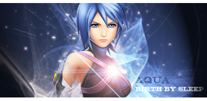
KH set:
aqua.png

aqua-1.png


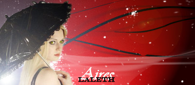
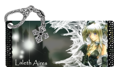
My Rp character Laleth:
lalethproject.png


So? Tell me what you think! Hehe! The KH sig has to be my best work yet! xD

I'll keep working hard! Goodbye for now!
 
Triple post in a row :hmmm: that's a first for me xD

But anyways I've been experimenting! here are some new ones! And I know it's very border heavy but I'm finding what works for me and what doesn't...so bear with me :P

Rouge.png


End.png


FF8-1.png

- I've always avoided making FF8 sigs because I highly respect the game and can't possibly find the images I want xD. So This time I tried it and I know there's something missing from it...I tried almost everything I could think of xD I really like the placement of Rinoa though.
 
aqua-1.png


^^This is very, very good in my honest opinion. It is done very well and looks very high quality. I like the effects around her and how they don't cover her up, but envelop her, like they should. The overall color is very good and I love the text. I see depth as well, which brings out the piece quite nicely. Can't wait to see more like it (y)
 
aqua-1.png


I sincerely believe that you should continue in this direction. This is by far, out of your update, the best I've seen from you. The lighting is great, and you really brought out the best of aqua

Good job (y)
 
Thanks alot you guys! ^_^ I worked really hard on that one. The next couple of works I post I worked just as hard on, even more for one in particular! I've learned so many echniques reading tutorials and experimenting on my own. Please give me more feedback! I really enjoy improving! ^_^
Avi's:
stel.png

Made this for someone but they never used it so...
kusanagi.png

Motoko Kusanagi
Selph-1.png

Selphie!

Sig:
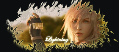
Lulu-1.png

Experimental siggy...

They all kinda have some Green/yellow theme going on! D: And I made them all at way different times so that's really weird...
 
Last edited:

As others have said, this is a very nice piece.

Looking at your other work I would say it's the best out of the lot.

I love the how everything is directed at her and the lighting around her looks fantastic!

Cute text and nice placement. The half border looks really neat too.

Keep up the nice work. =)
 
Thanks for the comment! I know my KH sig is a nice work but I'm hoping some of my other new stuff could be judged as well please? ^_^ I'm still looking for improvement.

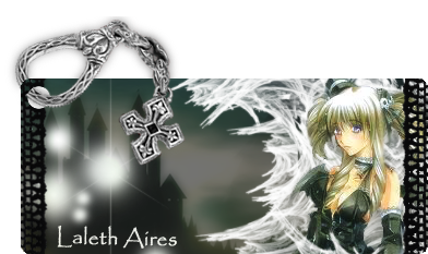
I found a nice way to do a Laleth Sig. This one was inspired from Yumiko's work. It's another Laleth sig of the rp character I made.

lalpromain-2.png
 
Last edited:
lalpromain-1.png


OH god yes, this one is great, and perfectly done. Pop-out tags are always a plus in my book,but aside from that, I love how you went as far as the concept goes. The chain..lock..thing is perfect. I love the colors; nice B&W. My only concern is the text. I think it's too far away from the focal, and that ruins the overall flow of it imo. Maybe if you were to make an applied layer on a new layer, and then flip horiznontally, and you could apply that same text on the lower portion of that white stuff.

Really good overall, though. Keep it up :)
 
Back
Top