Navigation
Install the app
How to install the app on iOS
Follow along with the video below to see how to install our site as a web app on your home screen.
Note: This feature may not be available in some browsers.
More options
You are using an out of date browser. It may not display this or other websites correctly.
You should upgrade or use an alternative browser.
You should upgrade or use an alternative browser.
Sabriel's GFX Fusions
- Thread starter Sabriel
- Start date
- Tagged users None
- Status
- Not open for further replies.
That looks like it, although you could have lowered the Opacity. Your using GIMP, right. I didn't see that you were until now  In photoshop, you could go to Layer-Adjustment Layer-Gradient Map and chose a gradient you wanted to apply and then chose the layer blending you wanted and then lower the opacity as you see fit. In GIMP, I has no idea.
In photoshop, you could go to Layer-Adjustment Layer-Gradient Map and chose a gradient you wanted to apply and then chose the layer blending you wanted and then lower the opacity as you see fit. In GIMP, I has no idea.


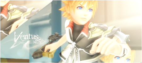
I love what you've done to the top left and bottom right corners. The text is gorgeous - though the words below "Ventus" are really tiny. It's simple, vibrant and clean. However, you could have toned the brightness down. It makes the overall thing seem hazy. If you do that, then it's perfect!

Your FFXIII ones (particularly the ones with Lightning, Sazh, Vanille and Fang ones) and your Avatar sig are also beautiful. The effects you amalgamated into the sigs are really nicely done. They're clean and simple - I can't fault the placement of the texts. Add borders on and there! They'll be perfect as well!
Keep going, Alison! I can see you're really getting better!


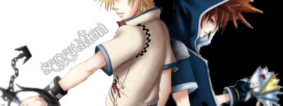
The text isn't close enough to the focal which should be the render in this one I think. I would also add a light source and maybe burn the edges of the tag to clearly define what you want the viewer to look at.
Maybe some more effects and blending wouldn't go amiss either.
I prefer the avatar. It's nice and clean.
Keep it up.")
Maybe some more effects and blending wouldn't go amiss either.
I prefer the avatar. It's nice and clean.
Keep it up.

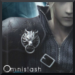
The image looks a tad slapped on, Sab!
 I think if you would've blurred him some, it would look alot better! The colours look very vibrant together.
  I'm not sure if it's clashing or not, but I'm really liking those two colours together for some reason. Look so lively.
 The icon is good, nice and simple. =]
Keep them coming!
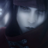
The render could have been blended in a bit more. The guy just looks placed there, which does not look good. The text is very nice, imo, but does seem far from the main focal, like Ewan said. You could have moved it closer to him and then cropped the signature, since moving the text would have left excess space on the left side. A border would have really been nice, too. The piece looks very clean and smooth, however, which can make any thing look great. The avatar looks great. Clean and smooth, like the signature. Text somewhere would have looked good, though.
This one is really good.
I like the smooth look it has about it.
The lighting is well directed, though I feel that the background could have been a bit darker just to get you focused on the character more.
The section up in the top left hand corner is different and looks good.
Nice border too. =)


This one looks quite good.
It doesn't look like to much has been done to it, except for the lighting around the top of them which looks good.
Nice and simple piece. =)
Hey, I was wondering if I could use this sig and give you credit and all that good stuff?
Nah, it looks pretty good as is. Thanks.
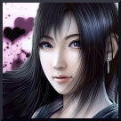
I was looking through your thread and your avatars caught my eye immediately. I think these are the best things you've made, or at least, displayed in your thread. They're so striking in their simplicity, I love them.
I much prefer the Blue Text in the Mitsuru avatar, I love the overall composition of that piece, it's lovely ^^
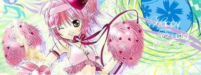
Very cute.
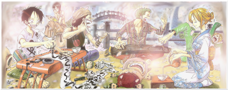
I like the lightness of this piece.
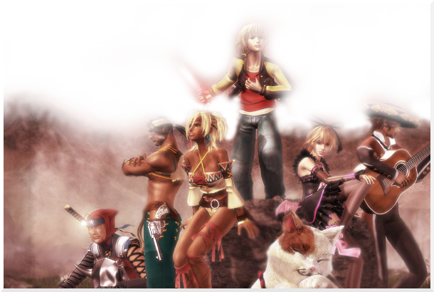
The colourful hazes around them look really pretty and you've done a good job at blurring out the background and drawing our attention to what's going on at the table. =)
Very pretty and simple piece.
Keep up the good work!


This one could use a bit more darkening and the text needs to stand out a little more, it's a bit illegible.

I actually like this one. Though, I don't say much about avatars. It has nice lighting and I like the position of the render/stock

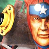
Fallout 3, a classic. Although, this looks a bit bland to me. It could be blurred and have a soft glow effect to it. No other comments.
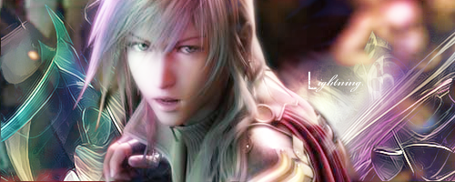
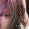
Lightning the sexy femme fatale
 I like the effects on the edges. I'm thinking those are C4Ds, but they appear to be. And the text is great, it just needs to be bigger and have a little type of glow to it. And the render could have been blurred to take of the "grains"
I like these two. They have a nice background. And the texts stand out, but somewhat illegible. It could have used more blending, It looks to me that the render was just slapped on there.
You don't expect me to critique everything do you?
OMG
This is epic, Sab. I love the background effects and color. It's so vibrant and pretty. It really brings out the focal, too. The color is so awesome and really corresponds to the render. The mixture of colors on Lightning are great, as well. The font is great too, although a tad small. Loving it
- Status
- Not open for further replies.