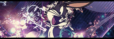
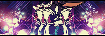
Yeah, that text looked weird to me too, I'll fix it eventually 
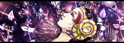
Also, this time, I tried working with more than one render, since I'm on a total CC kick, and I couldn't pick between the three so I stuck them in one xD
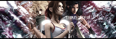

Also, this time, I tried working with more than one render, since I'm on a total CC kick, and I couldn't pick between the three so I stuck them in one xD

 Try not to overlap the render with it since it hogs the attention instead of the render. But if you do decide to overlap the render with a text, do it just a bit and lower the opacity. I think that would be much better anyway.
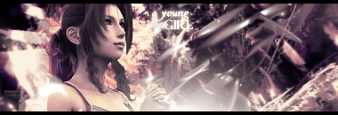
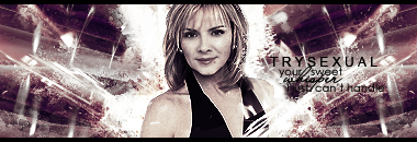
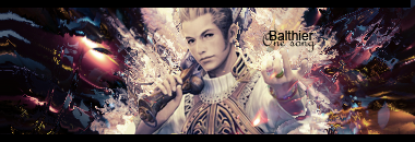


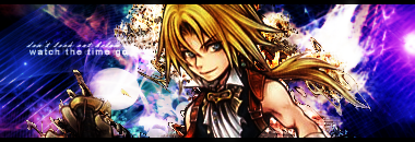
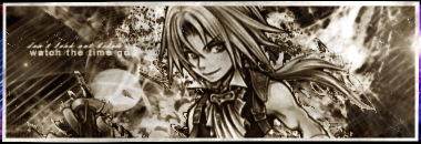
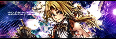
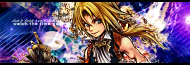

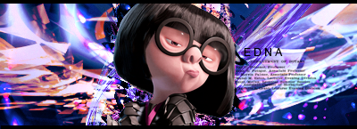
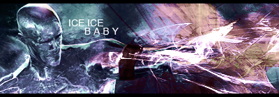
 The colours work very well, and there's not too much contrast in the bg, as there is in 2.