Navigation
Install the app
How to install the app on iOS
Follow along with the video below to see how to install our site as a web app on your home screen.
Note: This feature may not be available in some browsers.
More options
You are using an out of date browser. It may not display this or other websites correctly.
You should upgrade or use an alternative browser.
You should upgrade or use an alternative browser.
My GFX
- Thread starter DSXIII
- Start date
- Tagged users None


You know...You are pretty talented! I actually suck ") !
!
I like Seph sig, it's awesome")
!I like Seph sig, it's awesome
I like your stuff man, its really really good.
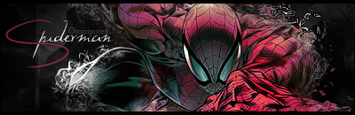
I love the tekken and spiderman ones, uv got major talent man. Nice work.
I love the tekken and spiderman ones, uv got major talent man. Nice work.
- Joined
- Jun 20, 2006
- Messages
- 2,517
- Age
- 34
- Location
- West New York, NJ
- Gil
- 3
- FFXIV
- Itami Raizou
- FFXIV Server
- Lamia
Holy shit. 
You're pretty good I must say, Spiderman and Tifa's sigs are really good, you're pretty good. >.< don't we get talented GFXers everyday?
You're pretty good I must say, Spiderman and Tifa's sigs are really good, you're pretty good. >.< don't we get talented GFXers everyday?
- Joined
- Nov 21, 2006
- Messages
- 2,925
- Age
- 41
- Location
- Nashville, TN
- Gil
- 25


- FFXIV
- Shu
- FFXIV Server
- Lamia
Very nice, I'm enjoying the Prince Vegeta one as well as Sephiroth.
Keep the pics coming!
Keep the pics coming!
I'm gunna repeat Kei here.
Holy Shit.
I love the spiderman and Sephiroth tags. They're really impressive. It's not everyday someone with your talent appears out of the blue.
Holy Shit.
I love the spiderman and Sephiroth tags. They're really impressive. It's not everyday someone with your talent appears out of the blue.


You are just epic win

This sig is AWESOME. I love the colors and the focal is well elaborated on. The text is freakin beautiful and the effects on the bottom of the sword look great. I only have a problem with the right side of the sig and the border. The right side of the sig looks out of place and the border doesn't fit. Otherwise, the effects, colors and background are very well done.
Can you PM me the steps you took to make this to the best of you memory? Please?

Last edited:
It's a bit hard, I wish I'd saved the PSD, but I'll do my best to let you know how it was done. The first thing I do in any signature is place the render. I happened to place this one in the center, however I don't do that often..
I tend to off center things just because it looks nicer to me that way and leaves room for text to balance out, however in this particular piece I achieved the balance through colors, and weighed out the font with some fractals by his sword.
The grainy, fabric-ish texture you see around the signature was from the oversized version of the render. It came from parts of his shirt, I messed with the layer properties to give it that highlighted look over the background.
Speaking of the background, when I begin a signature I always grab colors from the signature and blend them with some blacks all around to make a nice background. This gives more options when you do layer properties to fractals+C4d's or any type of effects brush you might want to use. A little hard to explain, but I hope you get what I mean.
The colors you see in the signature come from a variety of things. I take soft egde brushes and simply pick colors I like and put them where I feel would be good sources of light, or areas I simply want to highlight and then mess with the properties. At first it won't look that great, until you add a heavy photofilter of your choice. It's hard to say which filter to use because it's different for every signature. I believe I used violet on this one. At first it will look too heavy, but take an eraser with about 35% opacity and erase parts of it off until you feel it looks nice.
Speaking of erasing, when you want to have success in making a signature the eraser will be your best friend. Anything from erasing colors like I mentioned before, to cleaning up effects, blending the render, blending C4D's etc. will go a long way in making your piece a memorable one.
That's about all I can remember for that piece, but if there's something I may have missed about it that you have a question about feel free to ask.
Zee text. How did you do the awesome Text? And do you have a distinct way of doing text?
The text was simple actually. I usually don't get too fancy with it, meaning downloading different fonts and all. I normally use the ones that came with windows. One thing to note when doing text though, is that you want to get it in midway in your designing. Some people wait until the end, which I feel is a mistake because it will stand out clearly, which some might not be against, but for me I prefer the text to seem a part of the image, so effects and colors need to blend around it into the image as well.
One more thing is don't be afraid to play with text sizes, capitalization and mix different fonts for the same word. For example you may have a fancy beginning letter and the rest of the word be a plain text. It will come with different results, but just play around until you have something you like.
One more thing is don't be afraid to play with text sizes, capitalization and mix different fonts for the same word. For example you may have a fancy beginning letter and the rest of the word be a plain text. It will come with different results, but just play around until you have something you like.

I'm really in love with this one. <3
All of your work is amazing though, seriously.
It's all so creative and detailed and interesting to look at!
I'm in love with your use of colour in your signatures and you do an amazing job at picking out your fonts!
Keep up the fantastic work!
Can't wait to see more!

I like the smooth look this one has.
The background looks nifty all shuffled up like it is.
I like the tinge of blue over on the left and the lighting is well done.
Great text! The fonts are neat.
You've done a great job. =)

Gorgeous signature, and nice a very nice style!
I love how displaced the vector brushes are, it's like a puzzle. The whole tag has a great feel too it, and I think the colours are gorgeous.
Text is placed - spot. on.
Major props.
I shall comment on your other stuff soon! I looked through your thread, and you are a great GFX artist! ^^
Thanks for the feeback both of you. Yeah it's funny how that one ended up because I was going for a cleaner vector style, but I couldn't seem to place the brushes right. Then I added some lines for a puzzly effect like you said and it worked out in the end. Got lucky that time! lol
Anyways here is one I just made recently, I don't normally do these bright girly pink styles so go easy on me

Anyways here is one I just made recently, I don't normally do these bright girly pink styles so go easy on me
Last edited:


Wow! I freaking love this banner! It's so sick looking, man! The different font is the perfect touch. And the effects are awesome.