» midnight artistry «

Pandora

b l a c k s w a n
Veteran
Joined
Sep 29, 2010
Messages
1,236
Age
32
Location
Feymarch
Gil
0
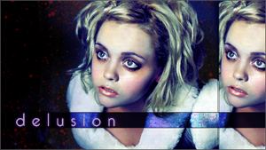
I've used Photoshop for about 5 years now [from 7th to 12th grade], but for the past few years, I wasn't able to use it as frequently as I used to be able to, so my skills have rusted up a bit because of that. But I've been putting in at least 2 hours a day of practice with my graphics. I used to use Photoshop CS2, but due to some technical problems, I wasn't able to install it - so I am currently using Photoshop CS5 Extended, and I've been happy with my more recent signatures :

PRETTY1.jpg
estrellabanner1.png

MYV4.jpg
gynsakurafinalcompletedammit.jpg

GYN5678.jpg

belialrequest.gif
riccibanner.png

hachisig1gh4.gif
rydiabanner.png

emperorbanner.png

kkbannerwhateva.png
beautifulbanner.png

whoa.gif

ravegirlsigg.png

christinaasig.png

estrellasinfulpleasuressig.png
ECSTASYBANNERWOOTWOOT.png


solitudesignature.png


deviantsignature.png
pinkhairasiansignature.png


phenomenonsignature.png


smalltowngirlsiggy.png


misanthropysignature2.png


estrellaartistbanner.png


perfectbalancesignature.png


estrellagruesomesig.png


serenitysignature.png


estrellapurplesignature.png


sexydudesiggy1.png


estrellaeyecandysignature.png


mysticbeingsig.png


enchantedsignaturenotext.png


bodymodificationsignature.png

*Used in Callout

sexydudesiggy-1.png

*Used in Callout


But I still say these are well done. And more will be put up as I create more .

cs-pu-3d-88x31.gif

 
Last edited:
riccibanner.png


saw this in yer clan application post and loved this tag.
Ususlaly not keen on the double image thing either but i love this tag. The blue and white colours are rich and deep. Nice to see some new member good at gfx joiining the site :ryan:
 
You have a nice style, it's interesting, but not too in your face. :ryan:

emperorbanner.png


At first sight this might seem like a simple tag, but I love what you did to the text. Love the font too. I like the overall lighting you have going on on most your pieces.

Your placement, in my opinion is fine too. :ryan: The text could use some work here and there, but that's definitely a last thing to worry about, seeing text isn't a need on a piece. :ryan:

Glad to see you signed up for the Graphic Clans!
 
estrellabanner1.png

MYV4.jpg


Out of the collection of tags here, these two are my favorite. They stand out the most to me because just the way you have the lighting is wonderful.

The first one has great contrast, and the green and yellow shades are really a complement to the stock's natural essence. The text is a bit far off from the focal, imo :hmmm:. As for the second one, the concept is what really brought me to it. Loving the filmstrip-like concept you did. It sort of reminded me of Mark's sotw entry last week. The text in the middle was a great addition, and I just love it. :ryan:
 
I appreciate the comments. One skill I know I'll have to reboost is animation. I made the animated banner when 4 years ago, but since then I haven't touched the animation choices, so I eventually actually forgot how to do it; so I'll learn that again another day. And a lot of people usually like the sigs I make with the Asian celebrities on them. Those sigs take THE MOST time to create out of all of the others I've made - no matter how simple they sort of look, but those are the ones I take the most time to make and the ones I like the most ~ I probably won't have time to make GFXs this weekend, but I'll definitely have the time to do so during Thanksgiving Break .
 
And I just made these two today out of inspiration [first post updated. I should probably make a gallery thread.]

estrellasinfulpleasuressig.png


ECSTASYBANNERWOOTWOOT.png


First one is my new signature ~
 
You have a very good style, and one that isn't stagnant. No complaints.
 
Made these three just now. Third one took the longest, even though I enjoyed using the picture of the guy for a GFX piece. Will probably make more today later on .

deviantsignature.png


pinkhairasiansignature.png


phenomenonsignature.png


*first post updated .
 

These two are gorgeous!

I love the lighting on the first one and how you've broken up the photo like that. Very nifty.

Cute pattern on the right too. <3

The second one is nice and bright!

Love the double vision effect behind him. The pink image of him behind the main focal looks awesome!

I think a thicker white border would have rounded this one more nicely but other than that great work!
 
estrellasinfulpleasuressig.png


Very nice sig. I like how you played around with the colours. The text looks pretty good as well. =)

The all round border looks really nice with the little opacity lowered bar on the left. :ryan: I like what you did with the signature. You kept the effects simple, but the side effects (the border, and text) look interesting.

You got a nice style, Raye. Keep that up. ^^
 
*First post updated.
S
ome signatures I did recently - third being my current sig .


smalltowngirlsiggy.png


misanthropysignature2.png


estrellaartistbanner.png


perfectbalancesignature.png

 
*First post updated.
S
ome signatures I did recently - third being my current sig .


smalltowngirlsiggy.png


perfectbalancesignature.png


These 2 are my faves

The first one is very nice =) I like how you've blurred the stock and used brushes that come down to really emphasise the focal, and it really works. Good job! I usually don't like the focal when its directly in the middle, you made it work, but the text seems a bit too big. Otherwise VERY good job!

The next one is quite cool. I love the photo and I was like "eh, wats so special about it?" until I saw the transparent line. You love ur transperancy, don't you? I love the font used, and this is overall a really good sig =)

Good work overall!!!
 
smalltowngirlsiggy.png


perfectbalancesignature.png


My personal favorites are these two.
1. I love the use of contrast and brightness in this one. The background just has these little pops of light that really bring out the stock beautifully, you've brought out a wonderful balance there. My only issue is that the brightness of the text is kind of overtaken in some areas, I had to kind of glance and squint a few times before I could read out what was typed out. Otherwise this is a magical sig.

2. It's got an eerie charm to it, the font fits, the washed out hues of green and blues bring out the stock. I feel like you might have smudged of burned the area between the coffee cup and her face too much, but that's just me. Nonetheless it's a really cool signature. I love, love, love the transparent line with the signature, it really makes a dramatic statement. It's art. Great job.
 
I'd comment on everything, but I'd be here all day and I'd repeat myself, so I've picked out my absolute favourites from you to comment on instead.


I really like this. You've managed to mirror/repeat images without it looking contrived or messy, it's very effective. The left hand side in particular is great.


I thought this one was stunning. The red/black/white colour scheme is just so effective, and that hint of blue is stunning. The text is wonderful. A really effective piece overall.


I love this one. The duplicate image thing has been done to excellent effect again, and the text on the black/blue bar is an inspired decision.


I love this one. The colours are stunning, and I love the positioning of the Emperor. By creating a black box, putting the text in the corner doesn't seem awkwardly placed, it works well with the flow of the tag and is a really good stylistic choice.


I love the lighting here, it really makes the piece. The text is wonderful as well. It's beauty is in the simplicity of the tag.


I love the colours here, they're very pretty. I'm unsure if all the white lines are necessary, as they sort of disrupt the flow of the tag, and I think it would have been just as pretty without them. The text is nice, but a little difficult to read, especially the "small". Overall though, it's a really pretty tag.


This piece is really nice, I'm loving the lighting and colours, and how you've done the text is really inspired; and totally different to what we normally see. It's an effect that really pays off.

I love your work, mainly because you have your own unique style, and every piece you make is interesting. Looking forward to your next update!
 
*First post updated .

Did several more freely minded signatures over the past week, considering my GFX-ing has been in high gear lately. Third one is new signature .


estrellagruesomesig.png


serenitysignature.png


estrellapurplesignature.png


sexydudesiggy1.png

 
I can't pick which one I like best, so I'll do an overall critique based on what I think :griin:

You definitely have a nack for picking the perfect stocks(at least stocks that are super sexy :wacky:). Your placement is - more or less - spot on, and that I love. Your lighting can sometimes be a bit off, but that's only in some bits and parts. Overall, your lighting is ace :ryan:. Your contrast/brightness is interesting because, in some of your tags, there's not enough contrast, but on the other hand, there isn't enough brightness. I believe the only qualm with your tags is finding the perfect balance of Brightness and contrast, now I know I'm not the expert in that area(no duh :wacky:), but it's just what I think ^^. As far as text, you have a nice way of doing it. I really don't have much to say on that subject.

Keep up the good work, Raye, you're doing a great job. (y)
 
*First post updated.

At this point I'm contemplating on making a Gallery thread. Also, I've decided to put in signatures that I've made to go against people in Callout threads in the GFX Clanhouse. Enjoy~

estrellaeyecandysignature.png


mysticbeingsig.png


enchantedsignaturenotext.png


bodymodificationsignature.png

*Used in a Callout

sexydudesiggy-1.png

*Used in a Callout

 
mysticbeingsig.png


Just have to say that this one is pretty fawking epic, and up in the creepy level. I'm not sure if it's the stock itself or something, but I just love how you used simple effects, with the right lighting to work to your advantage. I believe I see curves mixed with some great levels work. In any case, you did great with this. :ryan:

enchantedsignaturenotext.png


Another great piece. You got placement spot-on, and everything flows well in my eyes. The only problem in my opinion is the brightness in upper-right. I don't know why, but it draws me away from the focal point. Aside that, this is sweet too. :andry:
 
Back
Top