Marlena's Baby GFX

Tucker

I'm a Lover, not a Fighter!
Veteran
Joined
May 1, 2011
Messages
1,100
Gil
1
I had Gimp dowloaded on my computer for a few months, but I never really used it. I played around a few times, but never did much. So yesterday I decided to actually sit down, watch an actual tutorial, download some shtuff and actually try to do some shtuff. And here is the first thing I did!

firstsig-3.png

I know it's very plain, this was after I had downloaded only one brush :olivia:

Here is the second guy I made...
kawaii.png

I played like crazy with the lighting, and in the end I didn't do too much :lew: And I'm not too sure about the text...

And here is the latest piece I made so far...
pink.png


So I would love some feedback because I am constantly guessing when it comes down to it. Also I think they are a bit plain :hmmm: And I'm not very good at blending. But if you could tell me what ya think I'd be very much appreciated ^_^
 
I'm obviously not an expert and am still very new at Graphics but what I found works well for me is go to google and type in things like :hmmm: C4D Renders or Stocks or renders of things you'd think would look pretty in backgrounds like clouds or space nebula's. Then I blend heaps of them into the backgrounds by pasting them on new layers and changing the opacity a lot and changing the layer type to 'Screen' or 'soft light' etc (hopefully GIMP has something similar), it can really add some depth to your backgrounds instead of having them look a little plain.

You should check out the tut that Mitsuki posted in my graphics thread, it's really helpful and i am sure it could be easily translated into GIMP :D

Otherwise I like what you've done so far, I think your second sig is really bright and pretty and with a bit of time spent on the background I think it could look really special :D
 
Just like Toldies, you are on your way to be a great GFX artist! The last two pieces have amazing lighting techniques for beginners.

Now time for comments:
I agree with Toni. Background is a little too plain. You can probably include an image/texture/c4d and then blend it as you like.
About brushes, try to not make them look like they are obviously hand drawn and placed there. Concentrated brushes don't often look nice. Try brushes which cover a larger area, and if possible, blend them by changing opacity and colors.

GIMP is actually almost as good as photoshop in making sigs, especially if you know all the tools. For example, you can't really tell whether my Yeul sig (the blue one) is made by GIMP or photoshop, right? ;)
 
firstsig-3.png


sailor moon gets a instant win n my book.... This is very good for a first signature...... Pretty god blending and im liking the text very much :)

kawaii.png


For a second signature.... Ths is very good..... Amazing lighting fr a beginner also the text goes really well with the render great work for a beginner...... Blending needs a bit or work, using a erazer brush around the edges will help, also graidents with settings such as soft light, color burn, or that will help with your blending as well :) also background needs to be less simple, brushes or maybe even using a stck background image maybe even... My current signature below.... The background is just a stock image :)
 
I really like the 2nd one && definitely the 3rd one! I think the swirly star designs in the 3rd one have nice movement/direction && you didn't over-do it. ^^

Keep up the awesome work! ^__^
 
@Toldies I'll have a look at the tutorial. Yeah I wasn't really using stock photos, instead just brushes, which is why they are so plain. And I'll have to find out exactly how to change layer types, but I never thought of that. Thanks Toni ^_^

@Richard B Riddick haha thanks :P

@Yeul Kreiss I'm glad Gimp doesn't limit itself. That sig is really nice looking and no you can't tell! And I only changed the opacity on the third sig I think, so I'll have to remember that. Thank you!

@Stevie Another Sailor Moon fan :jess: Yeeeaaaah :woo: And I never thought of using an eraser...I'll have to try that. Thanks :)

@Chanteru Thank you ^_^
 
Last edited:
springsecrets.jpg

My newest piece. I tried blending the girl in but I don't think I did too well...But I used the eraser and used a different layer type and gradients. Feedback is appreciated ^_^
(Please ignore the white border, I did not notice it until now :hmph: I'll fix it later but for now I am too lazy.)

Update: I cut out the white, but also changed the gradient. Which version looks better because I can't decide :gasp: (aside from the white in the previous one)
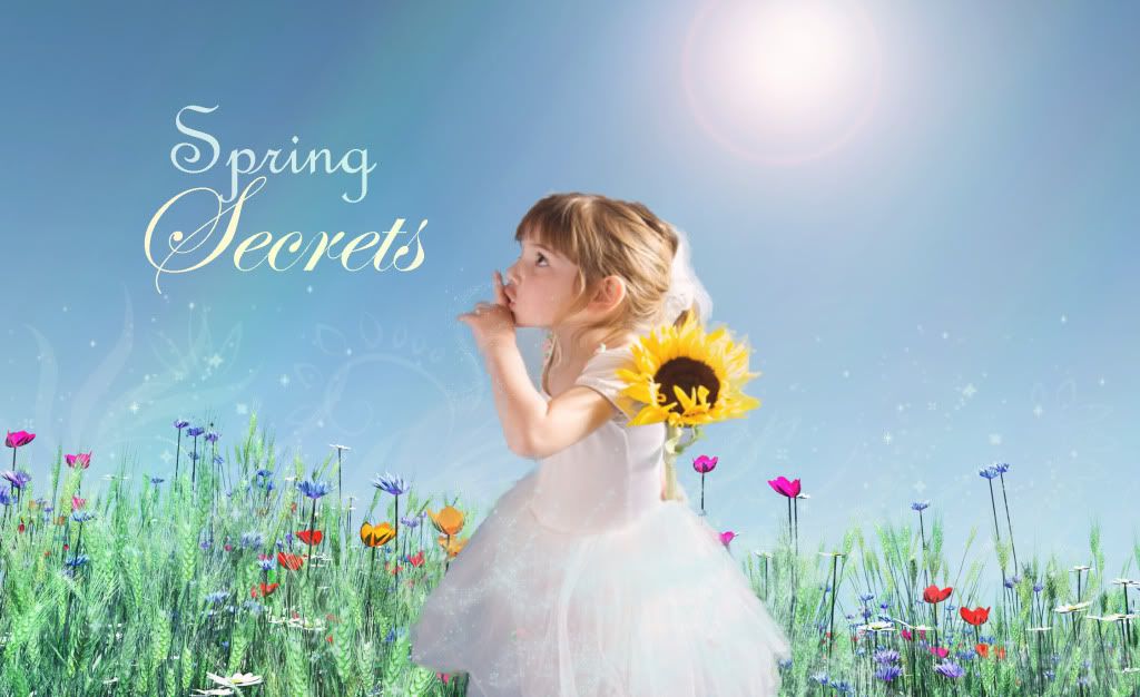
springsecretsnew.jpg
 
I like the colour of v1 better, but without the white :P Its a very good piece, and I think you did a wonderful job of the blending, considering I thought the girl was already in the picture. I really like the text, but I'm not too sure about the sunflower. Also, a little word on the placement for the future: try not to have your focal directly in the middle of the piece, its just a general rule =)

Still, very good job, I really like it! :D

Well the sunflower was already apart of the girl photo. But I agree with you, it does look out of place. And I noticed that too after I was done! I should have moved the girl a bit more to the right. So thanks for the feedback ^_^
 
springsecrets.jpg


If you were able to keep a border for this one, I'd think it would be swell. And also, for a future tip, save all of your images as .png It keeps the quality at a high level. Trust me, you'll see a total difference.
 
Thanks for the comments and I will from now on Ken ^_^

Small Update:
lightningsig.png

I'm not too happy with the text, and I realized after I had saved it that it was too dark. I followed Mitsuki's tutorial on the city lansdcape a bit for this one, and I blended in 2 backgrounds with the render, which I've never done :P Comments are appreciated ^_^
 
I think that lightning one is blended really well, you did a good job and I like seeing that you're starting to add effects into your background to make them stand out more. I think if you keep playing around with effects like this you'll start to get the hang of it :D

Your text could use a little work, it's just a little bit dark and the font could be a little fancier. Kira Six made this lovely little font pack, it has some really pretty cursive fonts and stuff that you should definitely download and play with!

http://www.finalfantasyforums.net/showthread.php?t=51986

or you could go to this site:
http://www.1001freefonts.com/

which has HEAPS of fonts for you to download for free :D

Anyway I hope I helped at least a little bit. I love seeing that you are using different and new effects :D
 
I actually don't think I downloaded any fonts...only brushes...

That site has a ton :O Thanks Toni ^_^
 
More :reptar:
blairsig.png

I regretted doing a purple swirl since it didn't really match, so I tried to make up for it with matching purple text. I don't really know what I think for it, I think it's a bit too simple.
noctissig-1.png

The blending/smudging by Noctis' head is horrible :hmph: I did so much blending and erasing that I just grew tired at the end and didn't even bother :wacky: I also think maybe the blue abstract stuff should have been a bit more transparent. Well whatever :grin:
Oh and does anyone know why the border turned out 2 different colors?
lunasig.png

And here's the last one. I went a little crazy with smudging because I wanted her to look like she was glowing ^_^

Comments are appreciated ^_^
 
I wanna point something out, 'cause I noticed your person proportions don't always seem even. When re-sizing an image, use:

Right Click > Free Transform > (hold shift) when resizing to a smaller size. That way it sizes down evenly. :gasp:
 
Back
Top