
I kind of agree with what Lew said above. I see this tag as two elements: the render/stock and the background. Both of these elements are quite nice when considered separately. The stock has some interesting effects done to it, and personally, I like the feel of it. The background is simple and effective, and the little dots are a nice touch.
I think a little bit of color correction and/or blending would help these two elements come together.


 but its nice. You brightened the original image up which looks great and though it's a pretty simple piece, it looks nice.
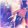
 You've probably seen my comments on your sig in the LP section
 ")
 The colors are stronger and it draws more attention to the stock. I especially commend your use of the glowing orbs (brushed?) because it fills up the piece nicely. I like the bottom tag's text style better, out of the two.