Fusionist's Graphic Attempts

Thanks for the comments!

Okay, I spent a long while today on this sig:

Shuyin and Lenne from FFX-2
37.png


Originally it was really big before, so I did resize, but I still kind of like the bigger version >__<

Anyways, I fooled around with the opacity on pretty much all the layers, and I think I managed to change the glow colour.

As always, comments appreciated ^_^
 
Definitely looking better. You seem to have added more depth to the signature overall and it's not too messy, but actually more organized-looking. (Like, it didn't seem as if you just added a bunch of brush effects here and there). You can still improve, of course...but I do like your text. Nice choice of font.
 
Lovely Fusion!

I love most of them, but most are a bit to light for my liking. The first few boarders were a bit too thick but the others ended up pretty nicely.

^_^ Keep it up.
 
Okay, back with another sig attempt!

Since Dissidia is one of the major hypes right now, I figure I make a sig attempt about one of the characters, and created this:

Ultimecia (FFVIII) from FF Dissidia
38.png


Yeah, yeah, I know, I'm STILL not using C4Ds, but we just can't seem to get a long >__<

And I'm totally in love with that kind of tile background O_O

At this point I admit that the only new things I'm doing is just fooling around the different level of settings than actually using new functions and such.

And I honestly prefer simple designs >_<

Anyways, comments appreciated ^_^
 
hah, well you sure like those lines in the background, anyway I like how you used the soft brushes for making the dot it's pretty good, but still I'm not a fan of those lines it ruins your signature. >.>
 
I'm not really a fan of the tiles. The latest sig doesn't have much flow 'm 'friad. I also feel the top of the sig could be chopped off as it feels vertically unbalanced... :P
The white star-like-things also seem to be added on for no reason other than to make it look prettier. They clutter the bg a bit. :/ I think it would have been better if you had only put those close to the character.

Sorry for all the negative comments but I find those are the most helpful at the beginning!

On the bright side, you've picked good colours for the bg. ^^ And placed her in a horizontally good place. =)
 
'Kay, I wanted to try something a little different, so I came up with this:

Tifa and Aerith from FFVII
39.png


For the most part, my mind was kind of a blank on creativity for this sig; it was more about trying something different then the standard stuff I've been trying to do in the past.

I admit that I couldn't really come up with much for this sig attempt. I wanted to put emphasis on Aerith and Tifa, so I tried those floral design brushes around the pair as a frame kind of thing, but I didn't know what kind of texture design I could use in the sig that wouldn't clash with the low opacity image on the right.

I actually originally put a floral brush at the bottom right, but then I thought I should do at the top right, and by then it started to look too cluttered -_-

Also, I actually wanted to use a nice quote or line or something that could've implied yuri, but the pic didn't really scream romance at me, so I just used their names since you can't really go wrong with that >_<

Anyways, comments appreciated ^_^
 
Last edited:
So simple but yet it's good, by the way do you have Galaxies Brushes? well if you do then try it it's pretty good, and there are abstract brushes using C4Ds try it ^_^
 
I don't go much on the text, I think you can ditch the drop shadow effect especially, it takes all the focus off the stock. If you can brush up something scrawling along the bottom there then that would look great and it would give you somewhere to put the text if you can blend it in right.

In a tag that size you should always keep text that stands out as far away from the stock as you can without making it look tacky.

I think you're definitely progressing though, your stuff is looking much better. I'd like to see you use C4Ds, even if you say you're not getting along with them, post something up with C4Ds in it and we can give you tips and pointers.

Keep at it because you're definitely getting better and I want to see how good you can get. :monster:
 
Alright, some more sig attempts:

Clair and Nel from Star Ocean: Till the End of Time
40.png


Yoite and Miharu from Nabari no Ou
41.png


Ryoji from Persona 3
42.png


Comments appreciated ^_^
 
I like the third sig the best I just like the BG but you know Thanatos is covering the rest of the sig :gasp:
I also like the first one and I like how you used a floral brush I think it's pretty nice but the render is kinda plain :/
second one I don't like it much to tell the truth I just feel it's empty that's all >.>
By the way are the effects on the left side of your last signature of the brushes I gave you? >.>
 
Now that's more like it! =] Your sigs are now very smooth-looking and nothing disturbs the images anymore. I like your last one, the BG on the left side most especially caught my attention, although it's very subtle. Hmm, I recommend making the last two images smaller though and you're good to go.
 
The first one looks good, there's a good use of colour in the background there and the stock works well. I just think it may be a tad bright overall, it doesn't really give off any sense of depth that way.

You're progressing well though, keep it up. :monster:
 
@Kei: Well, Ryoji and Thanatos are the same being...sort of... >_>

And yes, the brush stroke on the left of that sig was from the brushes you uploaded for me, so thanks again :)

Okay, some more sig attempts:

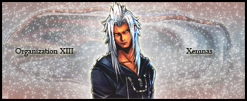
Xemnas from Kingdom Hearts II
43.png

Omg, I had it done but when I was about to save it, PhotoShop stopped working, so I had to do it all over again. And rendering Mansex from the original pic was a pain, but to do it twice...And the first version was better -__-

Dante and Virgil from Devil May Cry 3
43-1.png

Bwahaha, return of the icon thingies; and, um, yeah, I f-ed up with the galaxy brush; made Virgil look like some shoujo character o_O

I also re-did a sig I did a while back, so that I can compare them to see how much progress I've made >_<

The one I made about a month ago
18.jpg


The revised one I made today
18v2.png

And yes, it is very glowy, but I did it on purpose to fill up the sig space >__<

As always, comments appreciated ^_^
 
Last edited:
Well you can't expect that I know who is Ryoji but I meant that Thanatos is kinda big in the tag so it's better to resize the render. :P

Xemnas tag you shouldn't use outer shadow every time on the text xD and I like it somehow it's just that thick brown line that bugs me :gasp:

Dante and Vergil's tag I like the style but you see there kinda washed out they are not clear enough

And for the last tag that you remade I prefer it more than the first one it's kinda better, but it's kinda empty in the top left try a few brushes to fill it :/
 
Your text still needs working and try something different on the BG other than
repeating it.Patterns ruin the stock if they are placed on the stock.Not all tags need a border.
For example the Xemnas tag would look better without it.
 
Patterns ruin the stock if they are placed on the stock.

Um, sorry, what do you mean; I don't really know these GFX terms >_<

And what does GFX stand for; I still don't know o_O

'Kay, I just made this now:

Ryoji and the Hero from Persona 3
Untitled-1-7.png


I like comments ^_^
 
Whee it's cute.An image like this suits light(like on the right side).I disagree with the idea of the left side being so dark,but if you like it then ok.
What I meant to say is,don't make the image you place patterny(don't put on it patterns).
 
Clair and Nel from Star Ocean: Till the End of Time
40.png


I like it, it definitely one of your better sigs in my opinion and the colours go together really well, as well as the brushes look great :P

Dante and Virgil from Devil May Cry 3
43-1.png

Bwahaha, return of the icon thingies; and, um, yeah, I f-ed up with the galaxy brush; made Virgil look like some shoujo character o_O
I love that one as well! :neomon:
You definitely have icons sorted now haha, and the background looks great...I'm not sure whether this was the intended effect or not but when I look at Dante and Virgil I'm getting the impression it's a mirror reflection, either way, intended or not it looks great :wink:

Keep it up! ^_^
 
Back
Top