Frozen Silver GFX Gallery

Jasmine You

s i l v e r - i c e ;
Veteran
Joined
Jan 20, 2008
Messages
1,407
Age
33
Location
Lost Woods, Hyrule
Gil
0

470ffaf4.png
Signatures
(Oldest to Newest)

SophitiaSiggy.png

LinkSig.png

LelouchSigy.png

JackSiggy2.png

Angi-MitoSig.png

HaruSig.png

AerithSig2.png

CloudSig2.png

RiderSig.jpg

BahamutSig.jpg

WitchKingOfAgmarSig.jpg

AangSiggy.jpg

ToshiroSig.jpg

BridgetSig-blackwhite-.jpg

ChunLiSiggy.jpg

AshCrimsonSiggy-notxt-.jpg

TerrySiggy-Noext--1.jpg

SophitiaSiggy-1.jpg

ChrisSiggy.gif

samussiggy.jpg

CainSiggy.jpg

Sasuke-x-NarutoSig.png

GambitSig.png

LinkSig3.png

FoxSig1.png

RitsukaSig.png

MisaSig.png

BestFriendSig.png

ZidaneSig.png

LinkSig345.png

Ryuuki-x-OnyxSig.png

AssasinsCreedSig.png

LeonardoSig.png

NekoSig.png

ANTMSig.png

EminemSig.png

VanilleSig.png

JinSig.png

ZidaneSig-1.png

JakiSig.png

RyuukiSig2.png

SetsukaSig.png

0dcaacf2.png

529f5161.png

4fe4213c.png

0397aaad.png

4e46da5c.png

398061e4.png

e37cae41.png

934e35e7.png

fbcd4253.png

6e0e143d.png


Icons
(Oldest to Newest)

LightningIcon.jpg
Chrisicon.jpg
LenneIcon.jpg
1991Icon.jpg
Zack27.png

Sasuke-x-ItachiIcon.png
ZidaneAvi.png
LinkAvi.png
JakeSig.png
SquallIcon.png

16180290.png


Last edited:
6e0e143d.png

Onomonom. Love this sig :awesome: *Roxas fangirl squeals* The general feel of it is just awesome and the pictures in the middle were nicely placed. LOVE the text.
LightningIcon.jpg

The sparkles just did it for me. Loved the fading in the corner of the av and no text seems to fit this.
GambitSig.png

This is my fav out of yours. Vertical sig + popout + effects + txt = glompage and awesomeness <333 :monster:

Keep up the good work!
 
NekoSig.png


Definitely my favourite of yours. I love the pattern used in here, xD Is that a brush? I've noticed you used it in a few more sigs. It looks gorgeous, and at first it made me think it were those little square thingies from Advent Children. :wacky:

Love the font, colours, and sharpness of this sig. Your work always looks so original and like there was a lot of thought put into the details. Gorgeous really.

Loving your icons as well. I wish I was half as good as that with icons, AND sigs at that xD

Keep up the amazing work.
 
6e0e143d.png

My favourite, quite easily, though I am a fan of Kingdom Hearts anyway so that may be partly why :wacky: The background is very nice and flows well with the rest of the colour scheme and the lighting is effective and used in the right places. The cropped images are a nice touch but don't distract too much attention away from the Roxas render and I like the way you've done the text so that it's not taking away the focal. Grand job!
 
I love the pattern used in here, xD Is that a brush?

Yes, it is, its comes in a technology set. =) I thank Lew for showing me it.

Thanks you guys for the comments, they're very much appreciated. <3

I have an update, I still can't make too much, I don't have my glasses yet, they're coming tomorrow.

26bb0f7a.png


4e30856c.png


Anything on them? <3
 
As expansive as this collection is, I've noticed something interesting;

Seems as if your older work is much stronger than your newer pieces. Then there's also a noticeable trend going on in each time set of sigs, including having very heavy contrast, a bit of monotony, and the exact same patterns in stock placement, resources and general flow. It's good to have your own style, but remember that there's no shame in changing it up a bit every so often.

Everything here lacks diversity.
I also suggest to break into a new color palette.
Take a breather from the earth tones. Sometimes, they compliment your stocks better.
 

This one looks lovely!

I love the detail of the background with the patterns! The lighting looks fantastic right near his face too! It looks as though he's about to walk into the light

The texture of the background looks great and the text looks simply gorgeous! Lovely fonts used!

Fantastic blending and colour use too!

Well done!


Wow I really like the colours in this one!

The purpley/reddish/orangey colours look awesome meshed together.

The focal is well established and the lighting surrounding him looks great!

Once again I love the texture of the background too!

Lovely blending as well!
 
26bb0f7a.png


This one is hot. Your colour scheme going on throughout is very nice. Its quite neutral but it works in very nice tone with the lighting. Loving the vectors to the left aswell. The only thing id change is the amount of light hitting the render, its a bit much imo and looks a bit out of place. Other than that small thing. Nice word Gabriel ;))
 
Thanks for the comments and critique, guys. =)

I made somehting just now, I thought perhaps I could make somehting different?
What do you guys think?

6636805c.png


Just made =)

deb106a6.png


b9e56fee.png
 
Last edited:
Love your works.

I think the goofy one might be a bit too sharp? That the quality of the image is suffering under it.

I love how you work with earthy colours, and keep everything nice and fresh, in my opinion. You have your neat ways with text, that I notice more people have trouble with than there are people that have a good eye for it. xD

Loving your upadte. That icon is really cute as well. :D
 

I love the detail around the girl. It draws your eye to her which is good as she is the focal.

The colours are all very pretty and I love how you manage to mesh them in together so well.

The texture is appealing and the lighting is very well done!

Lovely blending as well!

Keep up the great work!


I think his eyes look a little crazy in this one. XD

The sharp look fits in fine I think and the colours in the background are very appealing!

Lovely detail around his head and also behind the text!

I simply love the font you used by the way.

I think I understand why he has a crazy look now. XD It's a Halloween signature. XD

Awesome work!


This one is very peaceful looking,

It feels very gentle and very loving.

I love the gorgeous soft colours which feel very warm too.

It definitely fit the 'love' theme. =)
 
Thanks for the comments, guys, they're very much appreciated! x3!

I have a somewhat small update and yeah.

SoTW Entry
626a97fa.png


AoTW Entry
TifaStronger.png


And then I have a small sign for my clan, its my first time trying to simulate torn paper and yeah x.x;;

d00796e6.png


Anything on them? x3
 

I voted for this one in the SOTW!

I voted for number 2.

I love the detail within the background and the filters used on some of the effects.

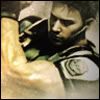
Lovely lighting and the pose of the image with the sword in hand looks awesome and feels very actiony. XD

Lovely blending and awesome use of colours too.

It really is a stunning signature! You did such a good job on this one! Keep up the great work!


I voted for this one! Congrats on the win again!

I voted for number 1.

It looks the cleanest out of the lot.

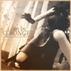
It feels like she's in the moment of performing a kick or something on someone.

The colours look awesome and the text is placed well and is readable.

Lovely border to round it off nicely.


I already commented on this one too in LP! =D

That is so adorable Gabe!

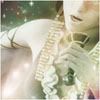
I simply love the text and the whole idea behind it!

The texture of it really looks like old torn paper and the colour for the tape looks awesome!

Love the additions of the butterflies too!
 
SoTW Entry
626a97fa.png


And then I have a small sign for my clan, its my first time trying to simulate torn paper and yeah x.x;;

d00796e6.png


Anything on them? x3

The sig: I like this one a lot, I think everything flows where it should and it has a solid colour scheme throughout, the vector brushes are placed correctly and also follow the colour scheme. The lighting and grungy effects are awesome. If I were to comment on something to add, it would be a border, but I think that just comes down to personal preference.

LP Sign: Awesome work on this, it's creative and original. It has a nice colour scheme, I like the way you've also keep the flower and the butterfly brown as well. The font is a good one, and I really like the tape on the top left, it's a really nice touch.

Keep up the awesome work! :D
 
Thanks for the comments <3
Ryan, the signature does have a border, I guess the dark background hides it x.x;;
Ah well. =)

Extremely small update
SoTW Entry

678e1bd5.png


=)?
 

Lovely work on this one!

I can definitely feel the isolated vibe from this one.

The image is rather depressing and scary. The eyes look zombified. =0

I love the little cut outs of the image over on the left and the text around them looks simply fantastic!

The lighting is well done and the colours suit the theme well.

Keep up the great work!
 
678e1bd5.png


I really like this one because (at least to me) it makes your eyes move in a triangle. First the eyes hit the girl on the right, then the mini pictures and then the main light source.
The mini pictures look really fantastic, I love using them as well! The text work is fantastic as well, I like how you can read it but doesn't pop out too much.
It has a kind of grungy feel, but the feeling of isolation really comes through thanks to the positioning of the girl in the sig.

Well done! :)
 
626a97fa.png

I didnt think this sig portrayed the theme action all that well, however. I think this is a bloody brilliant sig. I voted for it and it was definately the best made tag out the lot.
What i like most is the use of vectors. I love vectors aswell and uv used them to great justice here. The way you can see them in the BG however soome are blended in and covered up. It looks fantastic. Loving the simple lightsource at the top aswell. This tag is awesomeness Gabriel. :mrgreen:
 
So it does, maybe I was sat too far back to notice it :hmmm:

678e1bd5.png

Very good sig :ryan: 
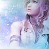
The lighting is fantastic and is one of the highlights of the sig in my opinion, it's extremely good. The stock is also very good and the lighting really brings it out as a strong focal. I also really like the smaller images in the middle, I'm a fan of them when they are used correctly, and you've pulled it off really well. Great work, keep it up :D
 
Back
Top