Navigation
Install the app
How to install the app on iOS
Follow along with the video below to see how to install our site as a web app on your home screen.
Note: This feature may not be available in some browsers.
More options
You are using an out of date browser. It may not display this or other websites correctly.
You should upgrade or use an alternative browser.
You should upgrade or use an alternative browser.
Eliwork.
- Thread starter Eliwood
- Start date
- Tagged users None
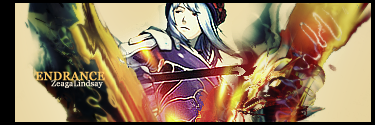
Those Tags you have there are really good. I like all of them. The colors are really well done in each of them. My favorite one is especially the Endrance one from Dot. Hack//GU. These are all really amazing. Keep up the great work. I want to see more from you in the future.
- Joined
- Dec 14, 2006
- Messages
- 11,628
- Location
- California
- Gil
- 0


- FFXIV
- Mitsuki Calei
- FFXIV Server
- Lamia
- Free Company
- Gaia
I like your style. There's still room for improvements, of course, but so far I can see that once you've gotten more comfortable with this particular style, you'll definitely make lots of interesting work. One thing I'll mention is that you have a tendency to be bold when choosing your colors and the placement of your effects. I like that. Keep up the great work!
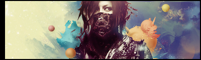
I'm new here, thought i'd show some of my most recent stuff.
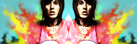
That's about it for now. C&c?
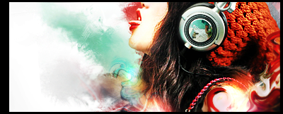
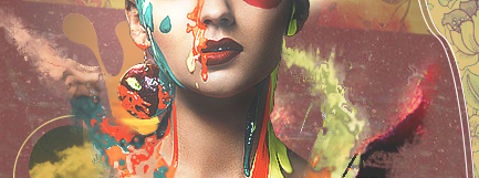
All be damned, would look at who the cat dragged in; Eliwood from KHI, well you already know how i feel about these; the newest one aka the one with the flames is brilliant, love everything about it. The dot hac one is pretty insane, i love the concept of it, and the text is well-placed. That one with the chick with the headphones is hott, and i am not meaning Avril Lagine hott, i mean scortching heat hot, that is your best imo. the last one, the one that is one with the brown BG that one might not be the best out of the four, but still it is pretty sick. the effects over the image is a unique approach, and i love every minute of it : D
Wow these are rather good I must say!
I'm impressed!
Number 3 stands out the most to me and I belive it's because the colours are much more vibrant and the lighting is definitely more appealing.
I like your style very much. It's very artistic!
Keep up the awesome work!
I'm impressed!
Number 3 stands out the most to me and I belive it's because the colours are much more vibrant and the lighting is definitely more appealing.
I like your style very much. It's very artistic!
Keep up the awesome work!
Awesome tag. I wanna learn how you smudged that.

Very, VERY nice work Eli. Your style is amazing. The colors are unique and vibrant. Although I didn't quite like the colors in the last one.. But over-all, I am envious of your skill. Terrific job and I'll definitely love to see more of your work.
Awesome tag. I wanna learn how you smudged that.
Very, VERY nice work Eli. Your style is amazing. The colors are unique and vibrant. Although I didn't quite like the colors in the last one.. But over-all, I am envious of your skill. Terrific job and I'll definitely love to see more of your work.
I'd like to remember how i smudged that lol. I'll have to look through all my brushes to see which settings i used xD
Thanks alot for all your generous posts. I'm happy that you all like my stuff, although it's not all that good.
I think i'll be quite active here (especially the gfx topics.) I think i'll probably enter a few Sotw's, too. Not this week though, i hate Xenosaga >_>; xD
Last edited:
Fate
Archangel
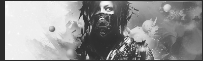
I'm new here, thought i'd show some of my most recent stuff.
That's about it for now. C&c?
Those are some very nice banners!
P.S. Don't I remember seeing you in the Square Forums?
Great work. The effects are well used across all those images.
Keep up the good work.
Keep up the good work.
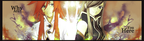
This one is quite intriguing.
I love the smudgy background and the mixed in colours surrounding the two characters. It looks awesome!
The light effect between the two also looks pretty neat and projects enough lighting for the signature.
The characters are blended in very well and the border is great.
The only thing I don't like is the font of the text.
Other than that awesome work!
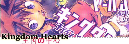
This one is very cute!
I love that image of Sora! The Japanese writing throughout the signature looks awesome and the softness of the tag looks great!
I especially like the dotted line border you used and how you made the text pop out of the signature down the bottom. It looks amazing!
Great work and hope to see more from you soon!
I'm very impressed by your tags.
I always had a soft spot for colorful tags,and in your tags the colors match.I like the style in your tags and how you've tried doing different stuff with them cause that means you like experimenting(right?)
My favorite so far is the last one in your first post,dunno why but it cought my attention instanly.I think it mainly due to choosing to show only certain part of her body,which doesn't always make it easy to work with.
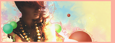
I like that one the best. It's excellently done ^^ Brilliantly blended and I love the effects ^^ I like how the colors are different, but not too vibrant, keeping the focus on the image ^^
Well done
