They aren't terrible! They're lovely! I especially love this one. I love the whole text over text thing (I wanna learn how to do that) and the dark theme of the sig really fits the render. And I just now noticed that part of Cloud's cape was black and white. I love your style! >__<


 looks really cute. I know that font...
  Isn't that...
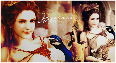
  The colors are so nice, it makes the photo feel like a painting, and I've seen the stock- and the stock's colors were so bland. You did an excellent job there.


