Cali's Graphics

6h0rw3.jpg


They aren't terrible! They're lovely! I especially love this one. I love the whole text over text thing (I wanna learn how to do that) and the dark theme of the sig really fits the render. And I just now noticed that part of Cloud's cape was black and white. I love your style! >__<
 
Aww, thank you, Tsukimori! I can happily tell you how to do the text thing, if you want?:tighthug:
 
>.o Darling I hate to nitpick but you have two L's in control. xD

But your work needs more Aerith oriented work, I'd love to see what you do with just her. =D
 
>.o Darling I hate to nitpick but you have two L's in control. xD

But your work needs more Aerith oriented work, I'd love to see what you do with just her. =D
*doublechecks*
HOLY SHI--

fdgb44.jpg


I don't even know how that happened. :mokken:

Also, Channy, I was originally making an Aerith sig but my GIMP crapped out and it got lost so I gave up. I'll work on some more.
 
OOOOOOOh! Cali! You're Aerith collection looks pretty :P

I like the green siggy and her Avis! I think I'd like to make an Aerith siggy request from you in the near future! :x3:
 
Well, thank you! Just request when you wanna! Also, you can use any of my graphics as long as you credit me.
 
2hg7g29.jpg


I like that one most about your last update. =) The colours look great, and the text is really pretty. ^^ I like that image of Aerith and how you've lined her to the side.

The glittery flow, looks like the wind is blowing softly, and her hair looks like it too, makes for a nice scene. xD Very nice half border topping it off nicely.
 
6h0rw3.jpg


This one is just toooooooo dark. Add a light source in there or something. I have to squint my eyes to just get a clear view of cloud -___-. Aside from that, it isn't too bad. A nice, simple tag :3

2hg7g29.jpg


i really like this one, actually. Usually, I'd say the text is too much, but here you made it work; and the colors you used are just lovely. All i could say is that it's a tad contrasted beyond eye-friendly, but aside from that it's pretty :ohshit:
 
Thanks. ^_^

Here's some random sigs;
sd0bbk.jpg


I wanted this one to be so dark and ebil. Or I tried, rather :mokken: I made the background myself so that's why it looks so weird >.<

zwcltv.jpg

I liked the effects I made in the background. Especially since I made them myself. I usually lack in the art department. I know it looks a little faded, but for some reason it wouldn't get the glossy feel like I wanted. Go figure.
 
Gaspard_Ulliel_by_CaliforniaBabeWV.png


I love him. This is my first time doing something like that. I'm sure I'll get better.

Pretty_In_Pink_by_CaliforniaBabeWV.png

Again, first time I tried to blend the image into something else. I wanted to make it look like the flower was breaking off on the right side.

Gypsy_Nights_by_CaliforniaBabeWV.png


Hmm, the red might be really bright. But I wanted it to look like fire. I really think the blending is good on the left, but I'm not sure >.<

Greek_Goddess_Hera_by_CaliforniaBabeWV.png

I made this the first day the SOTW: Mythology went up. I love it still :mokken:

comments ?
 
1st. If it's your first time trying a style like that, then there's no doubt you'll get better. I love the clean shading towards the sides, and the messy look in the middle. The text looks nice and crispy too. I especially love the -thingies- I have no idea why. xD It just looks good I guess.

I like those black and white on white borders. Looks really good.

2nd. Kinda scary tbh, I was just browsing through your DA, and I saw this, I was like amg purpleness too. xD I like the lime green in the center, it's so... out there. :lew: 
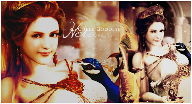
looks really cute. I know that font... :gasp: Isn't that...

3rd. I love the colours in this one, it looks clean and simple, but definitely not empty. I really ike the smudged smoke towards the left, and that font is too cute. :lew: Really nice, the white border makes the colours stand out even more. Great job.

4th. Voted for this one. I prefer the colours on the small image on the right, it's just eye candy. :ryan: The text looked great, and I just liked how you cropped the images to make it in to a full and organized siggy.

Edit: !

THAT FONT IS CALLED BIRTH OF A HERO, RIGHT?! I REMEMBER NOW.
 
Lol, yeah, it's birth of a hero xD Thanks for all the comments Kira <3 And thanks for the vote you gave me :3
 
This one is just toooooooo dark. Add a light source in there or something. I have to squint my eyes to just get a clear view of cloud -___-. Aside from that, it isn't too bad. A nice, simple tag :3

I have a feeling you either need glasses or your computer screen's brightness is toooooooooooooooooooooooooo low.

The whole idea of the tag is darkness.

Anyway.

sd0bbk.jpg


Love the contrast on this one, it really makes him stand out. The text looks great too.

Gypsy_Nights_by_CaliforniaBabeWV.png


This one is really pretty. I like the colors and you're right, the blending on the left is nice. :ryan: Love the half border as well.

Greek_Goddess_Hera_by_CaliforniaBabeWV.png


I already told you how I feel about this tag. :wacky: The colors are so nice, it makes the photo feel like a painting, and I've seen the stock- and the stock's colors were so bland. You did an excellent job there.
 
I have a feeling you either need glasses or your computer screen's brightness is toooooooooooooooooooooooooo low.

The whole idea of the tag is darkness.
Yeah, that was kinda the point. Thanks for noticing Sakura :3


I already told you how I feel about this tag.
wacky.gif
The colors are so nice, it makes the photo feel like a painting, and I've seen the stock- and the stock's colors were so bland. You did an excellent job there.
Daww, Thanks :3 *glomps*

And I'm gonna go comment like crazy on deviantART, I'll be ~camibee.
tongue4.gif
ooh, please do! I never get comments <33 Here's the image I used, by the way.
 
* Icons *
2hgw8yc.jpg
30cnjte.jpg

iwj7te.jpg
2rhpdz4.jpg

2rdafxt.jpg
w019mr.jpg


* Signatures *
2wdzsp1.jpg


(my sister asked for this.)

2dtya1e.jpg


15xmmg0.jpg


ta22aq.jpg


2nlfkti.jpg


i3gvwg.jpg


nfh9aq.jpg


Last edited:
The Bead Design siggy is really cute. I like how you made it look interesting with the letters, they immediately caught my attention.

I really like your use of colour in this update, it really stands out. Loving the bigger canvas sizes too.

Keep it up, Cali.
 
Back
Top