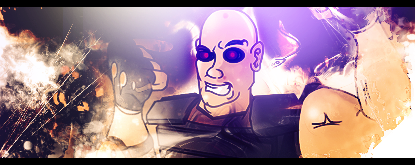
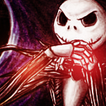
I can really see the improvement with each one. I really like some of the first ones you posted, and the colors in your recent ones just explode.
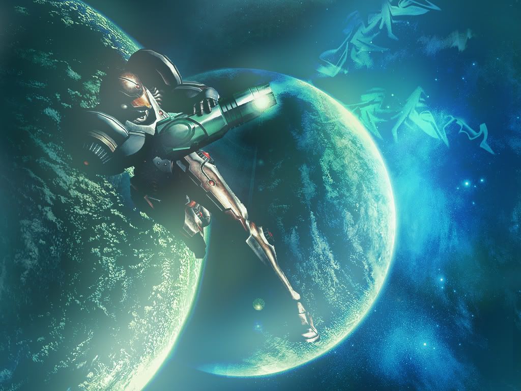
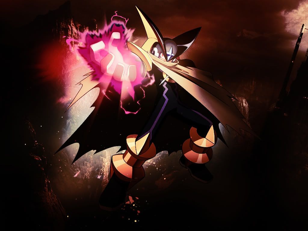
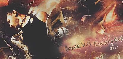
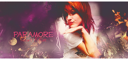
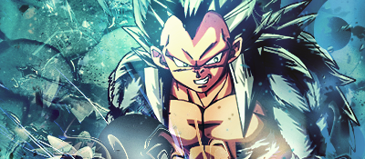
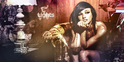
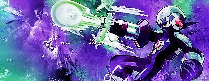
This one so far is my favorite. Stock blends in well, and theres not too much going on, I like the effects and I love where the focal point draws you to.


")

 ), take a few moments to comment, and well, yeah
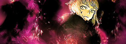
 , but hey nobody comments, so what is an artist to do
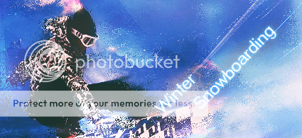


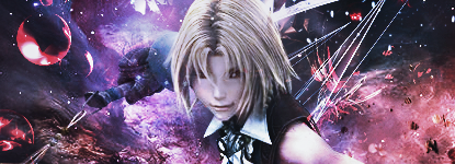


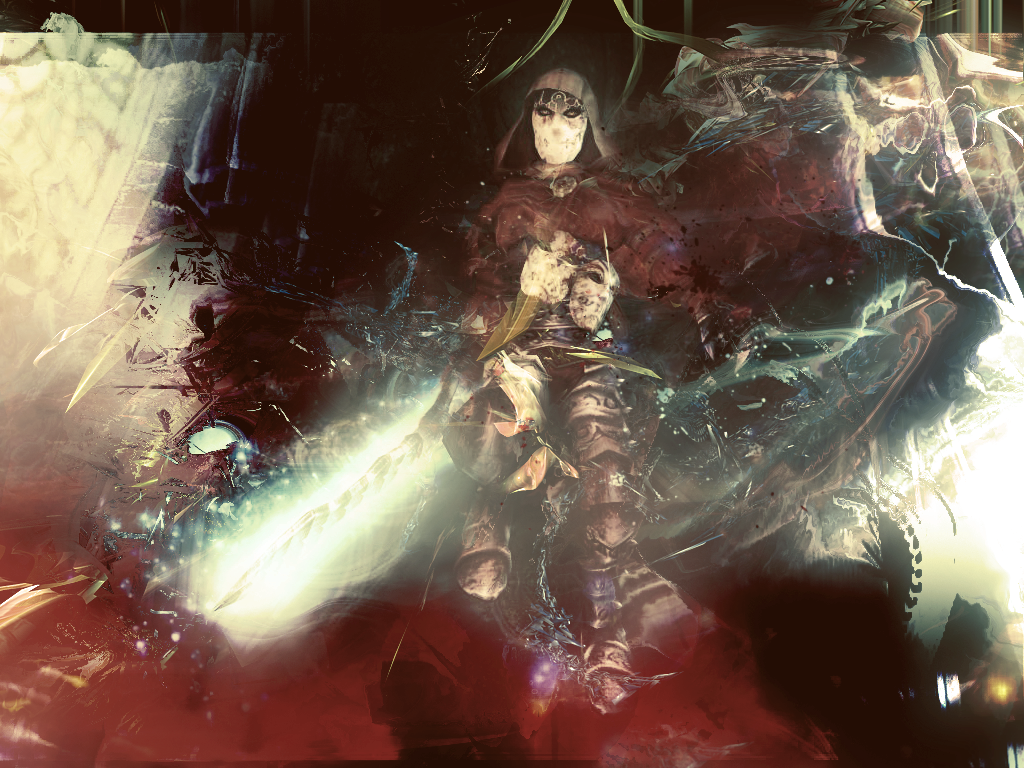
 a bit of a graphic slump. I don't really have much of an update, but at least its something