SOTW 88 Voting Thread

SOTW 88


  • Total voters
    15
  • Poll closed .
Status
Not open for further replies.

Daenerys

The Last Dragon
Veteran
Joined
Nov 26, 2006
Messages
11,178
Age
33
Location
Suburban hell.
Gil
1
The theme this week was Pokémon, and I got a load of really fantastic entries ^^ Remember, you must post for your vote to count please.

1)
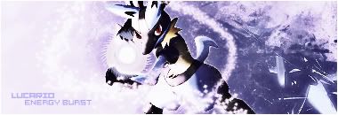
Lucario.jpg


2)

articunosig2.png


3)

2ia3jpd.jpg


4)

muts2v.jpg


5)

ji24gm.jpg


6)

lucariosigcopyp.png

 
Damn, these are really great entries! I honestly love all of them (although I only recognize a few of the pokemon depicted, haha).

However, I'm going with number 3 for this week. I love the effects behind MewTwo and smudging/masking in the sig as well.

But seriously, great job to everyone!
 
I'm really torn between 3 and 4 here.

I love the colouring of 3 aswell as the effects.

I love the way 4 is blended and the colouring.

Hmph, this is hard.

I'm going to go with number 4, based on the the variety of colour.
 
All are nice but 3-4-6 for me. #3 has nice focus point and everything is fine to me. Colors are in same family and the only thing I personally don't like is the text font! which it's shape does not match the style!. #4, has nicely done, two fire balls at two different sides makes the focus distracted and they're more attracting my eyes than the Mewtwo character itself! but has a good text and nice colors! #6 is so good to me!I appreciate the contrast and the dark theme with some details even in dark areas! Text matches the sig style and I just dunno if the energy ball is made by the designer or it's in the original image. My vote goes for number six - 6
Good job everyone.


There's just a single problem! It would be better if competitors post the stock(s) they've used so we can see how much effort they've put in their works! some pictures used have so many good graphics and it will be unfair to someone who makes all the details all by themselves!
 
Oooh awesome entries this week!

I had a hard time choosing between 3 and 6.

I love how 3 is blended in to a grungy looking background and I love those little rectangles on the right hand side. I like how the border looks like it's closing in on Mewtwo as well. The colour use is also great and the lighting is spot on. It's a very nicely done signature. Well done to whoever made this.

I love how 6 has blackness closing in on the character and the colours used really stand out! The lighting is great and the whole feel of the signature is really mysterious. I love the blending on this one as well. I like how the little bits of the original picture are discreetly popping out on the right. It's a very nice, simple and clean signature and more the style that I go for.

So my vote goes to #6.

Well done to all who entered!
 
This one I had to get to a simple reason to decide. number 6, because it was the only dark one there.
 
Right...great reasoning. Lol.

Anyway, I'm voting 5. Clearly the winning one me thinks. The colours of Espeon and Umbreon are beautiful, and the way they're highlighted makes them stand out and even look more special. Runner up is 3, and unfortunately, I don't like the rest of them much :(
 
Ooh hard choice again D:

Number 4 I think gets my vote int he end

Nice image colours and I liek the ball thingies on his hands
 
I have to say there all good in their own way, but my clear favourite has to be Number 6 because of the blend of the black and blue with the feature blended well. But I have to say Number 5 nearly had my vote, well done all :)
 
  • Like
Reactions: Kei
i voted for #5 because of its radiant and beautiful colours and the cute pokemon. the font and writing matches nicely as well, well done to those who entered with these stunning sigs! :monster:
 
It was a tough choice this week, but in the end I ended up voting for number 4. The lighting effects look very well done and I particularly like the purple in the middle of Mewtwo's head which is hard to notice at first, but once I noticed it I could barely take my eyes of it.
 
Great entries this week. But it's really between 4 and 6 for me.

It's so difficult to choose. Number 4 caught my attention first. I really like the blending and the choice of colors. I wasn't fond of the text or the size though. But still, great piece. :gasp:

Number 6 is darker. The lighting effect in the middle is beautiful. The stock is crisp and the text is good and nice use of negative space.

After thinking for about 5 minutes, my vote goes to 6. But good job to all! :gasp:
 
Definitely number 3. The blending and effects surrounding the pokemon is the main deciding factor and I love the colors as well. Dark and light thrown in together but I can tell it was at least maintained and controlled in a way so that it doesn't look messy. The lines were a good addition too although the text could have been better. (Smaller perhaps). The sig size is a bit too small for my liking, but that's not going to deter me from seeing the beautiful work done.
 
I'm voting for signature number 5.

While signature 6 looks good, if you look at it there's not a lot that's been done to it really, and it's very simple. Signature 5 gets my vote because I love how they've incorporated 2 renders, and I adore the text and the colors ^^

Darker signatures aren't always the best ones :gasp:
 
Arrgh hard choice but in the end i chose 6, great effects added to the character giving a dark gloomy yet suiting look, the text looks just right there, great job overall.

Great work I really like it, you get a WOOT from me.
 
I voted number five for the same reasons as someone gave in this thread. I personally hate pink, but this signature made me realize how good it looks with black again, I love the two sided-ness in the siggy and the pokemon are just cute. ^^ I agree with everyone else though, it was tough, 'cause they all look really gorgeous.

But 5 gets my vote. GOOD JOB, EVERYONE!
 
Last edited:
Well done to Lagunas dream for winning this week ^^

1 - Axis
2 - DLFlux
3 - Stevie Nicks
4 - Kei
5 - Paine
6 - Lagunas Dream
 
Status
Not open for further replies.
Back
Top