SOTW 63 Voting Thread

SoTW 63 Voting

  • 1.

    Votes: 9 36.0%
  • 2.

    Votes: 0 0.0%
  • 3.

    Votes: 7 28.0%
  • 4.

    Votes: 4 16.0%
  • 5.

    Votes: 2 8.0%
  • 6.

    Votes: 3 12.0%

  • Total voters
    25
  • Poll closed .

Gingerbread Lesbian

Banned
Veteran
Joined
Dec 30, 2007
Messages
10,644
Gil
0
Theme: SONY
You must post for your vote to count!

1)

SOTW63.png


2)
LittleBigPlanet.png


3)
PSPFFF3.png


4)
3stp2.png


5)
sotw.png


6)
SOTW63.png

 
1 is absoultely amazing. Image is sexy as hell and the brushes and lighting fix it well. Well done!
 
I have to go with 4, just 'cause it's so different. I'm not sure why else, I just really like it.
 
Number 1 - I just love the white colour, it gives off this wonderful aura :gasp:

Tis very pretty!
 
for me it was a tie between 1 and 3. I like 1 because the colors and effects are amazing ^_^ I also really liked the PSP in PSP effect, but I chose 1 because I absolutely loved it.
 
I vote for 4. I think the text fits very well and I really like the clean look it has.
 
Voting for #1! The effects and matching colors with the render are pretty amazing, plus Sophitia is just as awesome as cute. Nice work ^^
 
It has to be number 5 for me. The tag size is cute too. :D 
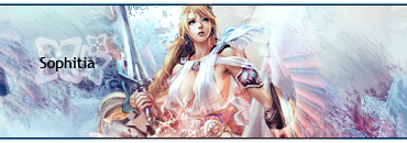
The effects surrounding the main focal point is quite impressive and the vector-style theme to it is a fresh style to see. I especially love the text here. 4 was a very close second, since I really fell in love with the text there. =] But 5 seemed to stand out to me moreso than the others.
 
Number 1 for me! I absolutely love the render of Sophita, as well as the beautiful colors and effects used on the tag. I liked number 5 as well, but it just didn't stand out to me as much as 1 did.
 
i loved how 3 had part of the FFF banner on the screen of one f the PSP's and how the background looked really cool. Also how the main PSP had one on it's screen looked really creative.
 
Three.

I find it to be the most unique work here by far. Most of these are pretty nice, but Three is most unique, which gives it the edge. Nice job!
 
I'm voting for #5. The tag isn't getting much attention for some reason yet it's really well designed. I like #1 too, but there's something really brave about using a cellphone as stock and surrounding it with effective vectors. :P
 
Number 6 FTW.

Awesome effects and great colors make for great visual appeal. The only thing I think could be a problem is the fact that the colors maybe too bright.

This one gets 7/10.
 
3 - whilst not the most technically proficient perhaps, it's clean and the lines are nice. It's an interesting and well realised concept, and it's a very good reification of the chosen subject.
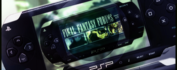
Yeah...uh...what he said. It looks pretty cool, that's for sure.

#3 gets my vote.
 
I voted for #1 because the effects with the background stands out nicely with the render and the use of colors.
 
Back
Top