SOTW 40 Voting Thread

SOTW 40


  • Total voters
    15
  • Poll closed .

Daenerys

The Last Dragon
Veteran
Joined
Nov 26, 2006
Messages
11,178
Age
33
Location
Suburban hell.
Gil
1
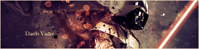
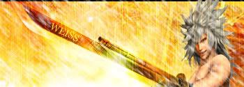
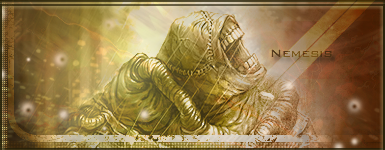
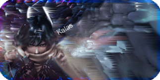
Theme this week was Villains, and here are the entrys I received. You know the rules by now, votes without posts do not get counted.

1)
vader.png


2)
sotw40rg2.jpg


3)
Nemesiscopy.png


4)
SOTWKalas.png


5)
idrjtg.png
 
I voted for 1 since I liked the effects and the colors, my second choice would be 3 I like the colors but I just don't like the stock
 
1.

Darth Vader looks so much better than anyone else in the sigs, mainly because he blends in with the background well.
 
It was a toss-up between the first and last entries for me. Both are brilliantly done but the only thing that throws me off voting for the last one is how much the text annoys me, for some reason. I can't quite place my finger on it but the Darth Vader sig was more appealing, text-wise.

So I've gone for 1.
 
No.1 totally. It really looks nice, Darth really seems to stand out, and not look really like a blended in background image. Nice colouring too.

Number 5 was pretty awesome though.
 
I voted for #5, Bowser. The background effects are faaantastic, and the sharpness and brightness and everything else is flawless. It's kind of like he's rising out of the lava with how bright his legs are in comparison to his head. Very well done.
 
1, easily. It's got a really nice composition, color scheme, stock placement, and background. The only thing that I don't like is the font.

2 is boring and has its stock shoved to the side, not to mention, I'm not digging the diagonal text placement.

3 is fairly good, in my opinion, but the borders and the fact that the colors are all of the same pallet ruin it.

5 is nice, but there is no stock-bg interaction, and the stock and bg don't match well. I don't like the text nor text placement.
 
I voted for one. Vader blends well with the background, and it's overall just a great sig.
 
i am voting for number 4
it just seems to stand out to me. and i like the way it looks
it also looks like it has had the most time put into it
 
1 and 3

1, has better color theme and better size.
The font does not match it in my opinion. It gets my vote, but could really do much better than this.

2- Low quality, overloaded, boring colors

3- is good, just a bit it's size, and low contrast, made me to send my vote to #1

4- I see nothing special with it.
5-, it's nice, but I dunno why the colors don't match well in my eyes.
 
#2,#3 all need to make the render stand out more. They have no depth

#4 was kinda cool once I found the face, but it was silly that I had to look in the first place. Perhaps a bit messy in that sense. However I do like the effects. Maybe desaturate a little around the focal?

#5. the biggest problem is 0 blending. otherwise, the effects are pretty cool, if not a bit messy. The colours are pretty nice on their own, but do they fit the render? you can't really tell since the render is not blended anyway but my guess would be no, unless you changed the colours of the render a bi, which would be perfectly fine.

#1. this gets my vote. It is a really nice one. My only complaint(s) would be the text, but even then it is only a minor one. the other is that I think some of the black spatter on top is unnecessary, the bits to the right are nice, and to the left, but I felt you could have erased some of the larger chunks in the middle.
 
1. Good merge between Background and stock. Colors match and the text is good in comparison with the others.

2.Nothing is happening with the bg, and it doesn't draws my attention.

3.Border and Text look nice, but something more could have been done with the background. Also there are better Nemesis's stocks.

4.Good one, though text is a no-no. Hardest part to do is text, I can tell for sure. Sadly, 1 was better.

5. What's placed on the lower right corner? The overall background is ok, but there's no interaction between Stock and Background (it is as if it were simply placed there). The stock looks edgy, it stands out too much. The text looks cool, though it could have been placed somewhere else to make it looks better.
 
I chose 1 because of how much Darth Vader just looks like he should be in there; it almost looks like he is coming out of some portal with his light saber in front of him. It just looks so right....
 
Number 1. I love the effects and Vader just seems to blend in well with the background. I'm usually put off by text but the text in this one was alright so it gets my vote :)
 
Argh I forgot to vote on this one!

I going to vote for #5. I liked the colors, lighting, and the render used. The only problem I have is the text placement; I'm not a fan of placing text in a corner.
 
Back
Top