SOTW 214 Voting Thread & AOTW 164 Winner.

SoTW 214 Winner?


  • Total voters
    14
  • Poll closed .
Status
Not open for further replies.

Warbsywoo

Hellodia.
Veteran
Joined
Apr 15, 2007
Messages
4,891
Age
35
Location
California
Gil
2
The theme this week is: Final Fantasy XII.

Here are the entries I received:

1.)
solidorsotw.png


2.)
el1c9i.jpg


3.)
ffxiisotw214.png


4.)
SotW214.png


5.)
FFXIISOTWv2.png


6.)
dpfgw3.jpg


Additionally, the winner of this week's AoTW (1 entry) is: Sabriel

With this entry:

vaanicon2.png


+ Voting ends in 7 days
+ Entrants cannot vote for their own entries.
+ Although posting is not required for your vote to count, it is highly recommended.
 
I voted for #4.

Easily the one that stands out above all the rest. Although, it's a bit blurry, that could have been fixed with some sharpening.

I like the colors altogether, it's a bit bright also, but still awesome regardless. Great piece. (y)
 
I voted for number 5. I really liked the grey-ish tones it had and the background was great. Focus on Gabranth was great, and the balance of everything is great. Also, I love Gabranth, so that helped my vote too. xD
 
Aw man I liked all of 'em...

In the end I voted for #4. It's simple and clean and it's so Peneloish :lew: I love it.
#6 was a close second.
 
FFXIISOTWv2.png


tumblr_lsg9x2im0h1qjfoswo1_250.gif


dear lord 8(

This signature is so sexy I was all:
tumblr_lsgl8mvsOb1r13cq3.gif


Seriously, it is all kinds of yum. :gonk:
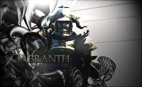
The gray color tones is just spot on. I really like the gray vectors wrapping around him, it looks amazingly kick ass. The font looks kick ass. I love the color chosen for the font and I like the placement. I just wish the font under it wasn't there. :hmmm: And the lighting is just... GORGEOUS!! :gonk:

Brilliant brilliant job on this signature. And I would love to use it if I may. :inlove:
 
This was a difficult one for me, but in the end I went with 4 :lew:

I really, really like the coloring used in this. The yellow background is very tastefully done ....and I like how Penelo is played up a bit in her stance with the flowers, that match the background so well :ryan: The size is also perfect...and the lighting is very nice.

One is nice, its just really really big. I like the concept that they went for...I just think it would've been a bit more appropriate looking if it were smaller. Its also a little on the plain side, for me personally. The text would have looked a bit better if it were black and scrolly maybe :hmmm:

Two...I can get what they were going for here but I don't care for the fact that Ashe's face is partially cut off, it makes the sig look a bit awkward to me. The text isn't all that clear and the lighting is the same throughout, which doesn't really bring a focus to any one part of the sig.

Three probably would've been my second choice. I love the pic of Fran and Balthier, I think the only thing I really don't particularly like about this is the black and white patch at the far left part of the sig...it would've looked much better if the whole sig would've been in color.

Five is stunning actually. The stock looks very nice and the text is so appropriate. I just don't particularly care for sigs that are mostly black and white, unless the concept is a real stunner. Black and white sigs really either hit me or they don't :lew:

Six...I just really don't care for Vaan omg :damon: It is a very nice sig, though. The lighting is nice, I just think its kindof the same throughout and maybe should have just been on Vaan himself. The text and boarder is nice and appropriate.
 
Congratulations to Ariana (Chloe Frazer) for winning this week's SoTW!

1.) Martel
2.) Cid XIII-2
3.) Kitty-Urie
4.) Six
5.) Chloe Frazer
6.) Ryuuki Corvin
 
Status
Not open for further replies.
Back
Top